
![]()
![]()
CLIENT
Capsule specializes in brand strategy, identity, naming, packaging, and customer experience design services. Since 1999, the Minneapolis, MN, firm has lent its award-winning, distinctive methods and perspectives to the international design community.
BRIEF
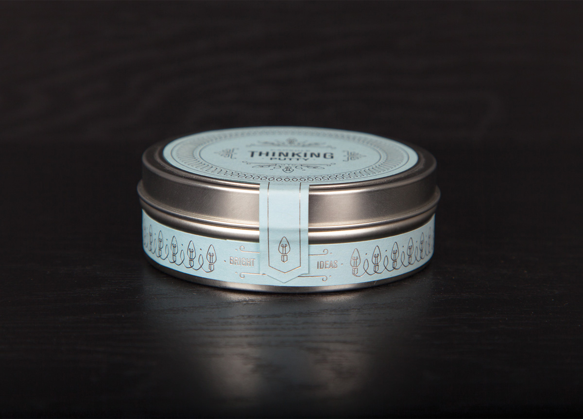
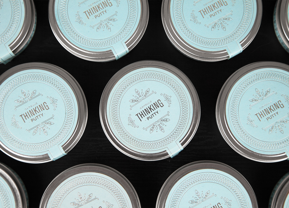
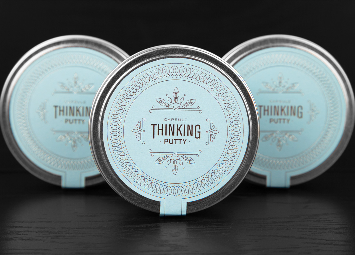
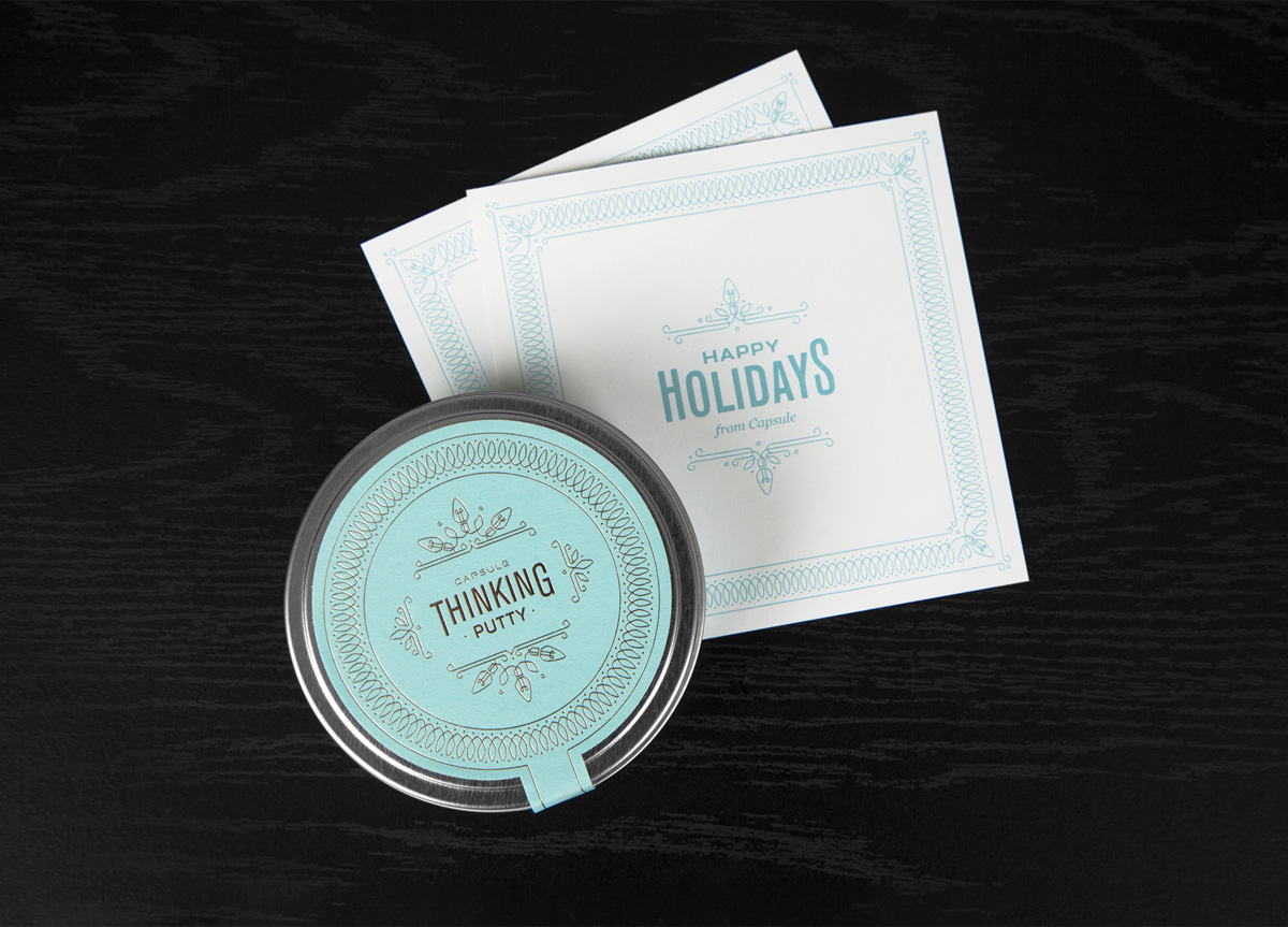
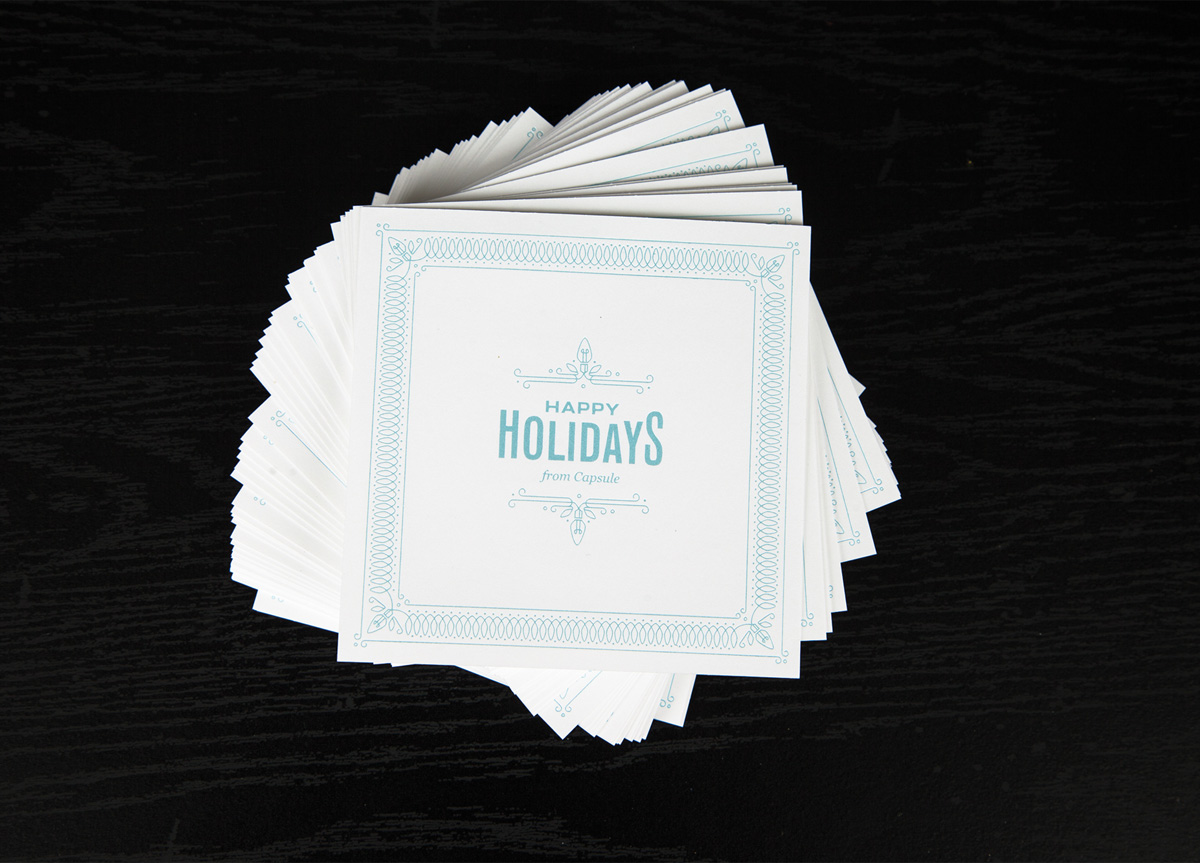
Capsule wanted to do something for the 2013 holiday season that inspired creative ideas. Inspiring a way for these ideas to become a reality, and using the crafting skills of our own two hands, we used a favorite piece of inspiration to promote our design thinking philosophy. Putty.
APPROACH
Capsule needed to be sure the gift would tailor to the spirit of the holidays and hold up the importance of thoughtful design. The intent of the putty needed to be communicated and presented in an efficient and inventive manner. Recipients were encouraged to create with the putty and socialize their craft for the world to see on twitter with the hashtag, #capsuleputty. The finished product is a delicate, foil stamped putty tin and card design, inspired by “bright ideas” and the holiday season. Capsule’s Thinking Putty encourages recipients to shape, form, and stretch thoughts and ideas into something tangible and inspiring for those around them.


