
![]()
![]()
CLIENT
Cynthia Woods Mitchell Center for the Arts at University of Houston is dedicated to ground-breaking, transformational collaborations across the performing, visual, and literary arts—it commissions and produces new works, presents public performances and exhibitions, offers curriculum, fellowships, and residencies.
BRIEF
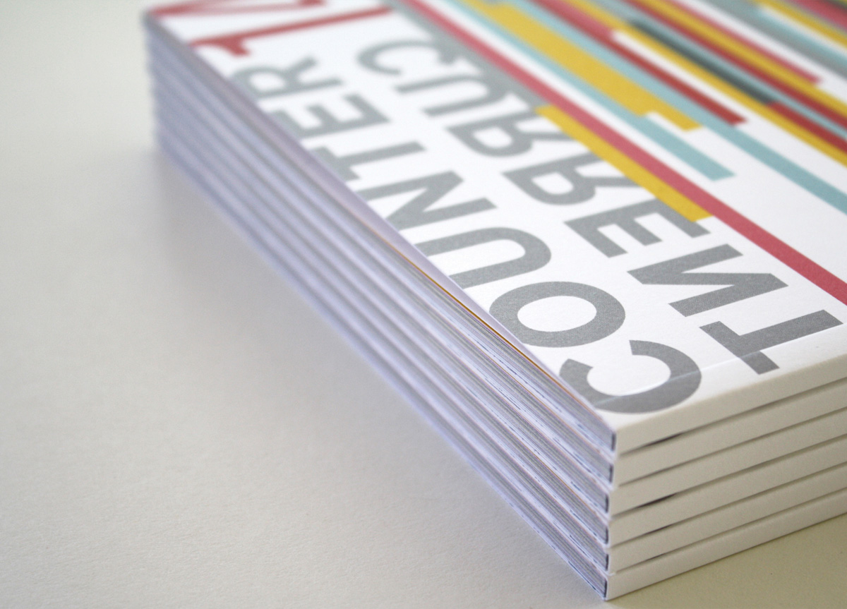
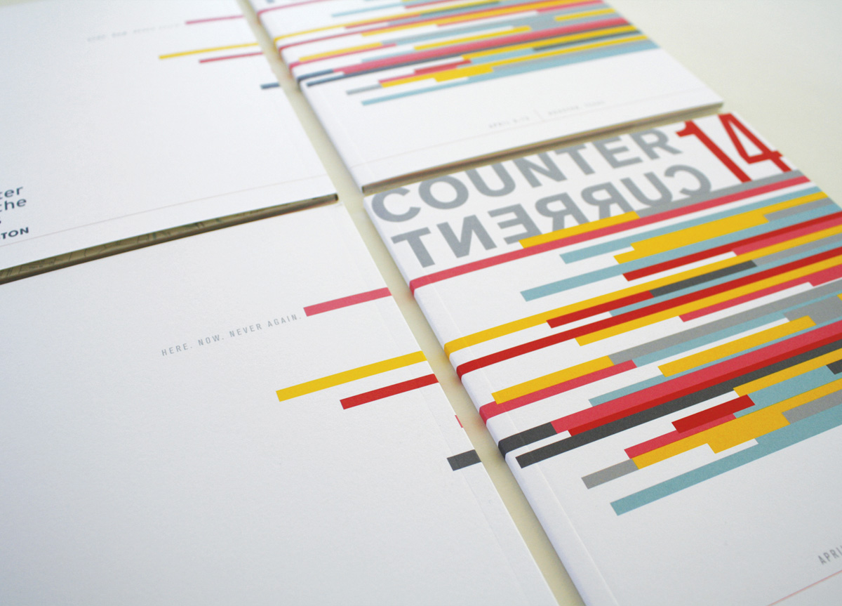
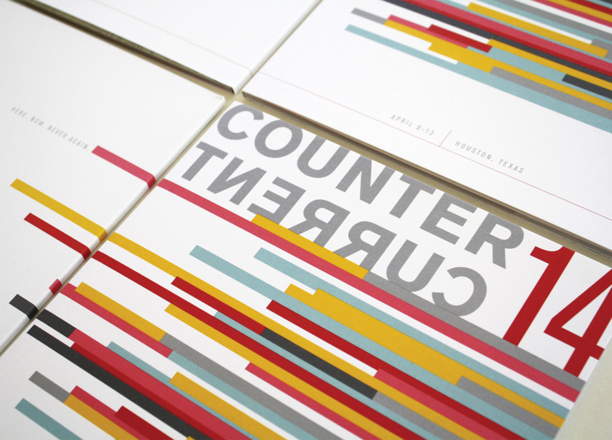
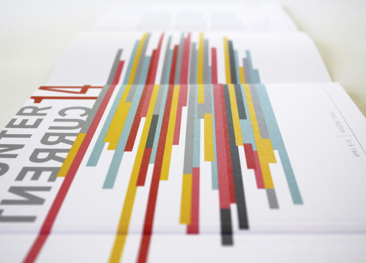
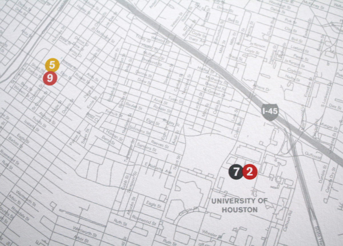
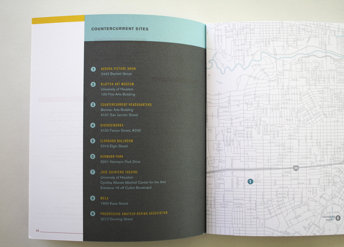
The Cynthia Woods Mitchell Center recently transformed all of their public programming into a five-day festival, called CounterCurrent. They needed a book for the inaugural art festival that felt substantial and would help position the brand as edgy and experimental, yet did not stray too far away from their ties to the University’s brand.
APPROACH
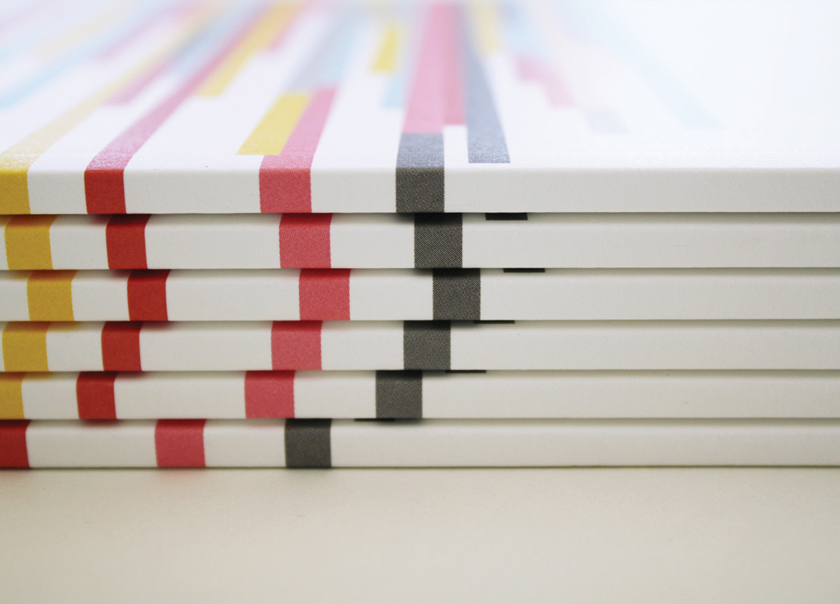
We looked at the purpose of the catalog as two-fold: to build excitement about the festival and to increase attendance. We set out to create a bold, beautiful piece that people would want to keep on their coffee table or open it if they saw it around town. That said, we also craved function. The piece was designed small enough to be tossed in a bag and toted around the festival for reference. Being a non-profit, budget was a concern (as was timeline) so we opted to use a premium paper, but to skip special techniques. The cover art elevated the piece with bold bright hues and a sense of texture without the extra cost.


