
![]()
![]()
CLIENT
Singapore Tyler Print Institute is a catalyst and advocate for new ideas and dialogues for contemporary art in print, and paper. It collaborates with emerging and established artists from all around the world to create artworks with its exceptional print- and paper-making facilities and expertise.
BRIEF
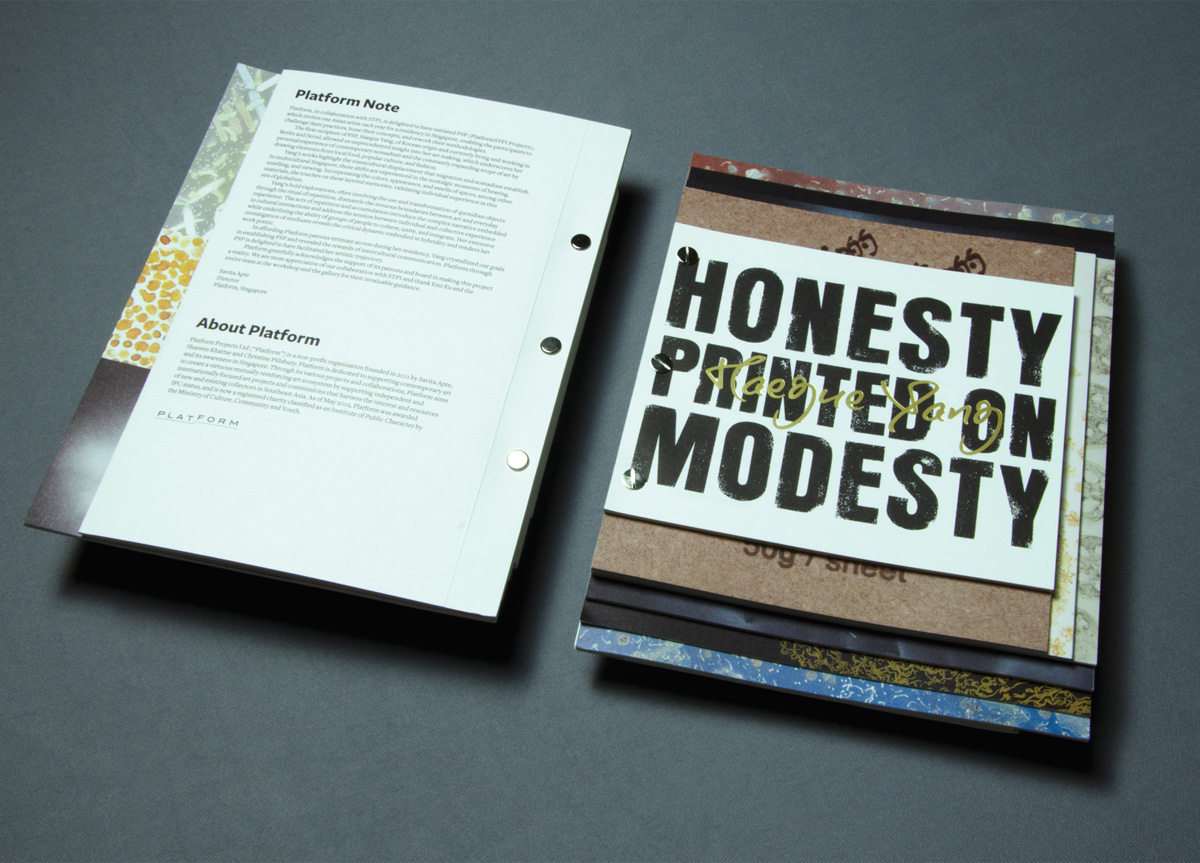
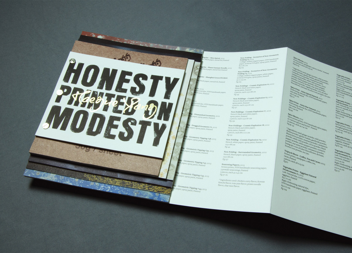
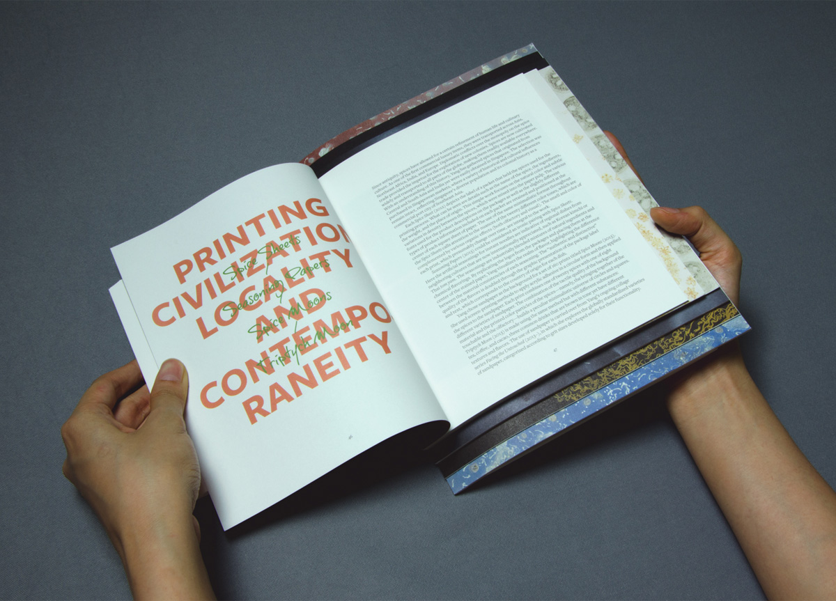
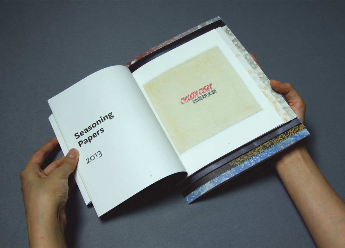
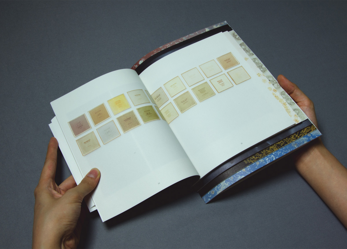
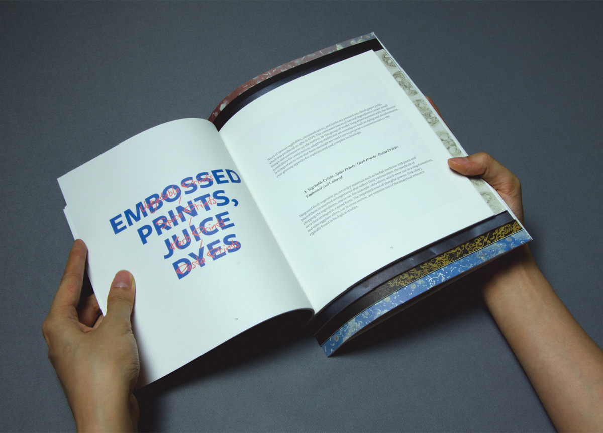
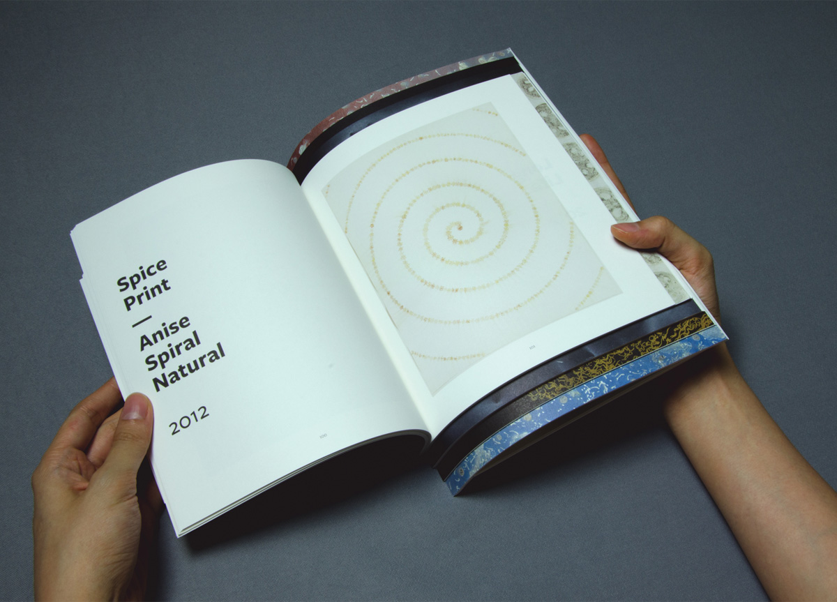
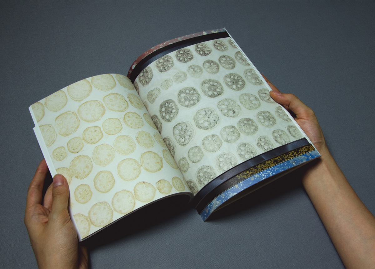
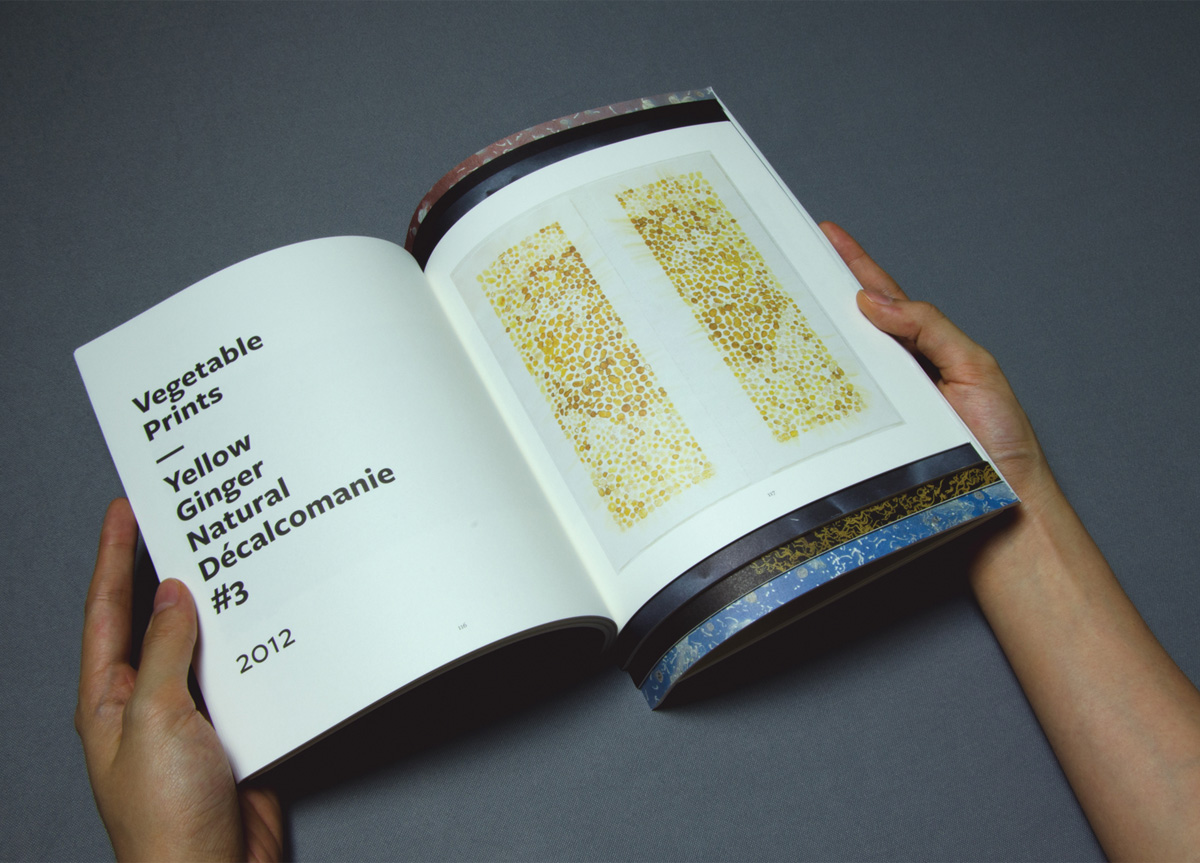
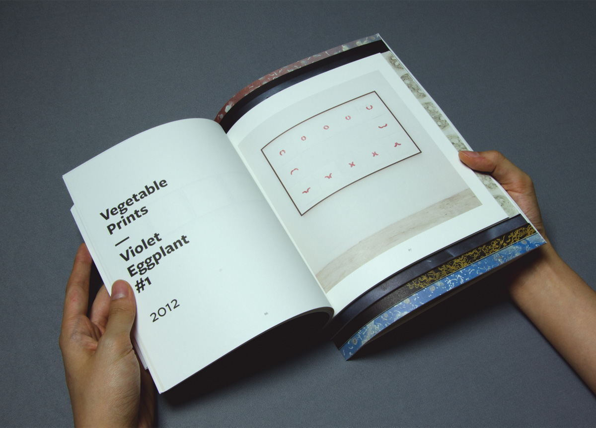
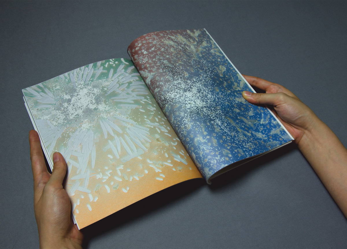
To design the catalog for Haegue Yang’s exhibition containing new works utilizing the colors and textures of spices and vegetables with print works produced in collaboration with STPI’s workshop, while drawing attention to the power of spices and everyday food from its domestic function to its impact on civilizations.
APPROACH
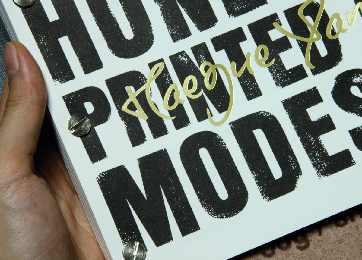
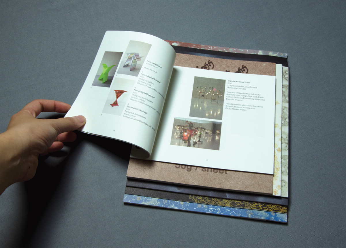
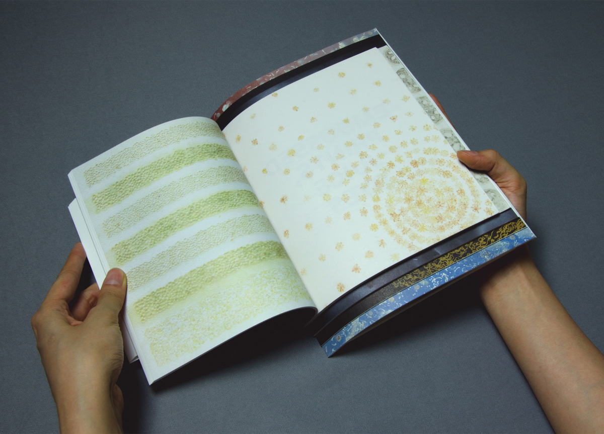
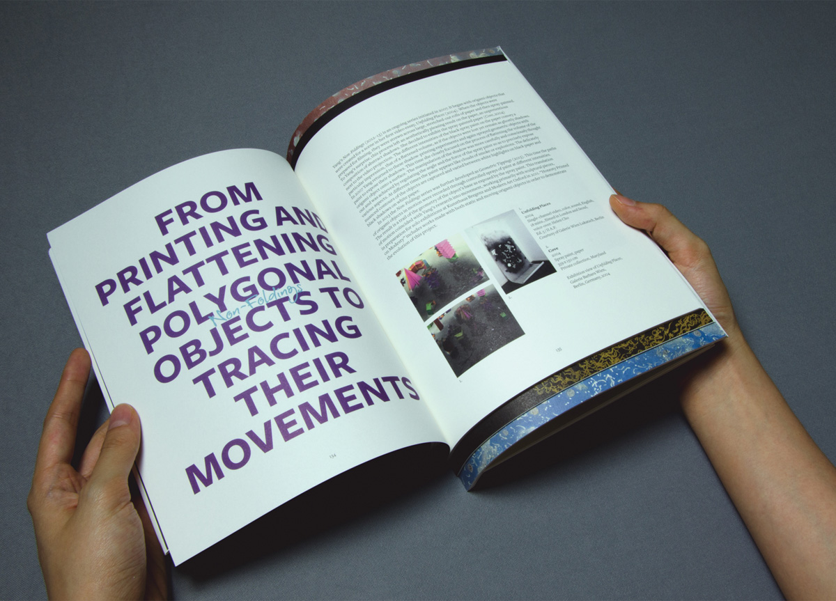
Broken up into six series/chapters, we created a catalog that echoed the hodgepodge of materials and food items, framing the diversity of work through paper stacks of different sizes, a solution born out of the need for variation without going overboard with the graphics or layout itself. Viewed from the front, these differing dimensions reveal a cover that is a harmonious collection of all the different series gathered together, and the screw-binding reinforces the raw look of the work.


