


![]()
![]()
CLIENT
Unit Editions is a progressive publishing venture producing high-quality and good value books on graphic design and visual culture. They combine impeccable design and production standards with insightful texts and informative commentaries on a wide range of subjects.
BRIEF
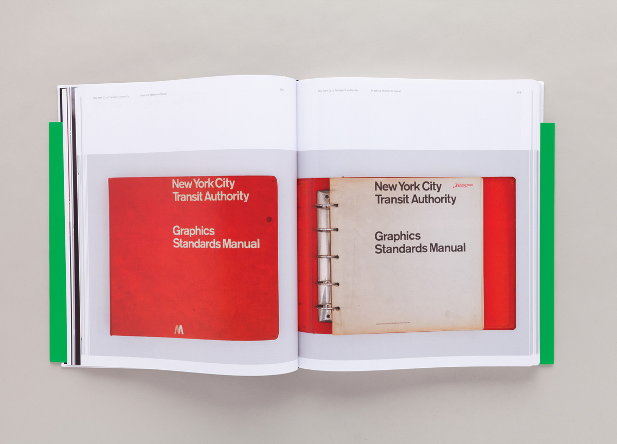
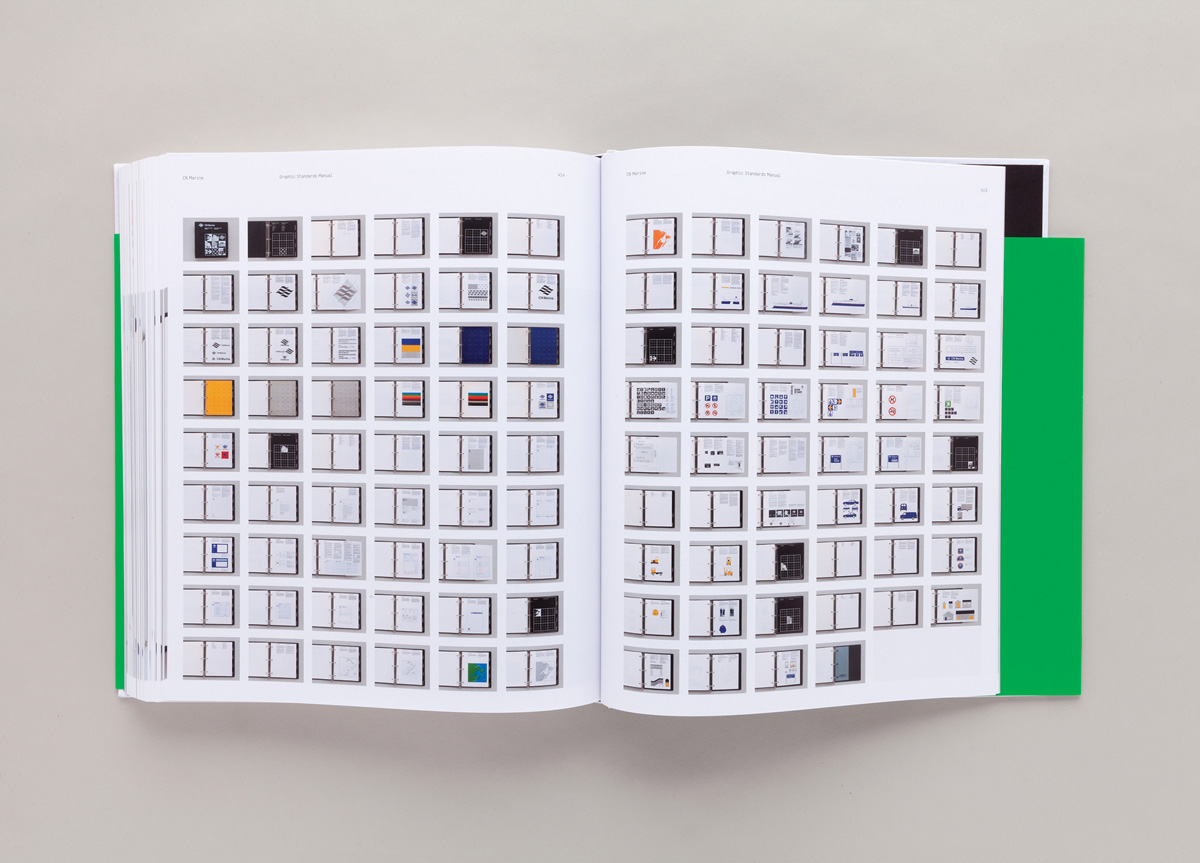
This book is the first comprehensive study of corporate identity design manuals, and features 20 examples from the 1960s to early 1980s—the golden era of identity design. The book includes manuals created for institutions and corporations such as NASA, Lufthansa, and British Steel.
APPROACH
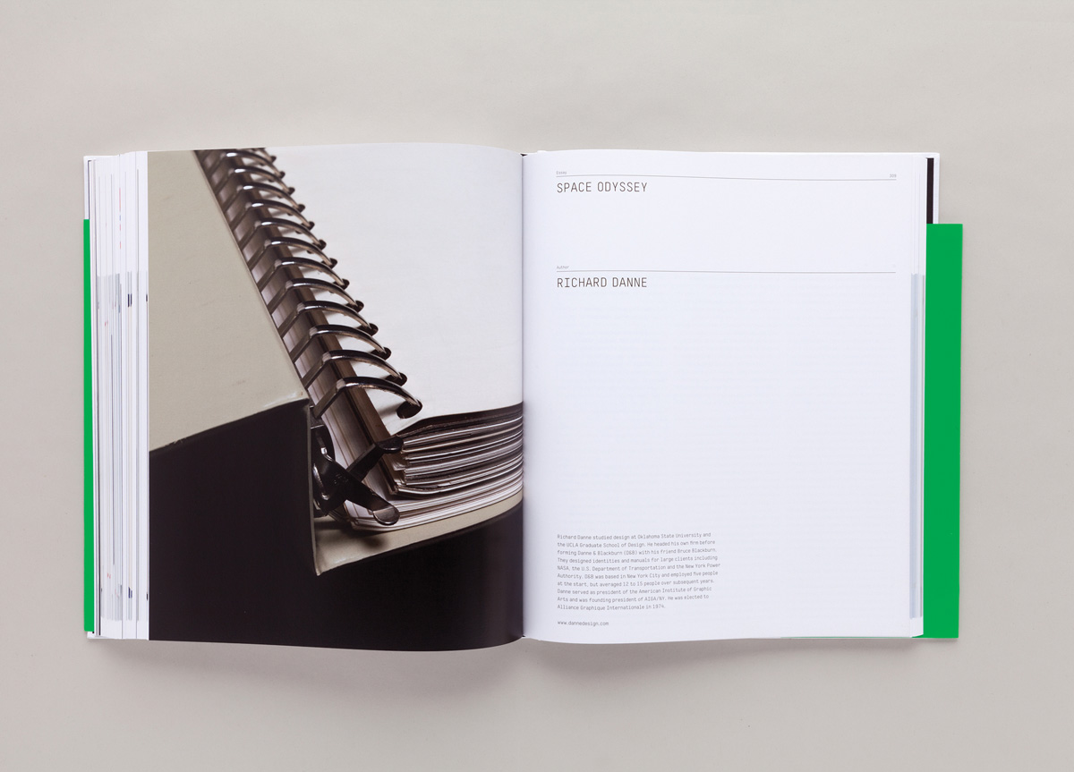
All of the manuals have been lovingly photographed and presented in a spacious and functional layout allowing the observer to fully appreciate these wonderful examples of information design at its best. Manuals 1 is printed in Italy, conforming to the highest production standards.
PRODUCTION LESSONS
Being on press in Verona was a good learning experience for us. It gave us the control of print we desired.
Manuals, by Unit Editions, was extraordinary for its sheer physicality. The thoughtful documentation of these style manuals was a delightful chronicle of a certain world history as well as design history, documenting the corporate appearance of industries that moved, powered, medicated, chroniclers, entertained, and connected people. Much of the delight of the images in this book is the yellowing pages, the dog-eared binders, the pages that curl in the clasp of giant three-ring binders, each proving its use and showing its age, proving Massimo Vignelli’s observation, “The definition of a good manual is a manual that gets used.” Author Adrain Shaughnessy contrasts the pixelated present to the “splendid physical presence” of these massive tomes, which are often left to speak for themselves in this gorgeous volume, which preserves their memory with understated reverence. From the incorrect usage page from NASA’s manual, to the single capital letters and then single lower case letters, each on it’s own page in Vignelli’s own massive 176-page 1970 New York City Transit Authority tome, this book, for designers, is a high-calory delight. — Stephen Doyle


