
![]()
![]()
CLIENT
Public Media Institute (PMI) is a non-profit, community based, art and culture organization located in the neighborhood of Bridgeport in the city of Chicago, IL. Their mission is to create, incubate, and sustain innovative cultural programming through the production of socially engaged projects, arts festivals, spaces, exhibitions, and media.
BRIEF
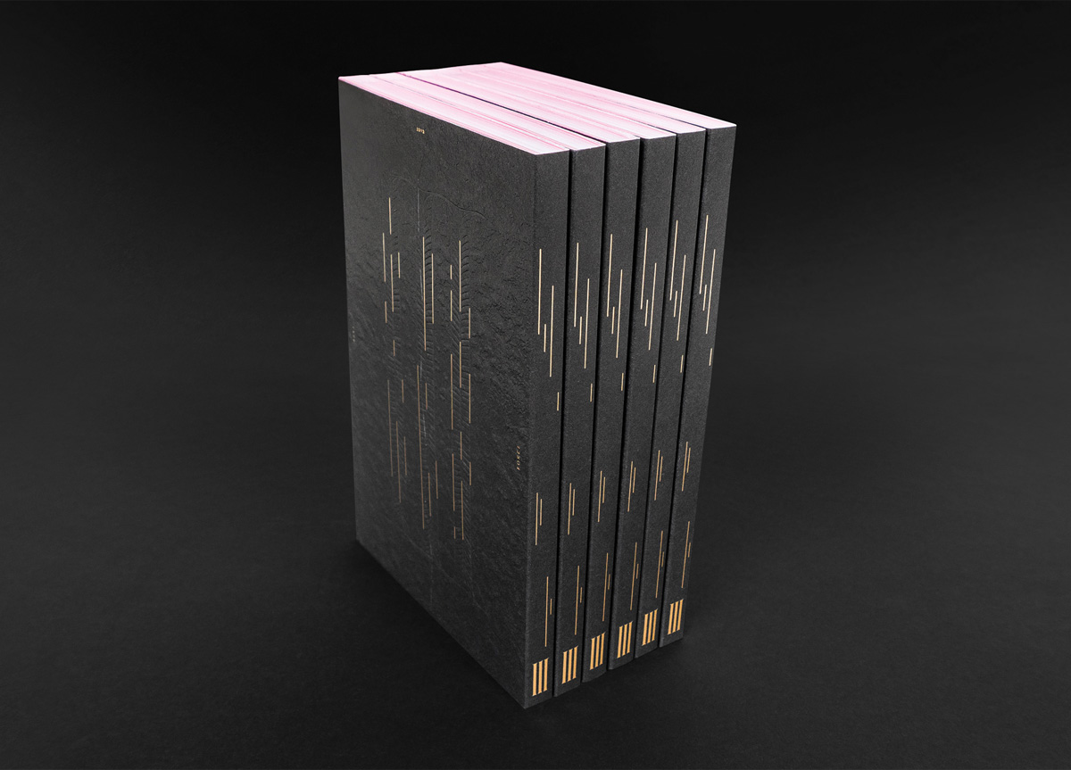
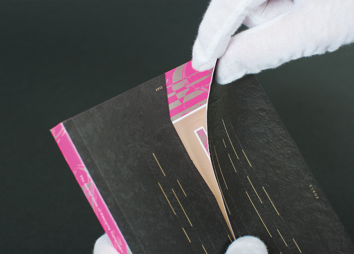
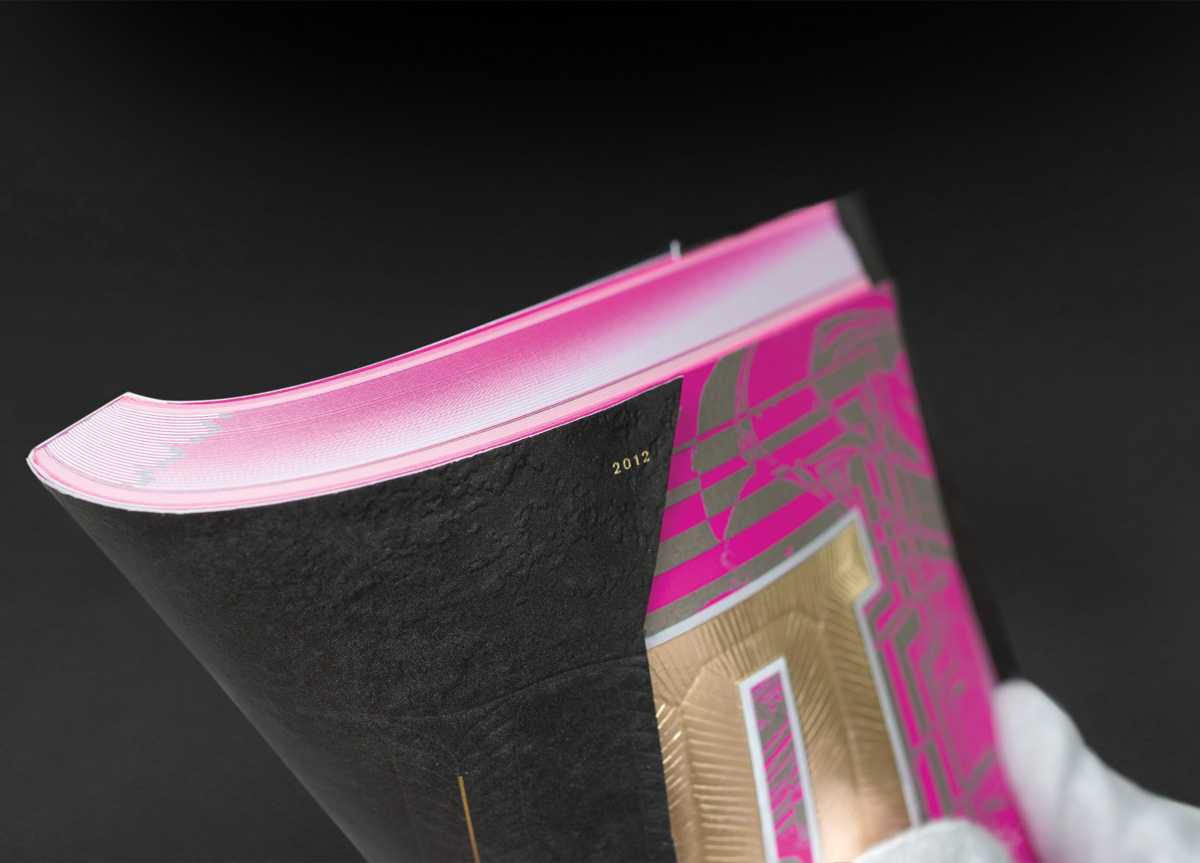
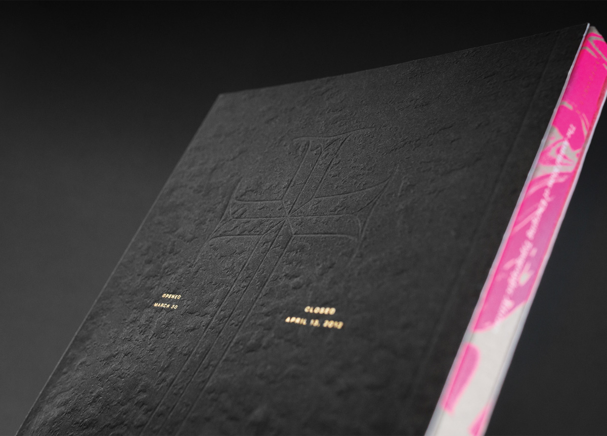
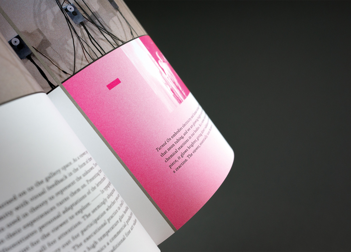
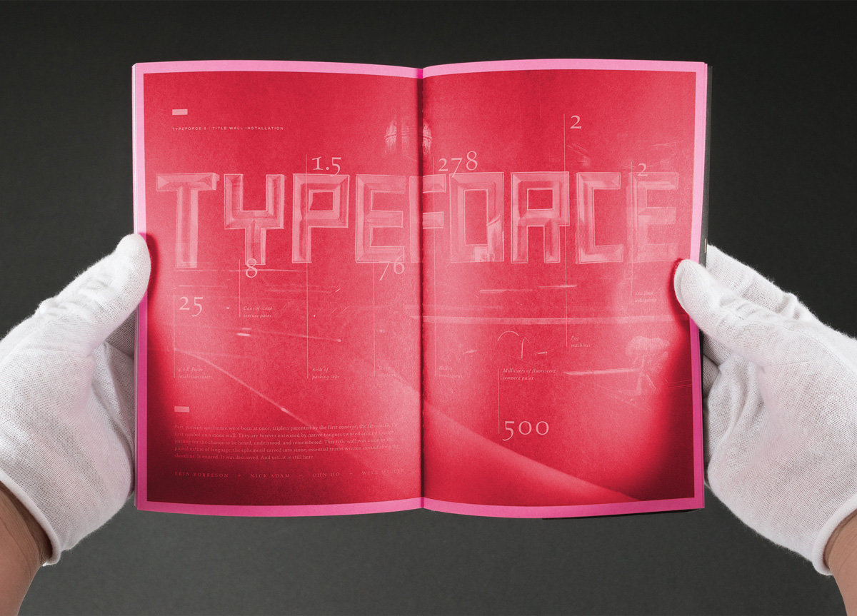
PMI and Firebelly collaborate every year on the annual TYPEFORCE exhibition. The catalog is meant to be a record of the experience and showcase of the work.
APPROACH
Can an exhibition catalog capture and provide the physical excitement of a moment while honoring tradition, the showcased typographic artistry, and artists individual conceptual narratives? By taking a UI approach to the book’s design we capture the physical energy of being one of the 1,000-plus attendees discovering new works at the opening reception. Each year Firebelly redefines this task by guiding the reader’s attentiveness in an effort to honor and celebrate each of the canonized artists. The studio’s third catalog explores new heights in fundamentals by uniting history with the discovery of contemporary methods.


