
![]()
![]()
CLIENT
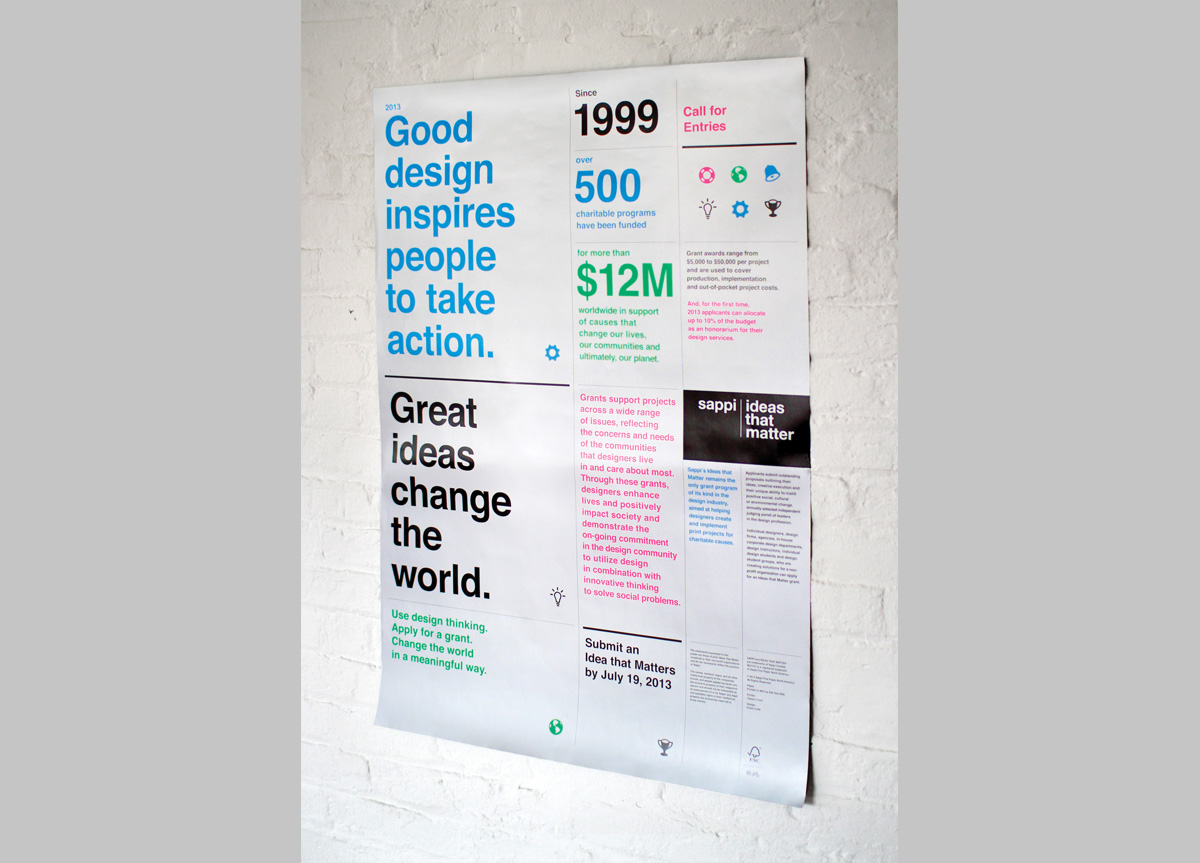
Sappi’s Ideas that Matter program is a non-profit annual design grant aimed at helping designers create and implement print projects for charitable causes. Individual designers, design firms, agencies, in-house corporate designers, and individual design firms are encouraged to apply.
BRIEF
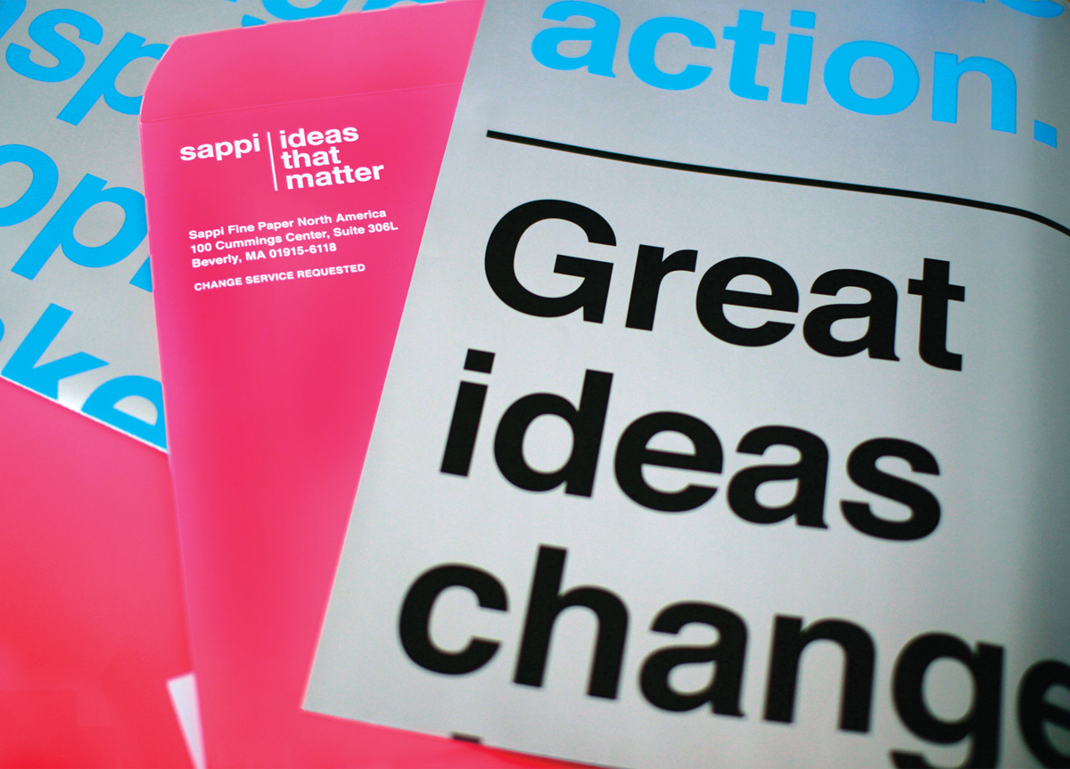
Sappi created a uniquely eye-catching fluorescent envelope mailer that conceals an Ideas that Matter grant application, which also doubles as an oversized, limited-edition poster. The metallic poster highlights a variety of causes that designers can apply their talents to help solve in the world.
APPROACH
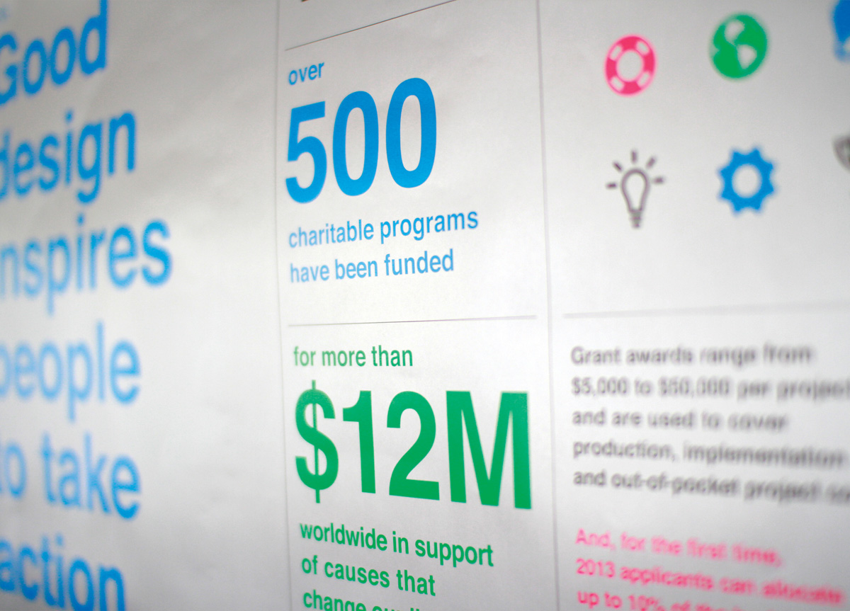
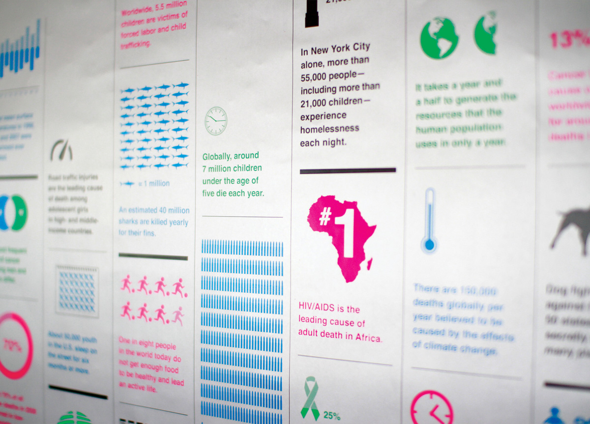
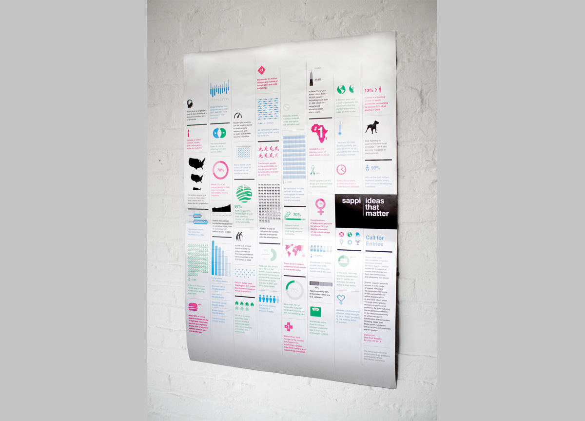
Ideas that Matter is an annual grant program and Sappi redesigns the application materials each year to keep it fresh. The goal is to grab designers’ attention so we pushed this concept by using fluorescent envelopes and a large poster with simple, eye-catching infographics that people would want to hang on their office bulletin boards. Conveying our new tagline, “Good ideas inspire people to take action, great ideas change the world” the design displays a matrix of causes.


