


![]()
![]()
CLIENT
DePaul University is the nation’s largest Catholic university, with about 25,000 students. DePaul is nationally recognized for incorporating service learning throughout its 300 academically rigorous programs. DePaul serves students from a variety of backgrounds, with particular attention to first-generation students, and has one of the nation’s most diverse student bodies.
BRIEF
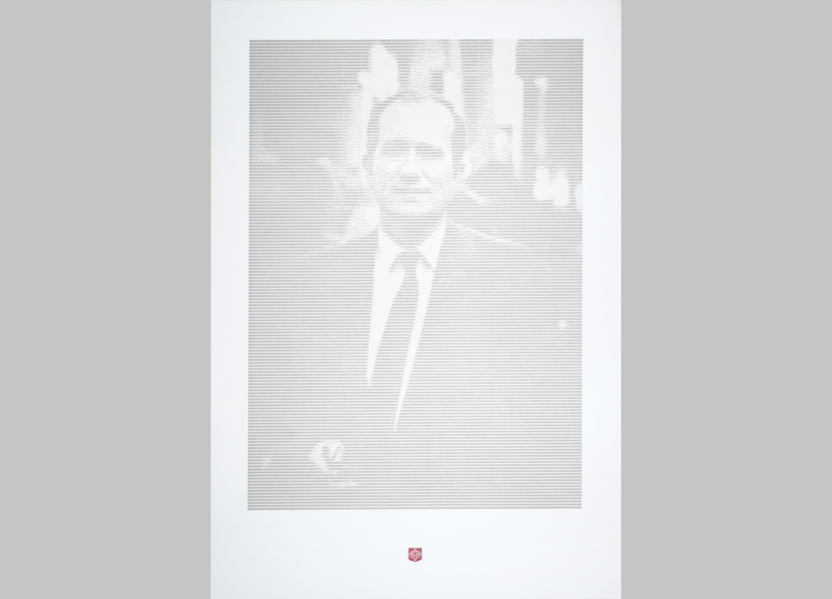
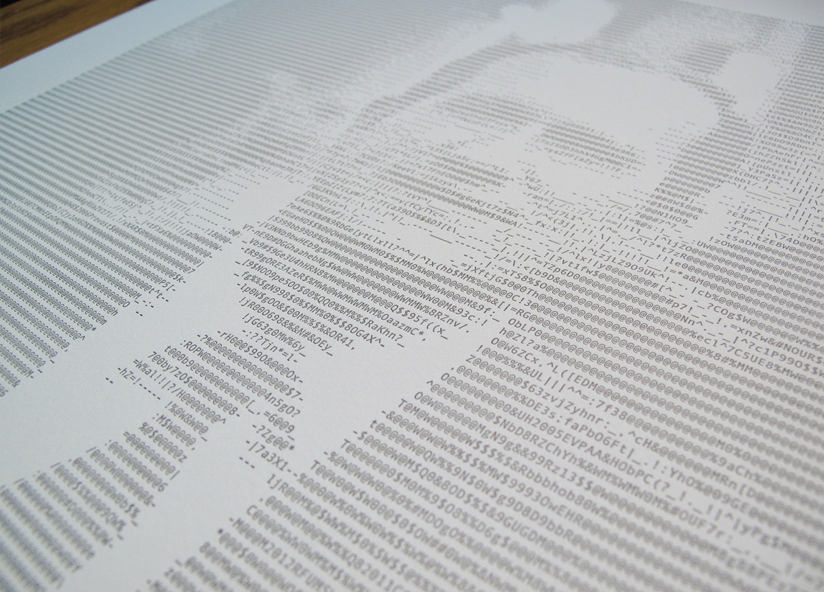
The poster honors DePaul Provost Helmut Epp on his 2012 retirement. The creative team used ASCII characters to create a portrait of Dr. Epp, referring to his origins at DePaul as the founding chair of the Department of Computer Science in 1980.
APPROACH
We wanted to give the art enough impression to add to the depth of the portrait, at the same time keeping the ink coverage light enough for the characters to remain open; the white space is key in making the picture visible. University clients on the whole have very demanding branding standards that must be followed, so we had to balance these factors while maintaining a very exact color match.


