
![]()
![]()
CLIENT
Jeopardy Magazine is the literary and fine arts publication of Western Washington University that showcases the unique creative works of the university community. Their goal is to present Western’s best works of the literary and fine arts as part of a cohesive, progressive, and engaging collection.
BRIEF
As lead print and web designer of the 2012 staff, I established an own-able identity through various touch points including web and promotional pieces. I made it my mission to amplify Jeopardy’s public image through production while also properly representing the year of the publication and the tone of the work submitted.
APPROACH
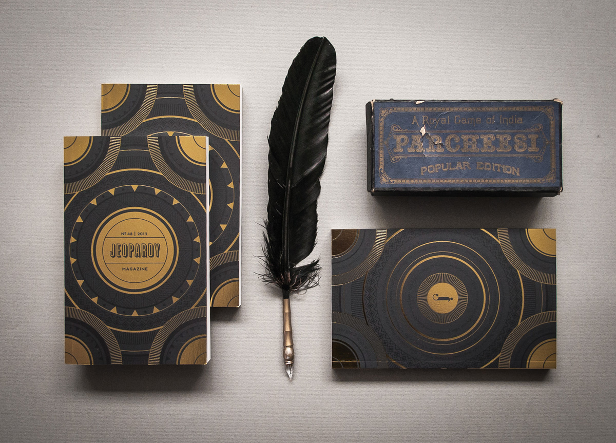
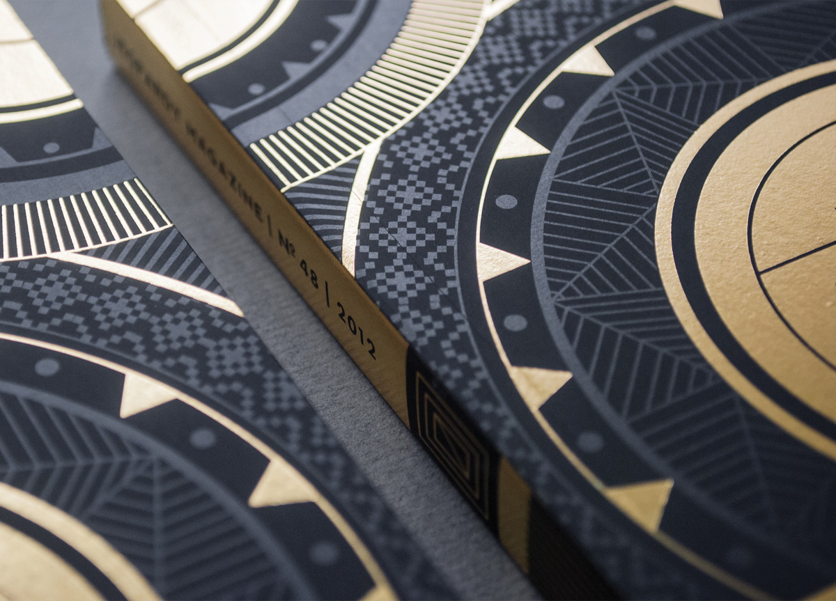
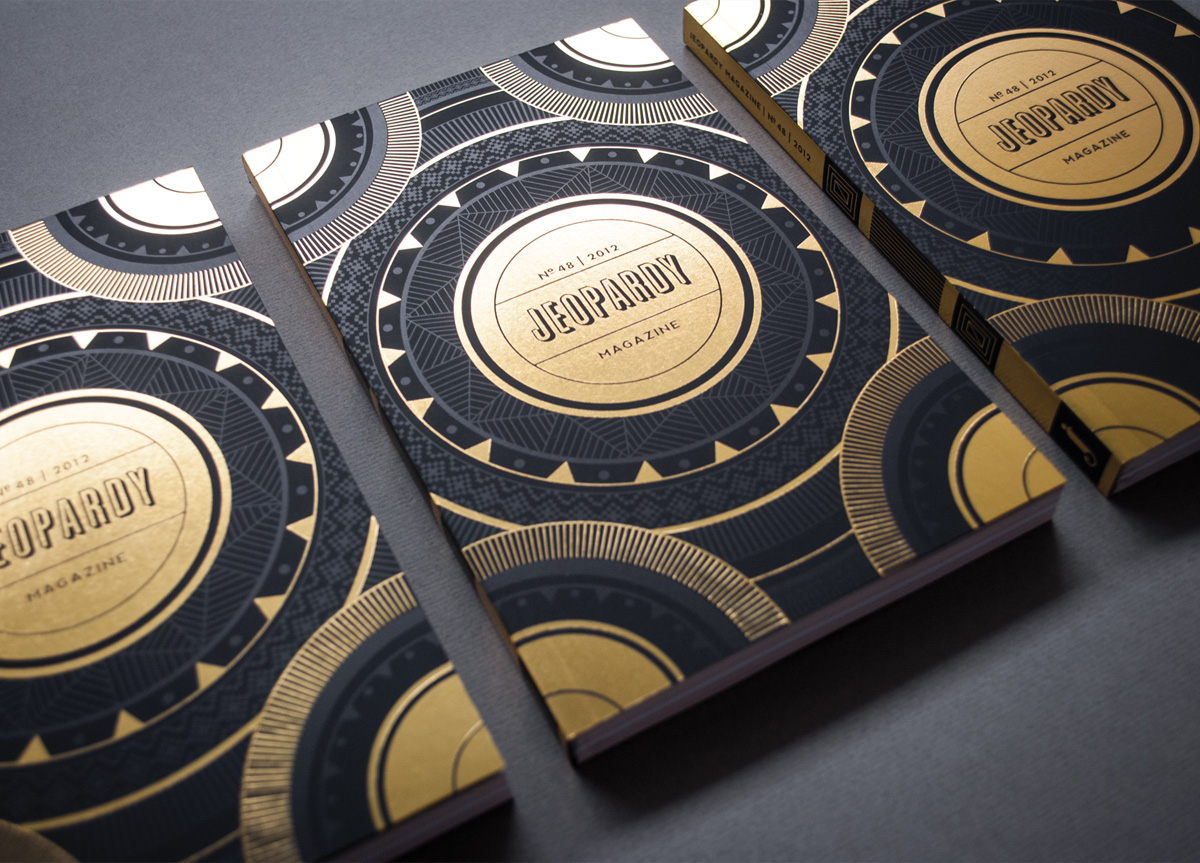
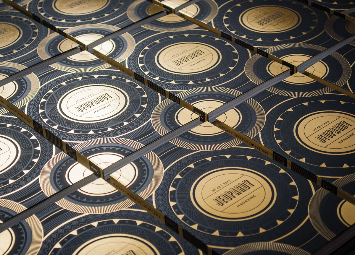
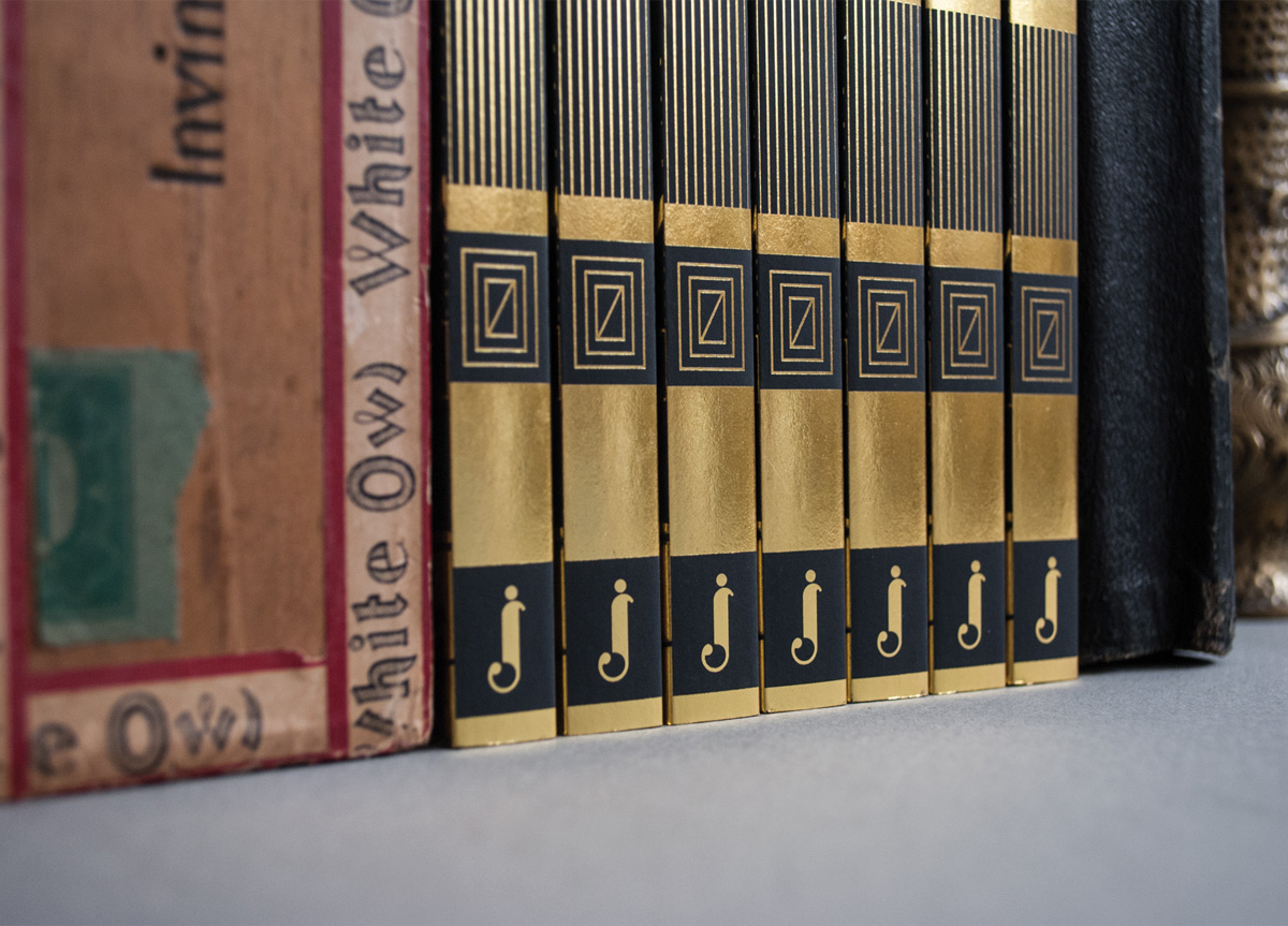
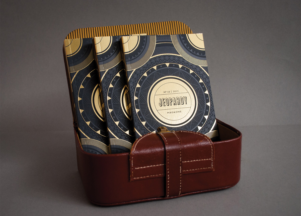
I found it important to highlight the year of the publication in some visual fashion because of the fact that the staff cycles each school year. For me, 2012 was a year of apocalyptic themes and the submitted writing also displayed a somber tone. I chose to use subtle Mayan motifs and gold foil to give the book a historical tome-like appeal; the hide and reveal of a spot varnish added a level of darkness and mystery. The printed books fit together in puzzle like fashion to create a bigger picture pattern that also adds to the cryptic quality.


