CLIENT
Éditions Non Standard is a publishing company looking for a special resonance between the textual and the visual. They wish to exhibit what graphic design, papers, and printing can add to projects. They look for pleasure in doing and sharing discoveries.
BRIEF
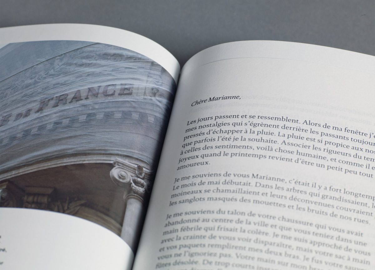
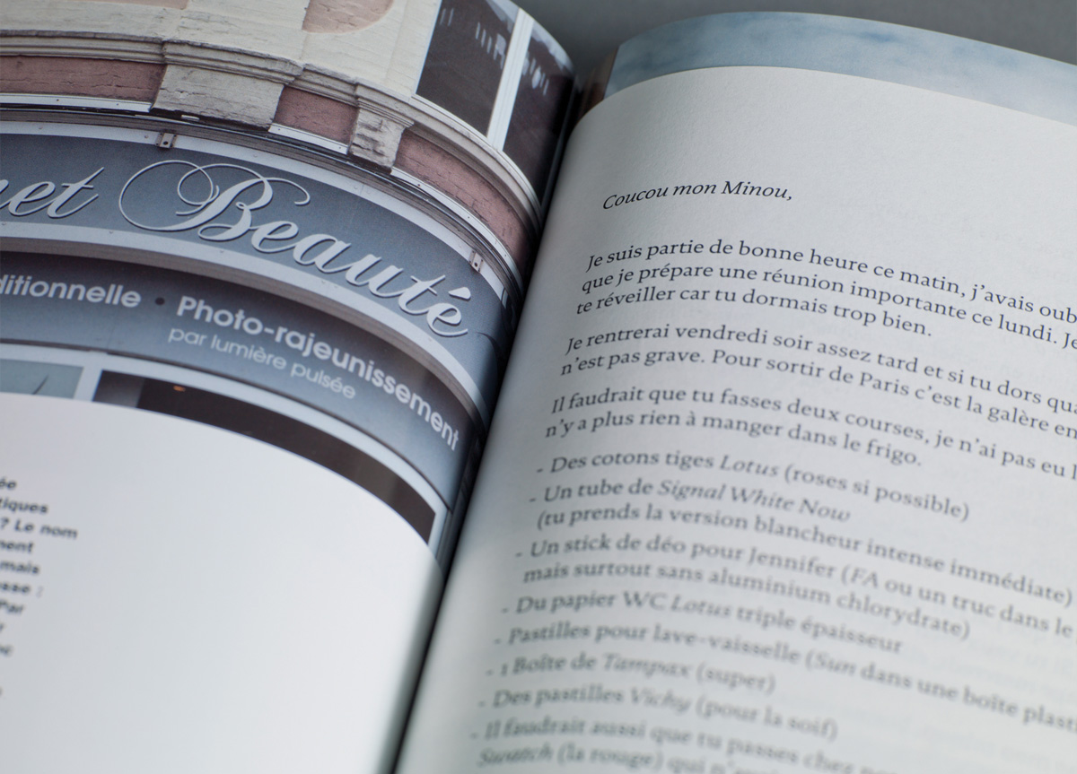
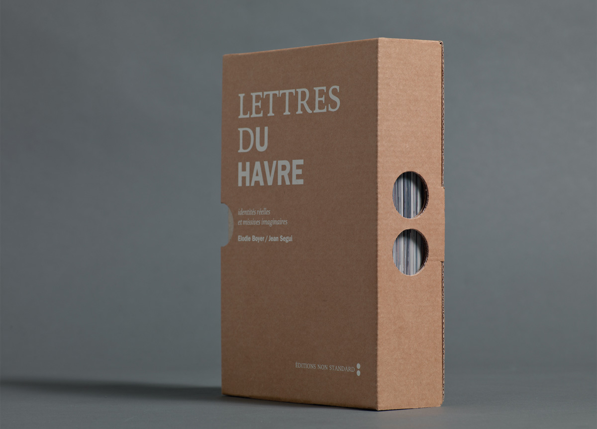
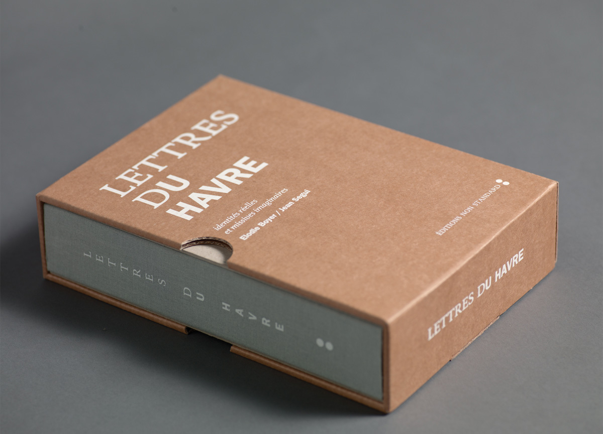
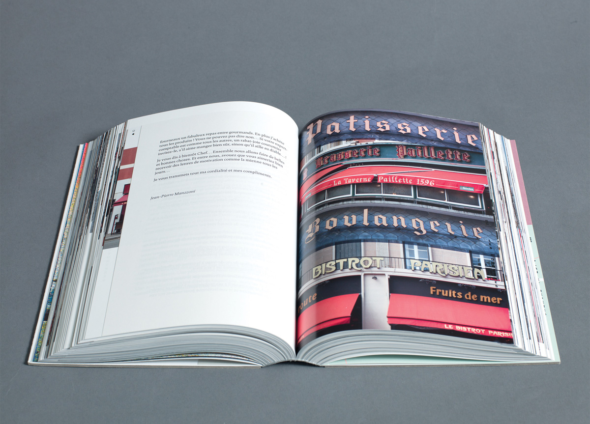
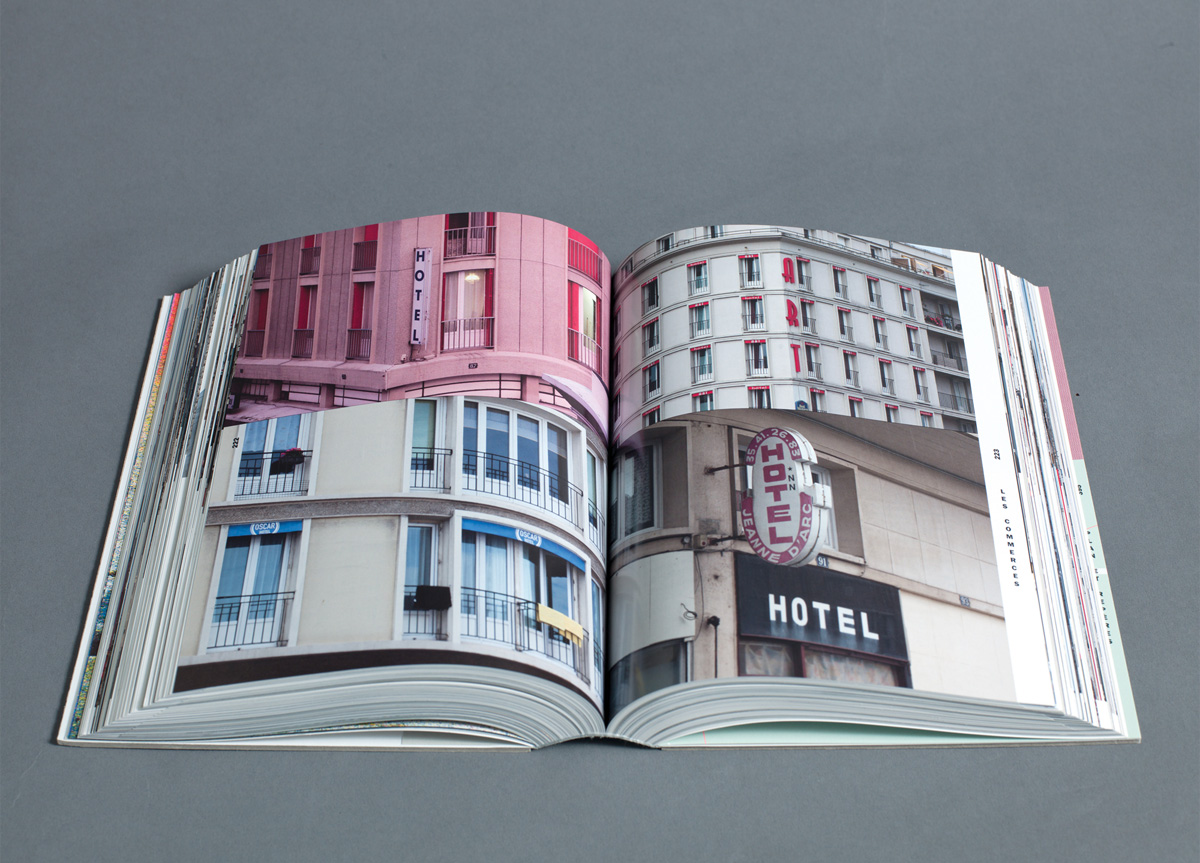
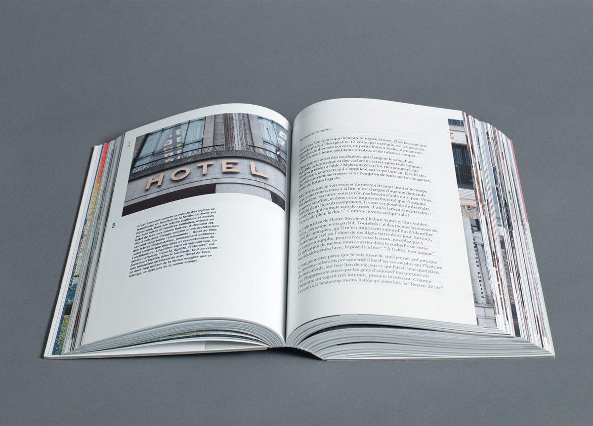
We wanted to read a fictional letter within a spread of photos of typefaces. This was the starting point for the whole book concept and outcome. This gave us freedom when conceiving the book. We wanted to exhibit photographs on a reportage mode and to make an echo to Le Havre architecture (concrete > rough cardboard).
APPROACH
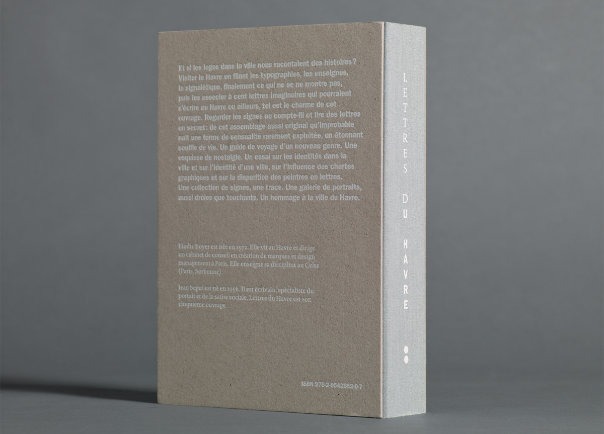
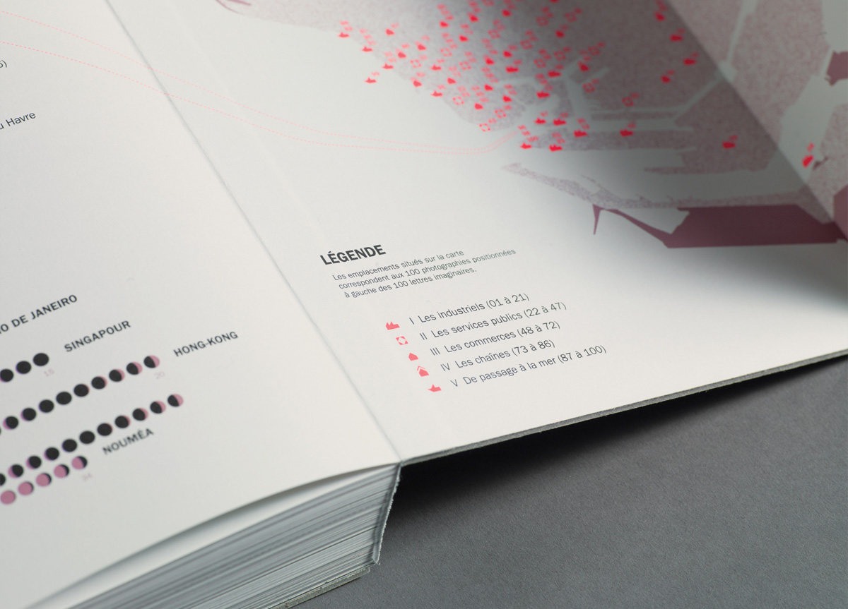
Lettres du Havre plays on the dual meaning of the word “letters.” As typefaces, signs, logotypes on the one hand, and fictional letters (love letters, letters to relatives, professional letters, administrative letters…) on the other hand, in order to investigate the role of identities in a city, the evolution of brand design and signage, the interactions between social state and graphic signs. It is an entertaining book aimed at making everybody interested in the strong influence of graphic signs in a city. The book is an alternative city guide, a collection of endangered signs, a piece of life, and a tribute to Le Havre.
PRODUCTION LESSONS
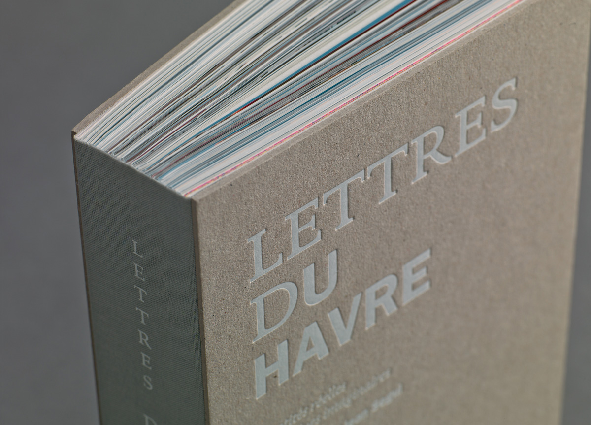
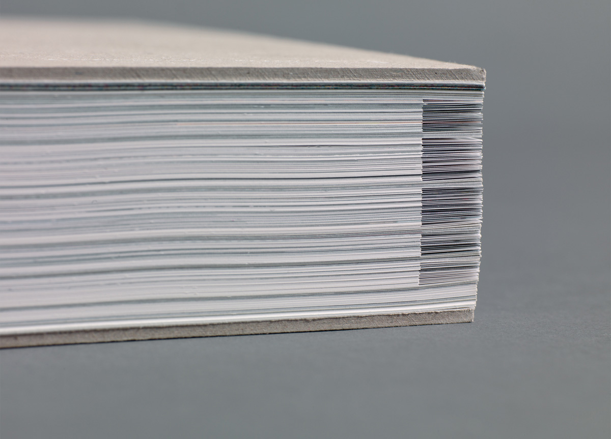
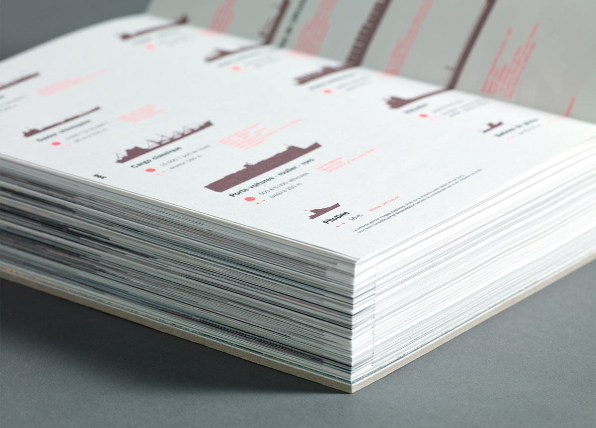
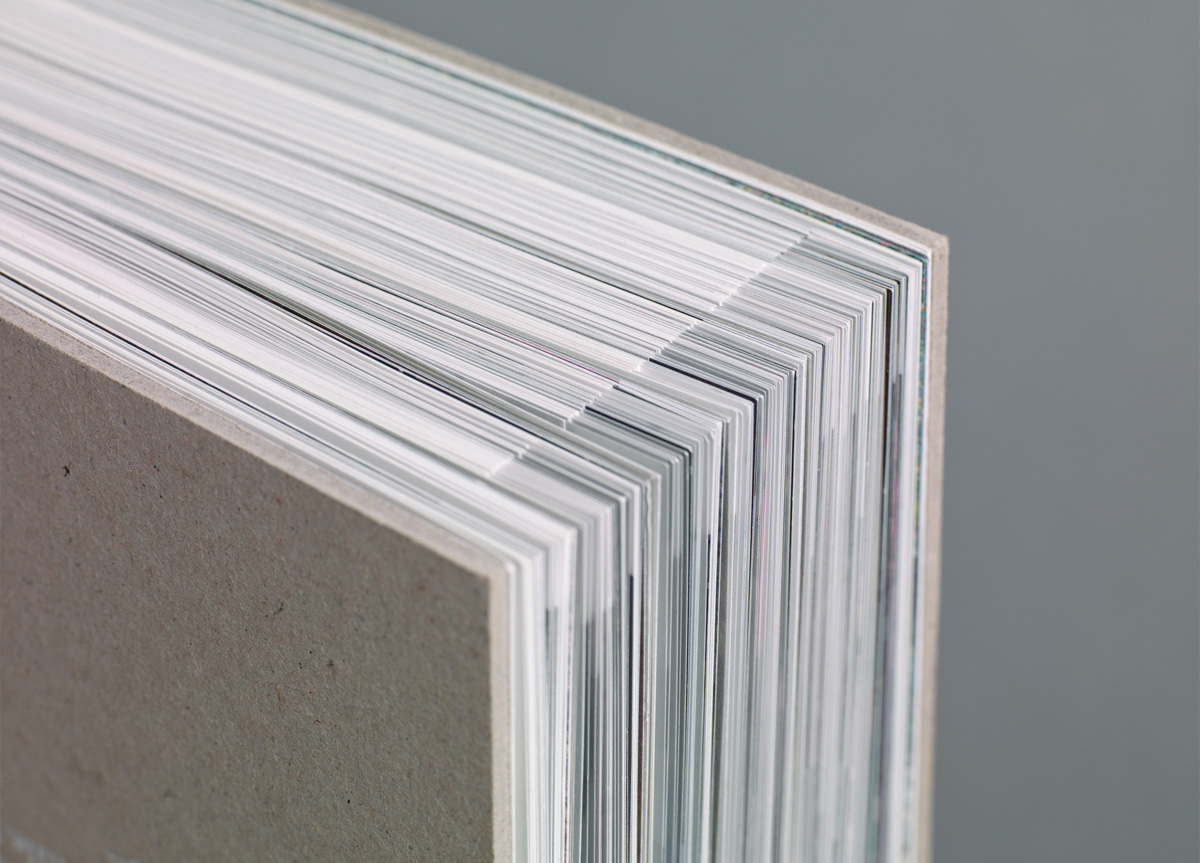
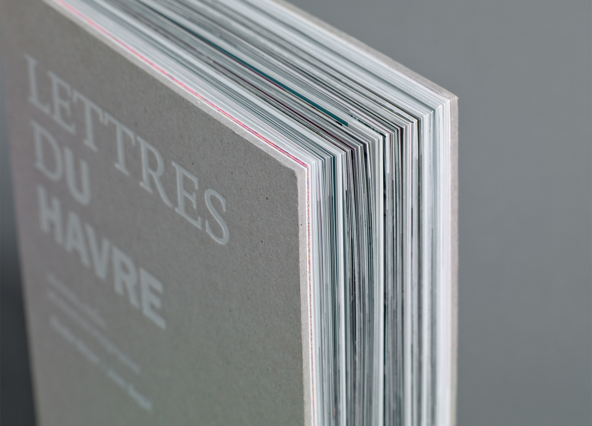
The binding of the book was the most difficult thing to achieve because of the 402 loose sheets, 2‑page formats and the five different papers (from 80gr to 150gr), making actually two intertwined books. The pleasure of doing and sharing was our best motto, with mutual respect between all the players in the project (authors, editors, designer, printer, binder). 500 books were numbered via laser burn.
Judge’s Comments
This is tour de force of hard handwork and binding skills. A masterpiece. — Art Chantry
The LETTRES DU HAVRE was the obvious choice for Radical Production due mainly to the insane amount of hand work needed to put together such an impressive piece of work. The use of two paper sizes, although not wholly original, was impressive to see at the 800 plus page scale. Production details also include a screen printed book jacket and hand sorted pages which are equally impressive. Éditions Non Standard may have created a new design language. — David Dodde
This was like 500 pages of crazy production, as well as, well designed/paced that kept you wanting to flip the pages. The short sheet pages that created a textured tab-like effect was very chic. — Pum Lefebure
When I first thumbed through this book, I thought it was very interesting in the design and layout, with different sized sheets and different paper stock. It’s beautiful to look at. Then, when you think about technical production and find out that there were over 400 pages with no signatures, you start to grasp the magnitude of the labor involved. — brad murph
This was a beautiful, thoughtfully designed book but the difficult production exercise of interleaving short personal letters throughout the glossy pages of the book seems remarkably foolish to attempt–and super smart for its successful execution. — DJ Stout