ADV @ UNDERCONSIDERATION Peek here for details
BROWSE
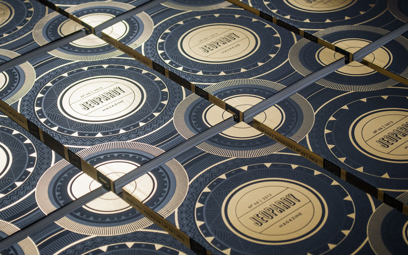
Jeopardy Magazine
Production Method
Offset
Design
Catherine Dimalla
Creative Direction was a collaboration with Erik Fenner, Jeopardy Editor-in-Chief
Printing
Premier Graphics, Bellingham WA
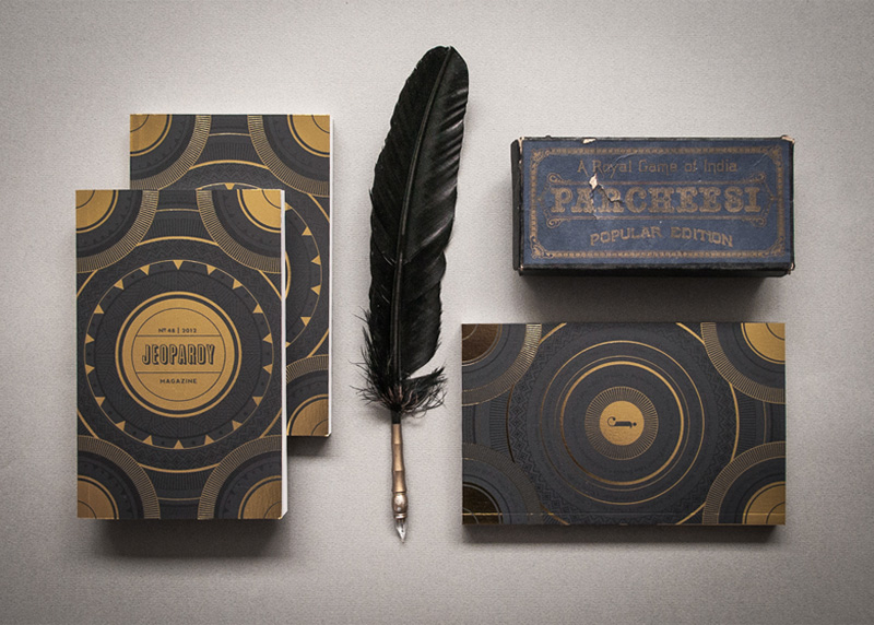
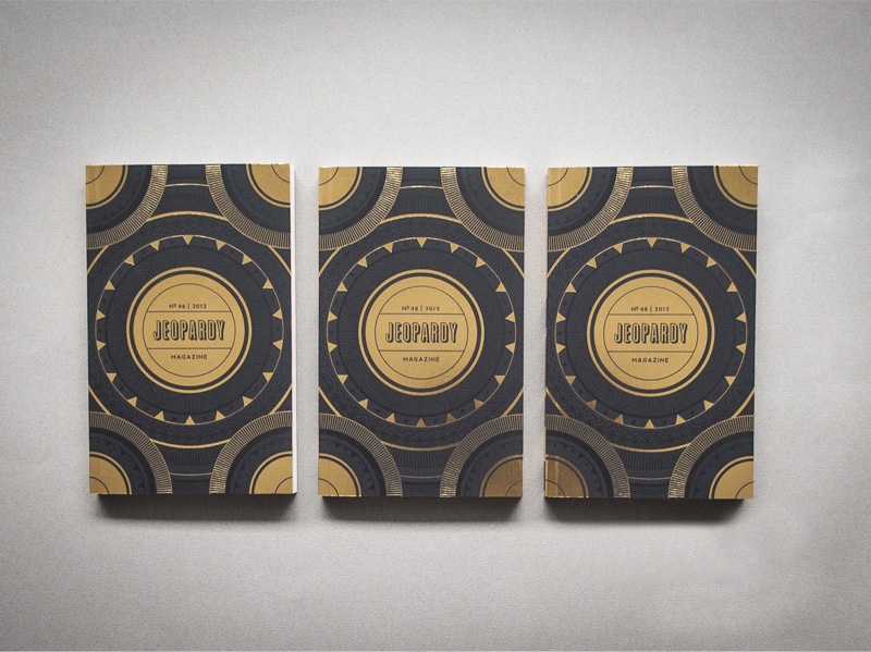
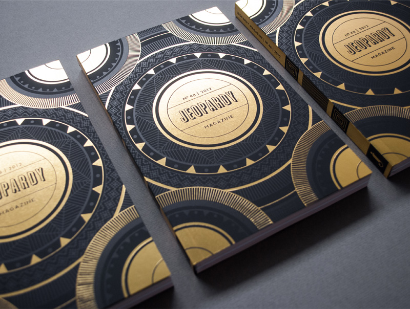
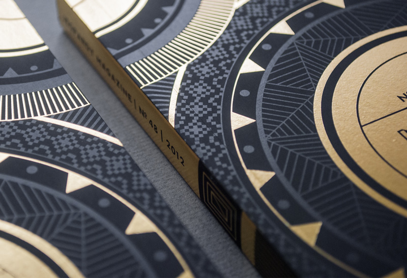
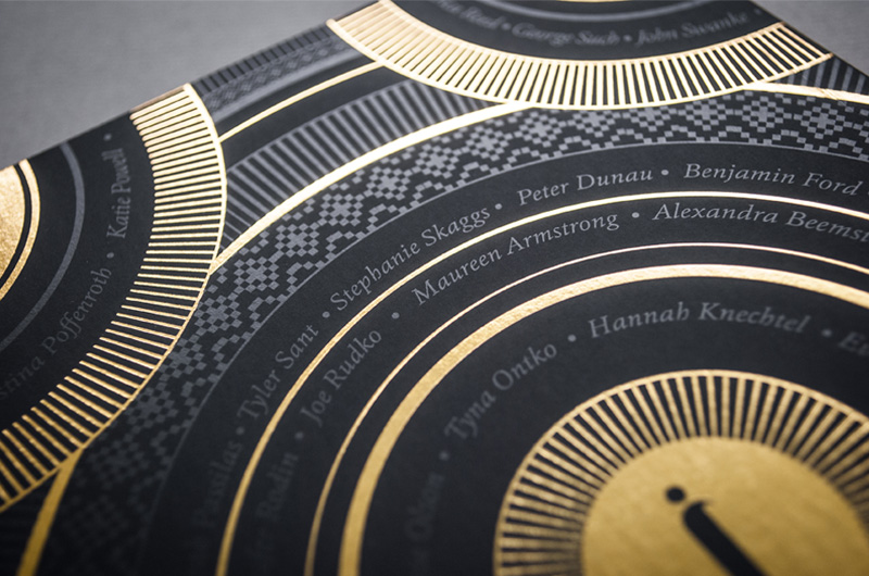
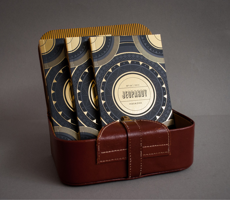
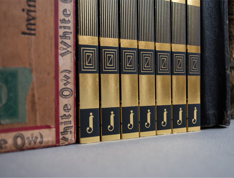
There is so much to see on this cover that you can’t possibly get the full scope in one sitting. With lots of details of gold ink on black paper that are quietly complemented by a spot gloss varnish that add a second dimension of meaning, the one thing I want to do is flip page by page expecting a lot of the same magic.
Dimensions (Width × Height × Depth)
5 × 8 in
Page Count
186
Paper Stock
Cover: Gruppo Cordenon / Plike / Graphite / 122C
Body: Cougar / Natural / 70T
Number of Colors
Black and White internals with 2 four color signatures.
Varnishes
Gloss on cover
Binding
Perfect-bound
Typography
Graphique Pro by Hermann Eidenbenz
Cala by Hofftype
Quicksand by Andrew Paglinawan
Meta Pro by Erik Speikermann
Project Description
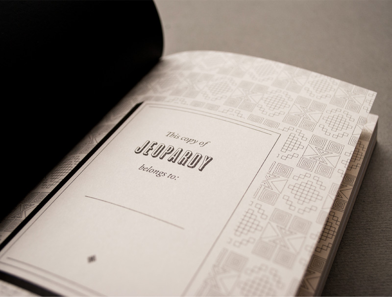
Jeopardy Magazine is the literary and fine arts publication of Western Washington University that showcases the unique creative works of the university community each year. 2012's 48th edition was designed to emit a timeless look using historical aesthetic elements paired with modern production methods. The overall feel is that of an apocalyptic tome, with a lattice of Mayan motifs printed with a spot varnish. The varnish shines in the light on a completely matte graphite cover stock. Gold is an important symbolic element for the Mayan culture among many other civilizations. I chose the gold foil to mark the year of the publication, but also to hint at the treasures inside: the creative talent.Production Lesson(s)
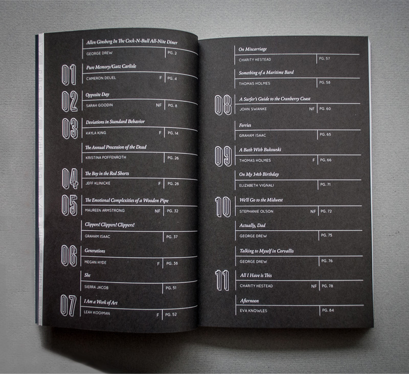
I took on Jeopardy knowing full well that I would have little production guidance and that I would have to work as a one man design show, but I was still very game. There's nothing like having co-workers who are just as passionate about the project as you are, even if they aren't designers. Jeopardy is a campus publication that had a considerable amount of funding, and we wanted to push the production to the limit for maximum shelf appeal. In the end, we sacrificed full color internals for just two select signatures to showcase artwork in order to be able to do a run of foil and varnish. I think by the time it was all said and done we ended up owing $10 out of pocket. Well worth it!
About
FPO (For Print Only), is a division of UnderConsideration, celebrating the reality that print is not dead by showcasing the most compelling printed projects.
FPO uses Fonts.com to render Siseriff and Avenir Next.
FPO is run with Six Apart’s MovableType
All comments, ideas and thoughts on FPO are property of their authors; reproduction without the author’s or FPO’s permission is strictly prohibited
Twitter @ucllc
Sign-up for Mailing List
Mailing list managed by MailChimp
Thanks to our advertisers
About UnderConsideration
UnderConsideration is a graphic design firm generating its own projects, initiatives, and content while taking on limited client work. Run by Bryony Gomez-Palacio and Armin Vit in Bloomington, IN. More…
blogs we publish
Brand New / Displaying opinions and focusing solely on corporate and brand identity work.
Art of the Menu / Cataloguing the underrated creativity of menus from around the world.
Quipsologies / Chronicling the most curious, creative, and notable projects, stories, and events of the graphic design industry on a daily basis.
products we sell
Flaunt: Designing effective, compelling and memorable portfolios of creative work.
Brand New Conference videos / Individual, downloadable videos of every presentation since 2010.
Prints / A variety of posters, the majority from our AIforGA series.
Other / Various one-off products.
events we organize
Brand New Conference / A two-day event on corporate and brand identity with some of today's most active and influential practitioners from around the world.
Brand Nieuwe Conference / Ditto but in Amsterdam.
Austin Initiative for Graphic Awesomeness / A speaker series in Austin, TX, featuring some of the graphic design industry's most awesome people.
also
Favorite Things we've Made / In our capacity as graphic designers.
Projects we've Concluded / Long- and short-lived efforts.
UCllc News / Updates on what's going at the corporate level of UnderConsideration.




Related entries
2017 Brand New Conference Program
Severe(d): A Creepy Poetry Collection by Holly Riordan
Um Caminho para Santiago CD Package and Diary
BOYCO Classpack® Book
Antes de Perder la Esperanza Book