ADV @ UNDERCONSIDERATION Peek here for details
BROWSE
Client
Self Promotion
Quantity Produced
Business cards, 600
Notecards, 150
Production Cost
Undisclosed
Production Time
4 weeks
Dimensions (Width × Height × Depth)
3 in × 1.875 in
Page Count
–
Paper Stock
140# Holyoke 100% Cotton Rag, Bone color
Number of Colors
2 spot inks, black and orange
Varnishes
–
Binding
–
Typography
Chaparral Pro, Clarendon, and Whomp
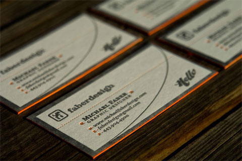
As soon as I saw these cards, I was struck by the vibrancy of type and color, the texture of the paper, and the changing levels created by the letterpress. But then I looked closer and realized there was more going on than I first noticed, so I emailed Michael Faber hoping to get more information on how these cards came to be.
On the edging:
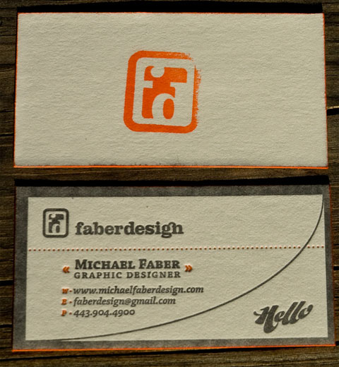
The edging was a technique that I noticed perusing through some other business cards on Card Observer, Beast Pieces, and FPO. I liked the way a thick stock could really pop with a bright color painted along the edge. As far as the actual execution of the technique, I really had no idea how to do it myself, but I knew I wanted to do it as cleanly as possible. I had the stamp pad already as I knew I was going to use the stamp on the reverse side of the card, so it really wasn’t difficult to put two and two together and use the stamp pad itself to edge paint the cards. The result is easy, quick-drying, and not messy at all. Plus I can just do a handful (10-20) at a time as I need them and there is no setup or cleanup for the job.
Adding a stamp to the alternate of your printed business card is a nice way of mixing professional printing with DIY, while adding a layer of technique and texture that can only be achieved by mixing processes such as these. Of course, that also helps minimize costs — just make sure your paper is thick enough that you don’t see the effects of letterpressing on both sides.
On the actual printing:
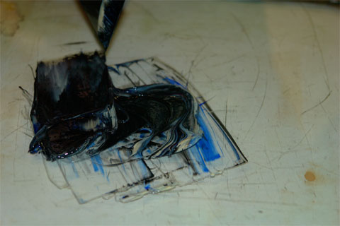
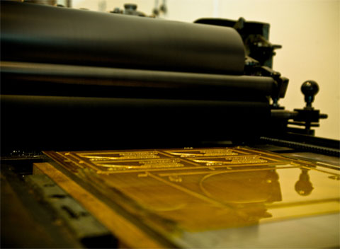
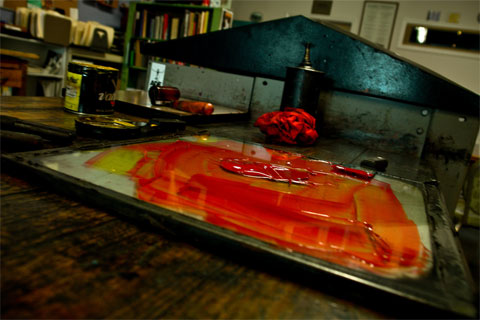
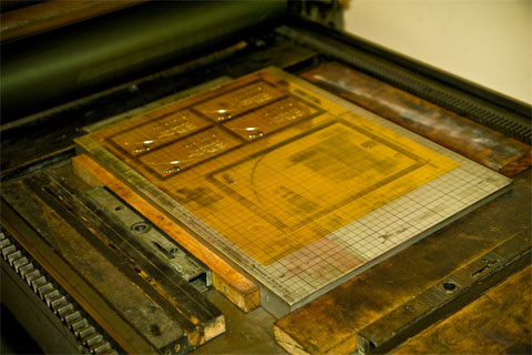
I fell in love with letterpress printing during this project. I am very grateful to Dave at Horse & Buggy for letting me join him in the studio for the day and showing me the ropes on his Vandercook press. At each step from mixing the inks to cranking out each print, he showed me how it was done and then let me do each step. Operating the press was definitely a great experience. You fall into an almost hypnotic rhythm as you are performing each repetitive task. Along with the ambient hum of the motor turning the cylinders and the regular clicks as you rotate the crank arm along the path, it’s very easy to let your mind wander and relax once you have your pattern.
Also, I used to do a bit of metal sculpture before moving into graphic design, so the combination of typography with an almost sculptural piece with a very hands-on, dirty process (a letterpressed card/note) was of course very appealing. I love giving the cards out and watching people rub their fingers over the impression and marvel that people still do this kind of thing. I handed the card to one of my coworkers recently and he asked me a really interesting question (we both work in multimedia/digital media). He said “Do you have trouble reconciling the old and the new technologies [letterpress + computer-based graphic design]?” I told him that this project has only made me realize how important the old techniques were and that because nowadays anyone can think that they are a designer if they have Photoshop, that the ‘old’ techniques may be seeing a resurgence as people try to distinguish themselves from the crowd. I think I had always known this, but it was his asking that actually prompted me to think even more deeply about graphic design as a real skill and trade with techniques and practices, as opposed to vectors and layers…
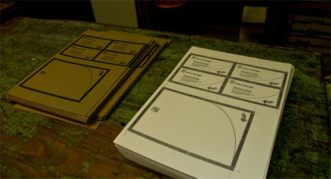
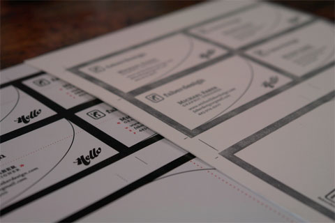
Horse & Buggy Press suggested Michael print his business cards alongside a foldable notecard, which could be fitted in the same plate. In doing so, he was able to print a second memento in which to engage his clients and future relationships.









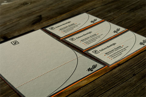

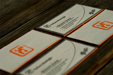
Michael Faber Business Card
Production Method
Design
Michael Faber
Printing
Printing: Horse & Buggy Press
Stamp: Simon's Stamps
This post was published in the original layout of FPO so all images are smaller. Project descriptions as well as production lessons are quoted in the main content area.
Post Author
Bryony

Bryony Gomez-Palacio
Editor of FPO and co-founder of UnderConsideration LLC.
More: Online / On Twitter
Date Published
August 20, 2009
Filed Under
Business Cards
Tagged with
business card
edging
holyoke
letterpress
stamp
stamp pad
About
FPO (For Print Only), is a division of UnderConsideration, celebrating the reality that print is not dead by showcasing the most compelling printed projects.
FPO uses Fonts.com to render Siseriff and Avenir Next.
FPO is run with Six Apart’s MovableType
All comments, ideas and thoughts on FPO are property of their authors; reproduction without the author’s or FPO’s permission is strictly prohibited
Twitter @ucllc
Sign-up for Mailing List
Mailing list managed by MailChimp
Thanks to our advertisers
About UnderConsideration
UnderConsideration is a graphic design firm generating its own projects, initiatives, and content while taking on limited client work. Run by Bryony Gomez-Palacio and Armin Vit in Bloomington, IN. More…
blogs we publish
Brand New / Displaying opinions and focusing solely on corporate and brand identity work.
Art of the Menu / Cataloguing the underrated creativity of menus from around the world.
Quipsologies / Chronicling the most curious, creative, and notable projects, stories, and events of the graphic design industry on a daily basis.
products we sell
Flaunt: Designing effective, compelling and memorable portfolios of creative work.
Brand New Conference videos / Individual, downloadable videos of every presentation since 2010.
Prints / A variety of posters, the majority from our AIforGA series.
Other / Various one-off products.
events we organize
Brand New Conference / A two-day event on corporate and brand identity with some of today's most active and influential practitioners from around the world.
Brand Nieuwe Conference / Ditto but in Amsterdam.
Austin Initiative for Graphic Awesomeness / A speaker series in Austin, TX, featuring some of the graphic design industry's most awesome people.
also
Favorite Things we've Made / In our capacity as graphic designers.
Projects we've Concluded / Long- and short-lived efforts.
UCllc News / Updates on what's going at the corporate level of UnderConsideration.




Related entries
KitchenAid Limited Edition Cards
Black Sheep Studio Business Cards and Promotional Items
Seegno Business Cards
Fracas Productions Business Cards
Elegante Press Business card