Zuma by Miles Walker

This was my final major project studying at university. It was up to each student to set their own brief which was then negotiated.

De Montfort University
Leicester, UK
BA (Hons) Graphic Design and Photography
Ben Archer

Approach
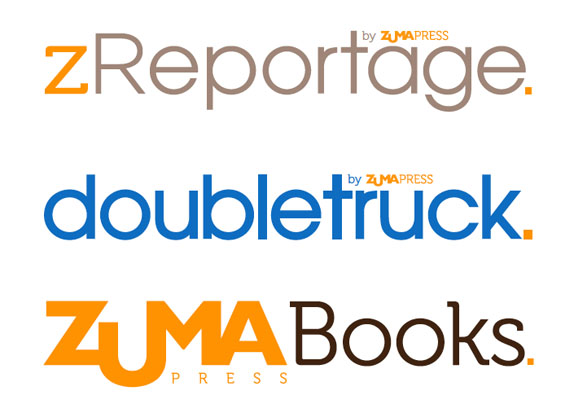
Zuma Press is the largest Independent Photo and Press Agency in the world. I decided to give the company and all of its affiliates a complete rebrand in order to re-instate itself within the industry. This included restructuring the brand architecture, redesigning the logos for all Zuma Press’ affiliates as well as its own, redesign of the Zuma Press Website, the cover of its monthly magazine Doubletruck, a Book dust cover and a Visual Standards Book.
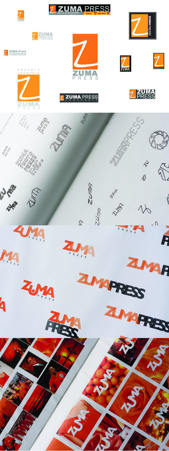
It was important to keep Zuma’s brand values as an independent agency in mind at all times. Zuma Press was the first agency to create a picture downloadable website back in 1992 but has struggled to keep up with the likes of its corporate competitors such as Getty Images. The first step of the rebrand was to create a fresh, new logo which would finally remove its outdated logo from all aspects of the agency. I chose to keep Orange as a primary colour for the brand as this would help maintain any brand recognition it had already established. Once I had found a final solution I was then able to implement the new logo to various collateral such as stationery and website visuals.
One of Zuma Press’ main problems I felt was the gradual introduction to various affiliates over the years, such as a dedicated Reportage Website called ‘zReportage’and a monthly magazine called ‘Doubletruck’, stretched the limits of its existing identity system and so I decided to restructure the brand architecture so all Zuma affiliates were brought back under one roof.
It was my aim to create a new identity which gave the high quality of photography that Zuma Press produces the respect it deserved.

Sketches and Process

Solution

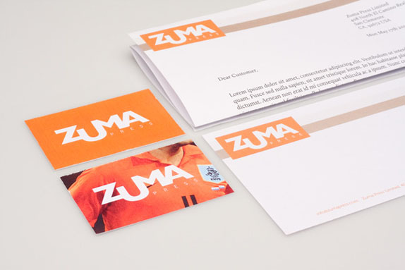
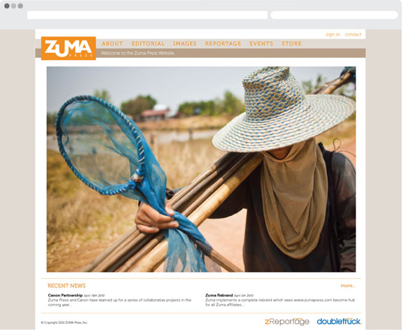

Image watermark using alternative Zuma logo for use online.
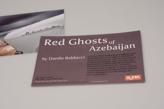
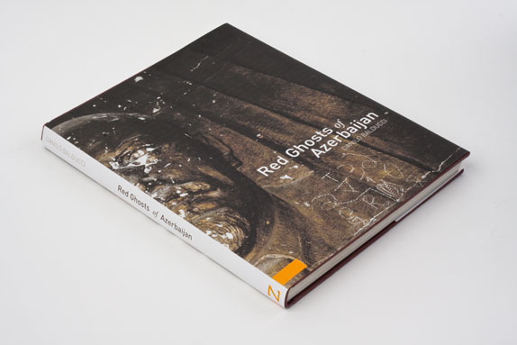
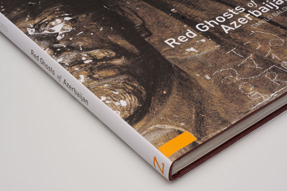
Dust Cover for a Zuma photo book.
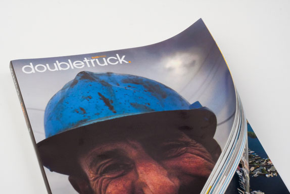
Cover for Zuma’s monthly publication called Doubletruck.
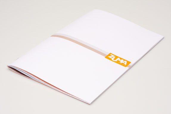
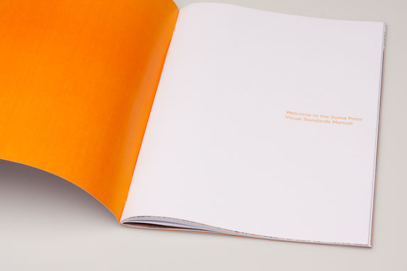
Zuma Press Visual Standards book.
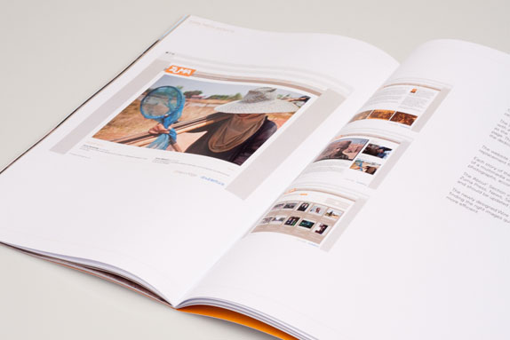

Miles Walker’s Website


DATE: Jun.29.2010 POSTED BY: Bryony
 CATEGORY: Retail
 COMMENTS:

TAGS: book, standards, stationery, sub-brands, typography, website, zuma,


