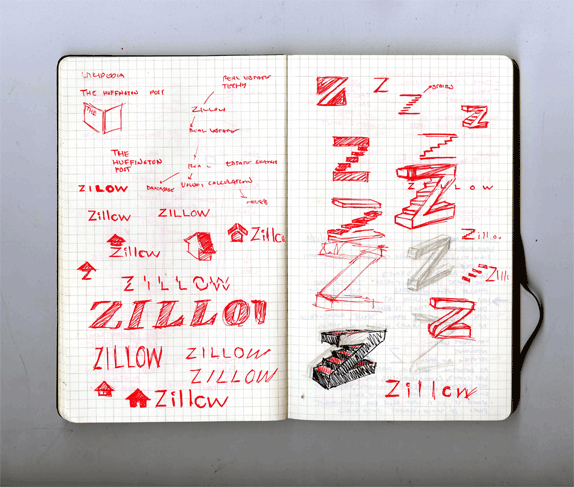
Zillow by Adam Katz

ASSIGNMENT
Milton Glaser asked our class to redo an identity that we felt was unmemorable, unappealing and failed to communicate the company's image correctly.


Milton Glaser asked our class to redo an identity that we felt was unmemorable, unappealing and failed to communicate the company's image correctly.

SCHOOL
School of Visual Arts
New York, NY
School of Visual Arts
New York, NY
COURSE
Design Intent
Design Intent
INSTRUCTOR
Milton Glaser
Milton Glaser

Approach
I chose Zillow.com, an internet leader in appraising real estate and a company in flux, marketing themselves to both home owners and real estate agents. I decided to drop the “.com” from the identity to make the company appear more mature and credible. From there I began to think of the idea of the Z and house and sketched ways to differently convey this concept. Too many real estate logos feature houses so why not show the interior? The result is an update identity, complete with a more tasteful color palette, word mark and logo.

Sketches and Process


Solution


Adam Katz’s Website


DATE: Nov.18.2010 POSTED BY: Bryony
 CATEGORY: Service
 COMMENTS:


Comments › Jump to Most Recent


