
Zagreb Airport by Ivan Nikolic
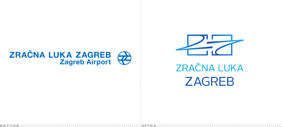
Rebrand existing company in a new, modern way. In many cases, these companies had badly defined brands so this was meant to create something fresh and new.

Polytechnic of Zagreb, IT Design
Zagreb, Croatia
Visual Communications Design
Jana Ziljak-Vujic
Assistant: Vesna Ugljesic

Approach
I chose to rebrand Zagreb’s main airport. They already had clearly defined brand which can be seen here but I tried to do it in my way, to see if it can be improved.
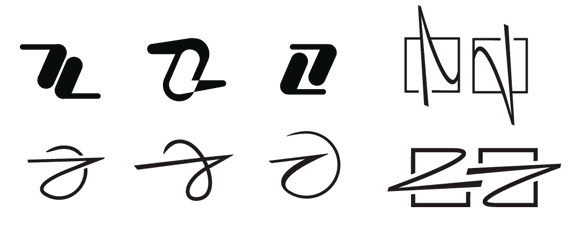
Many of us tried with different themes related to Zagreb (distinct marketplaces, cultural heritage, etc.) and I, after many different tried themes, at the end oriented on familiar Croatian crest and squares that define that crest. Many other Croatian brands use squares as main identifying element for our country so this was one of the logical starting points.
To achieve connection with open space and air transport services I chose to connect squares with wings to signify Zagreb’s airport direction on clear goal - safe transport and reliable service.
Although it was hard at first to achieve something that others already tried, I think I’ve managed to create simple yet recognizable identity.
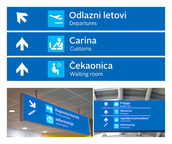
Typography used on logotype is Alright Sans, and for signalization I used clearly defined AIGA symbols to keep familiarity with other airport’s and other public and transportation stations.

Sketches and Process

Solution



DATE: Jul.19.2010 POSTED BY: Bryony
 CATEGORY: Transportation
 COMMENTS:

TAGS: logo, signage, uniform, zagreb airport,


