X-ACTO by Jesse Kirsch
The class was asked to pick any brand (that included packaging) that interested them and redesign or refresh the identity and packaging for a line of products.

School of Visual Arts
New York, NY
Packaging Design
Chad Roberts

Approach
Being a graphic designer, and one that enjoys working with my hands and comping up my designs in 3D, X-ACTO was a perfect choice for me. Their brand is extremely well known within the design and art community with its chunky word-mark along with their color blue. We had to approach the current design and take and throw away elements that were working or not. Finding the essence of the brand and reinterpreting these elements so that the equity was still present in the new design. We could not just throw away everything and start anew, this would be too easy.
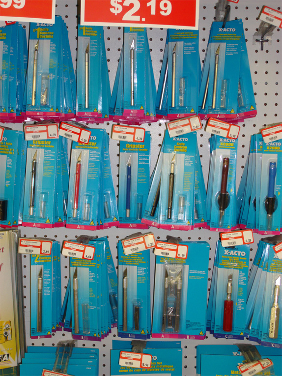
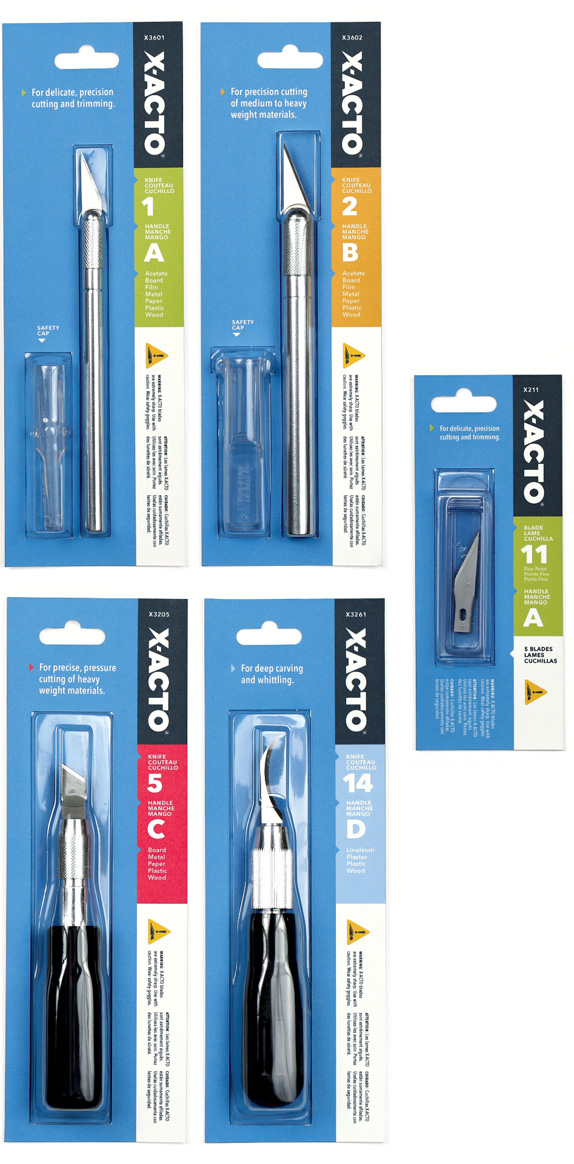
Existing packaging.
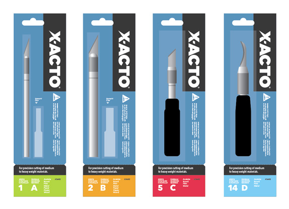
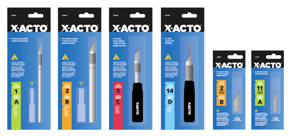
The main issue was the organization of the dozens of different handles and blades. There is currently no easy way to figure out which blade works with which handle without having to really look close at every package. My goal was to come up with an easy-to-use, color- and letter-coded system that would make the experience much easier and more enjoyable for the consumer. The current packaging sports three different languages so keeping it as clean and simple as possible was key.
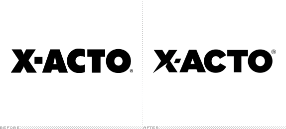
The logo had to be approached as well. It currently has no distinct characteristics beside being bold, but this one characteristic does make it recognizable. I took a similarly bold font, but found one that felt cleaner and modern. A simple tilt of the dash and the sharpening of the one leg of the “X” says it all. It still feels the same, but is now brand appropriate. Lastly the background blue color was updated to be slightly darker, warmer and more appealing, but still close enough to be X-ACTO’s color.
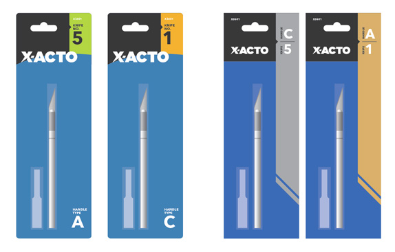
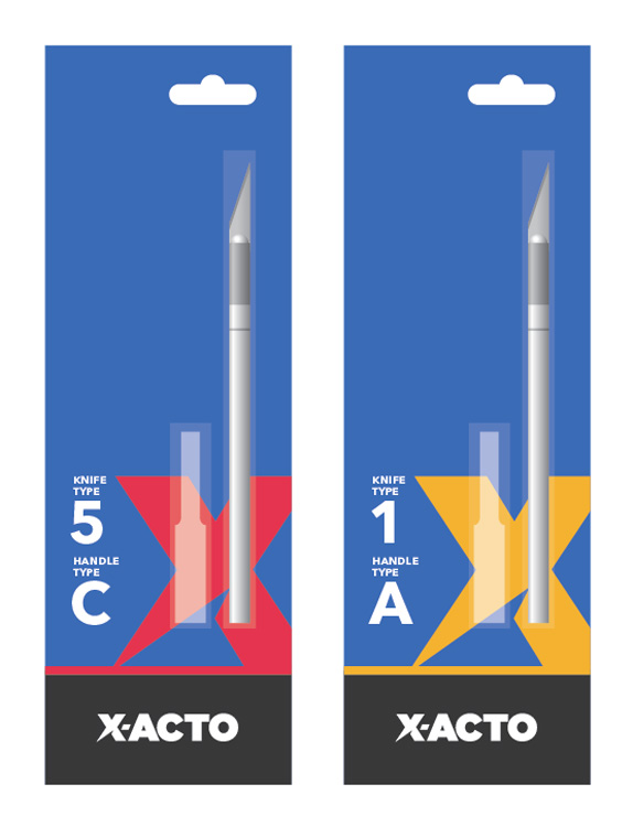
I did all my sketching and design on the computer and tried a multitude of options. I tried a few that felt more “fun” although these felt a little childish and unsophisticated. They also didn’t help in the way of organization and creating a system. One iteration included a tear off card with the relevant information that you could bring with you to the store to pick out a corresponding knife or blade.

Sketches and Process

Solution


Jesse Kirsch’s Website


DATE: Apr.27.2010 POSTED BY: Armin
 CATEGORY: Consumer Product
 COMMENTS:


