Verizon by Bryan Mendez

ASSIGNMENT
We were asked to come up with a well known company that could use a new logo. We could choose any company we wanted. I chose Verizon.


We were asked to come up with a well known company that could use a new logo. We could choose any company we wanted. I chose Verizon.

SCHOOL
Baruch College
New York, NY
Baruch College
New York, NY
COURSE
Corporate Design
Corporate Design
INSTRUCTOR
Terry Berkowitz
Terry Berkowitz

Approach
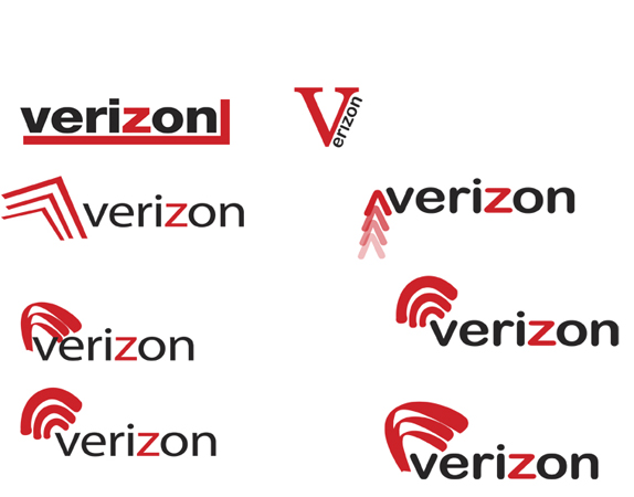
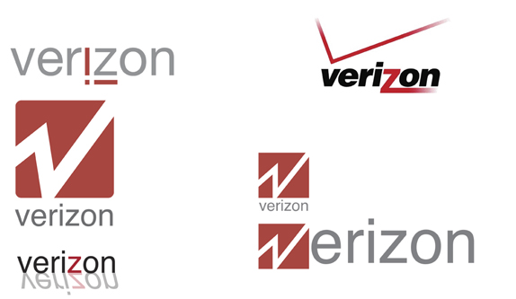
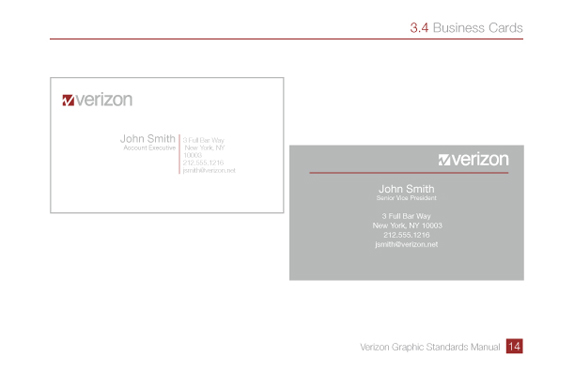
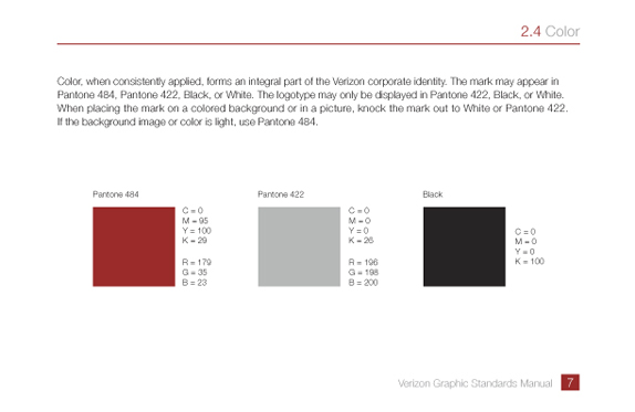
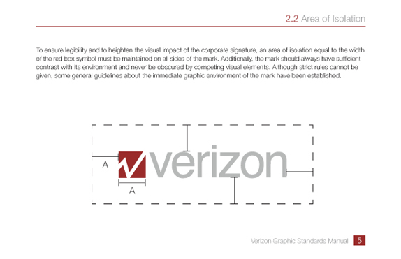
I approached the assignment with much disgust for the current Verizon logo. I knew that my professor had strong feelings for the logo as well, and she encouraged me to take it on. I willfully accepted the challenge, and knew I had to come up with something that was modern, eye catching, and something that didn’t take away from the old version. I knew that I wanted to incorporate the “check” and the “z” in some way, but until it happened, I wasn’t sure how to achieve it. I feel as though this design encompassed everything I was looking to, and gets the message out there, that Verizon is a strong, united, rising company that’s here to stay.

Sketches and Process

Solution




DATE: Jun.09.2011 POSTED BY: Lauren Dickens
 CATEGORY: Technology
 COMMENTS:


Comments › Jump to Most Recent


