TSA by Joe Golike

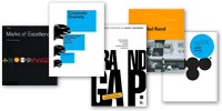
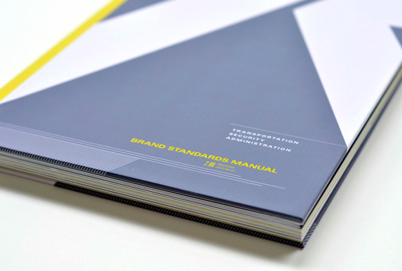
We were asked to create a new identity for a dead, dying, or defunct brand. The final product was a bound brand standards guide.

Academy of Art
San Francisco, CA
Nature of Identity
Hunter Wimmer

Approach
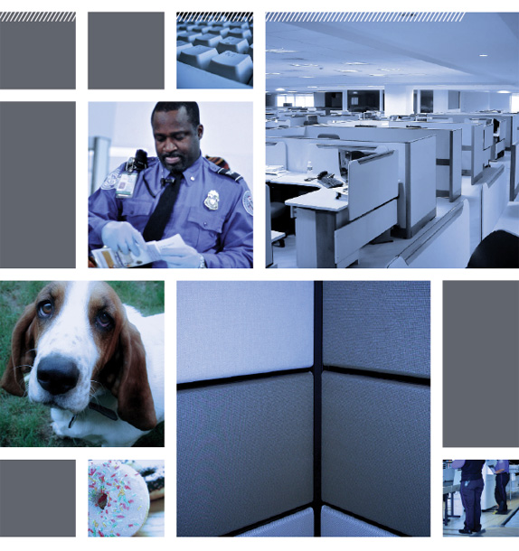
I stretched the limits of the typical consumer brand selection by choosing a government agency, the Transportation Security Administration. Most American travelers think of the TSA as inefficient, inconvenient, and ineffectual. My goal was to take it beyond what it *should* be, and imagine what it *could* be. I wanted to push the TSA into the realm of the believably ridiculous.
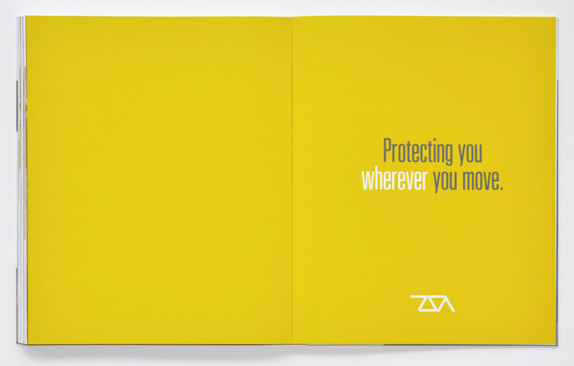
“Protecting You Wherever You Move”
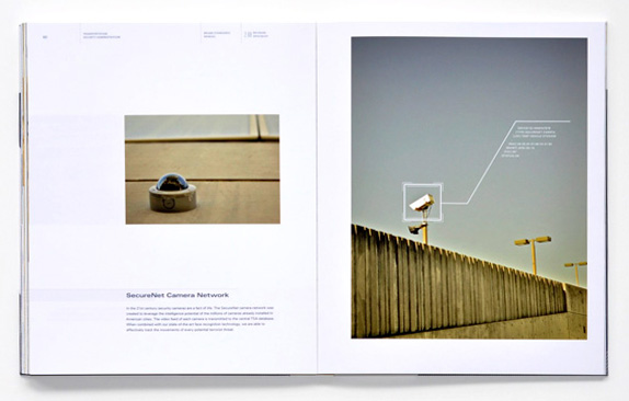
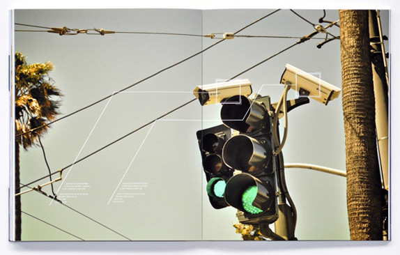
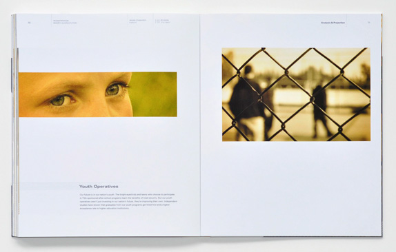
In the not-so-distant future the new TSA is not just responsible for airport security, but now has complete jurisdiction over all types of transportation in the United States. I transformed them from an agency that passively waits for terrorists to come to them into one that hunts them down (think CIA meets Special Forces). Using security camera networks, wiretapping, and citizen informants, the TSA of the future is able to preemptively eliminate terrorist threats and to guarantee complete transportation security.
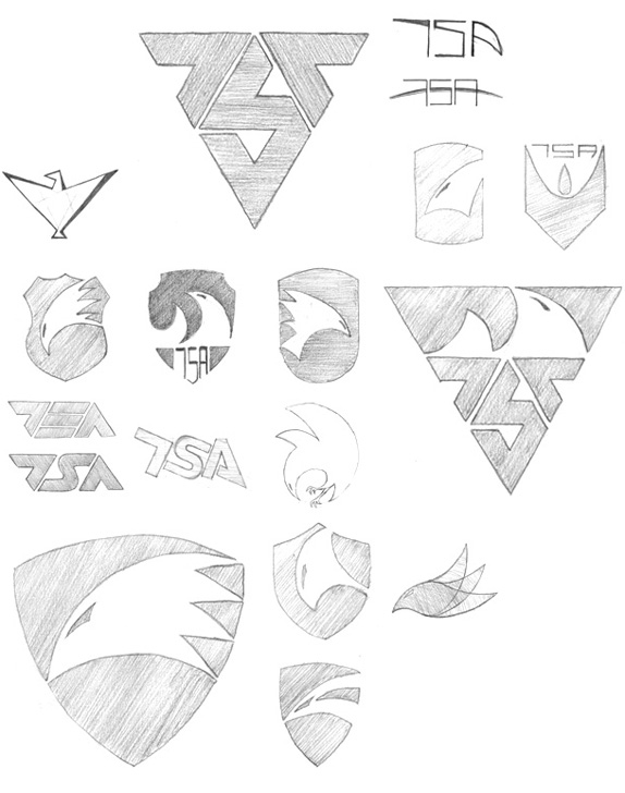
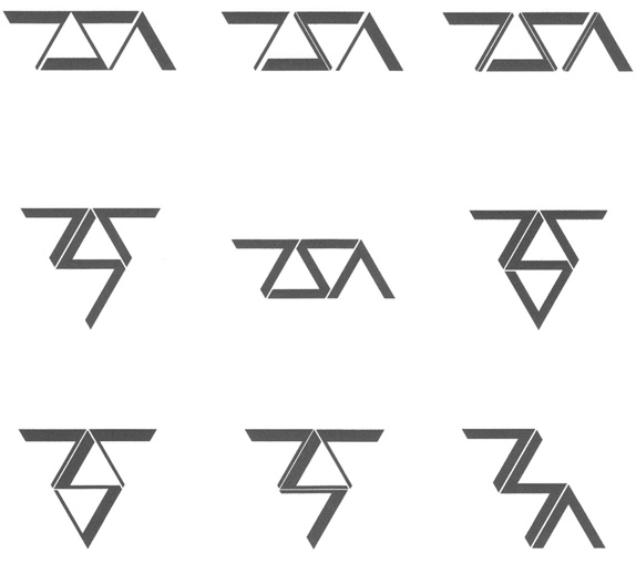
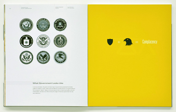
I spent a lot of time generating logos with eagles and shields, wanting to communicate speed, agility, and power. But they turned out too much like football jerseys, too boring and expected, or they just didn’t fit the TSA of the Orwellian future I was imagining. Finally I settled on a typographical logo that hit the mark with simple geometry, an anonymous feeling befitting a government agency, and a futuristic vibe.

Sketches and Process


Solution

Joe Golike’s Website


DATE: Oct.06.2010 POSTED BY: Bryony
 CATEGORY: Transportation
 COMMENTS:

TAGS: brand book, mood board, tsa, typography,


