Toronto Transit Commission by Tommy Silver
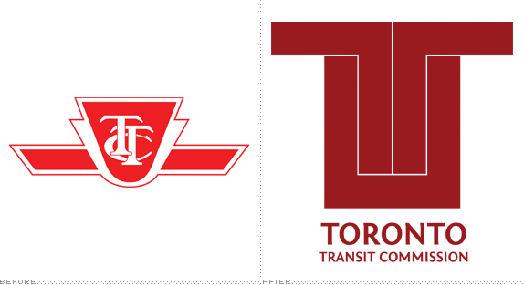
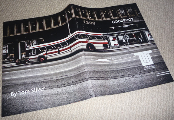
This was our major project for 5th semester. We had the choice of doing literally anything. I used to live in Toronto, Canada, and was never a fan of the Toronto Transit Commission's (TTC) design and overall look. I really enjoy the thought processes that go into branding and thought this would be a great challenge, given all the different collateral that goes into a public transport system, especially in a city like Toronto.

Billy Blue College of Design
Sydney, Australia
Bachelor of Design (Multimedia Design)

Approach
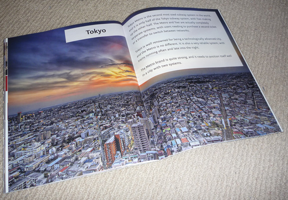
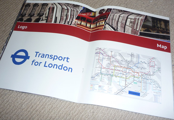
I researched many public transport systems around the world and of course one that stands out is the London Underground. The most obvious thing to me about this was how it wasn’t merely a system to get around, it was an icon of London. It represented the whole city.
I looked at the TTC and thought it was anything but a proud representation of Toronto, and wanted to change that.
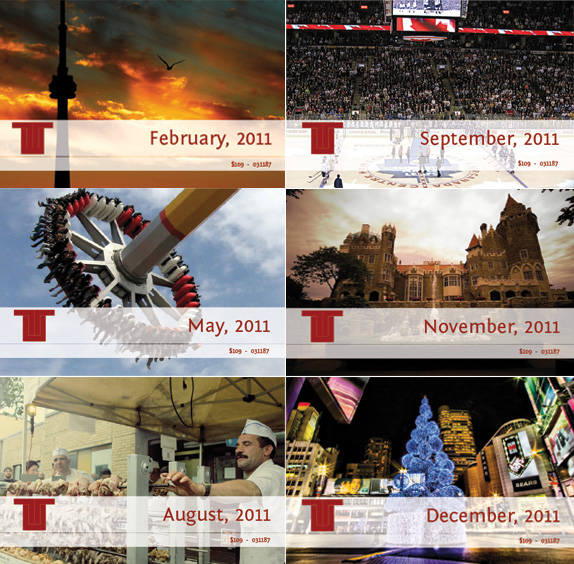
The way I went about that was using imagery of the city. The monthly tickets were images of events in the city during that month, and photos that could be submitted by the people of Toronto.
The logo was designed with a few Toronto ideas in mind. First, was the Toronto City Flag. It is made up of two Ts, and I used them as a starting point for the logo. I also used the Toronto City Hall as inspiration for shapes and things. The final consideration was the Toronto Subway map, and the logo resembles this map.
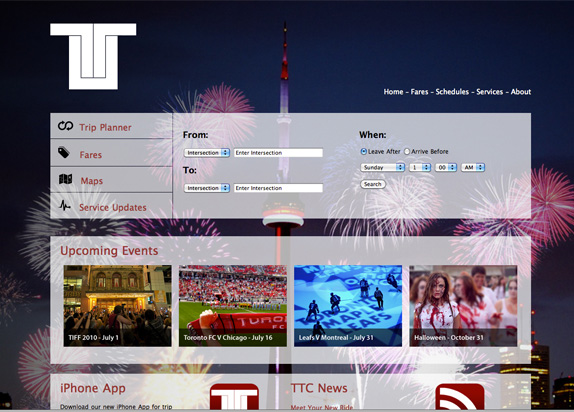
Other parts that I designed included the website, which would feature one image per season — that is in the winter months, an iconic photo of Toronto in the winter would be the background. The website was also stripped back of too much information and only the most vital details were provided to the user, and also displaying some of the major events in Toronto in the coming weeks.
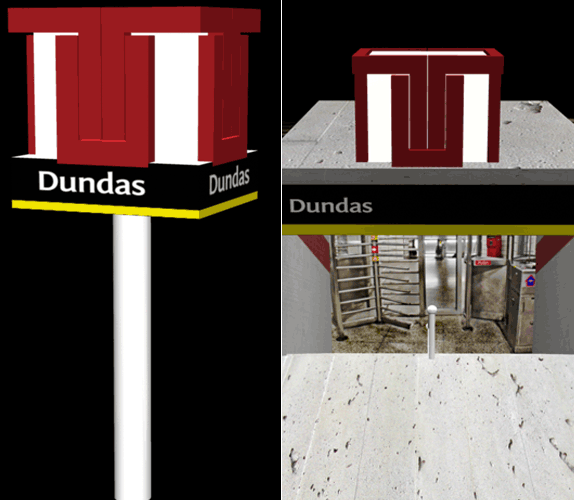
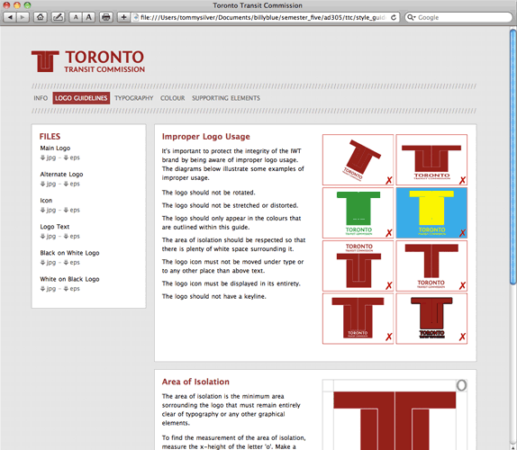
I also mocked up an iPhone app, 3D designs of the station signage, onboard stickers and an online style guide.
I really enjoyed the whole process and think it has actually turned out quite well. To change perception of such a massive and everyday service is not easy, but hopefully my direction has some strength.

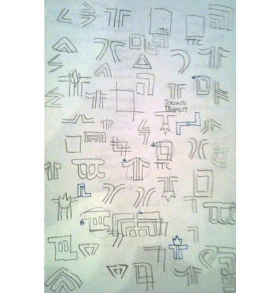
Sketches and Process
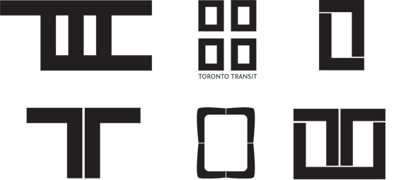

Solution

Tommy Silver’s Website


DATE: Jul.15.2010 POSTED BY: Bryony
 CATEGORY: Transportation
 COMMENTS:

TAGS: icon, signage, standards, stationery, ticket, toronto transit commission, website,


