
Toft Dairy by Cassy Jean Bindis
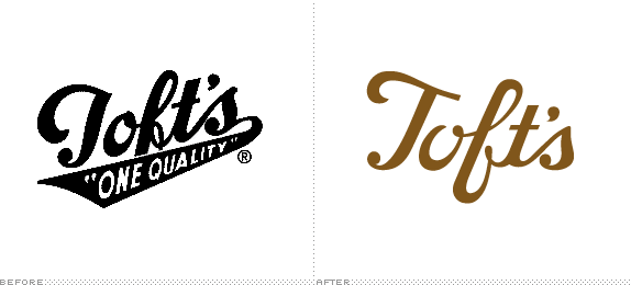
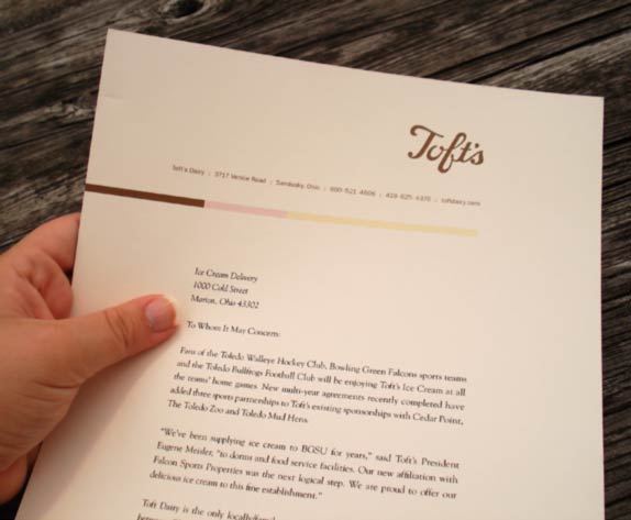
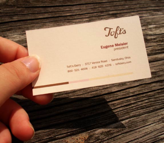
Students were asked to design an identity system for a given sector of the market: Food and Beverage. We were asked to choose an existing company, get it approved, research it, redesign the identity and stationery set and finally pull it all together in a standards manual. The standards manual had to include the following: intro, mark, basic standards, color, typography, stationery system, web site, an innovative creation for the company and logo placements on objects and ephemera.

Bowling Green State University
Bowling Green, Ohio
Identity Design
Matt Davis

Approach
My initial research team of myself and two other students, after given the Food and Beverage sector, decided to wander around local supermarkets in search of logos that could use a little revamping. We came across a local ice cream company called Toft Dairy from Sandusky, Ohio. After being given approval from the instructor, we set to work researching the company. Utilizing their web site, online searches about the history, food review sites (which gave online customer feedback), online newspaper search engines and even an interview with the owner of both Toft Dairy and their current marketing company, our research group was well-prepared to set out redesigning the company. It was at this point the initial group split up to create individual logo redesigns. I reviewed our research and realized an evolutionary mark was the only way to uphold the brand equity Toft currently has; given their mark is at least 50 years old. Through sketching I was able to make adjustments to create more flow, movement and to add readability and recognition to the mark. The stationery system evolved from the melding of the mark, the history of the company and the quality of their product. With the research collected, the standards manual was not as difficult to piece together as I had initially thought. The company, customers and research were the design and dictated how the company should appear and present itself. With such valuable history and quality, I made sure these vital items still presented themselves in the final output and identity.

Sketches and Process
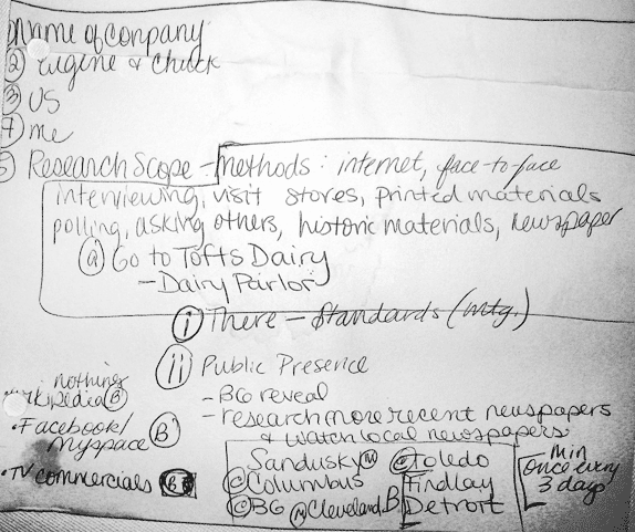
My beginning listing and research process to learn about Toft Dairy.
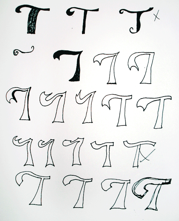
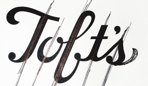
Sketches for correcting the movement and readability of the ‘T’ in the original logo.
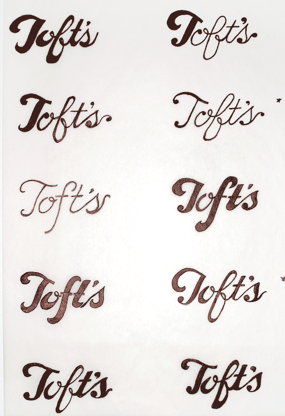
Sketching ideas for the evolutionary mark before touching a computer in order to capture the more handwritten feeling of the original mark.
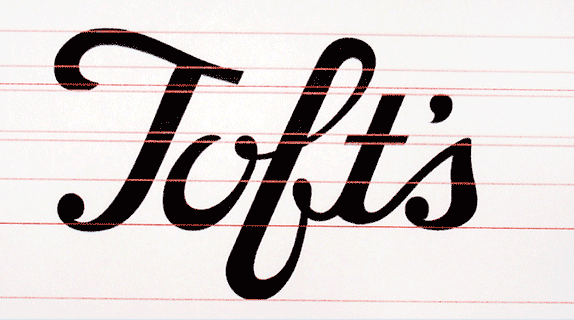

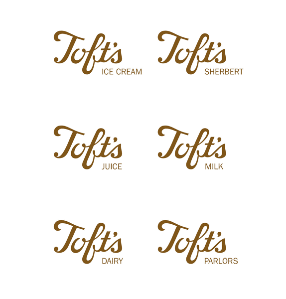
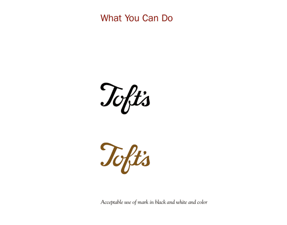
Solution
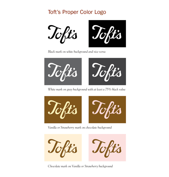
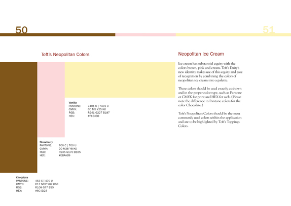
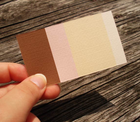
Primary Color Palatte from the Toft Dairy Standards Manual: Toft’s Chocolate, Toft’s Strawberry and Toft’s Vanilla.
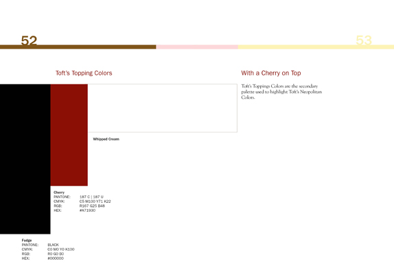
Secondary Color Palatte from the Toft Dairy Standards Manual: Toft’s Fudge, Toft’s Cherry and Whipped Cream.

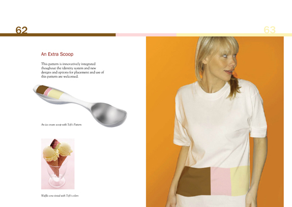
A pattern developed for use across ephemera and placement to add a form for unity and consistency across the brand.


Cassy Jean Bindis’s Website


DATE: Jun.30.2010 POSTED BY: Bryony
 CATEGORY: Food
 COMMENTS:

TAGS: color palette, packaging, standards, stationery, toft dairy, typography,


