TNT Post by Colin Dunn

ASSIGNMENT
Rebrand the official mail carrier of the Netherlands: TNT Post. The identity should reflect that TNT Post is transitioning from a public to a private organization and will face stiff competition. (Little did I know the company would be coming out with an official rebrand weeks later.)


Rebrand the official mail carrier of the Netherlands: TNT Post. The identity should reflect that TNT Post is transitioning from a public to a private organization and will face stiff competition. (Little did I know the company would be coming out with an official rebrand weeks later.)

SCHOOL
Willem de Kooning Academie
Rotterdam, Netherlands
Willem de Kooning Academie
Rotterdam, Netherlands
COURSE
Graphic Design
Graphic Design
INSTRUCTOR
Karin Mientjes
Karin Mientjes

Approach
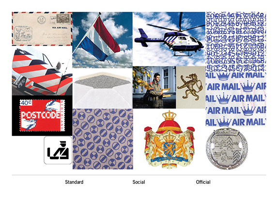
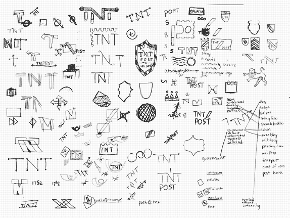
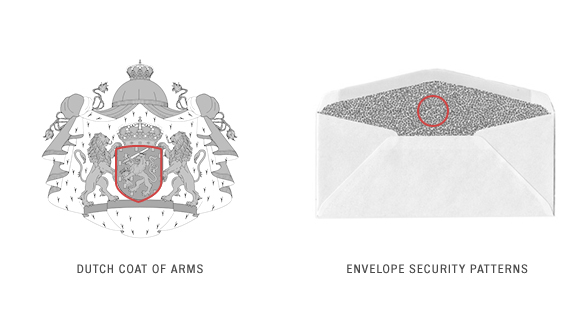
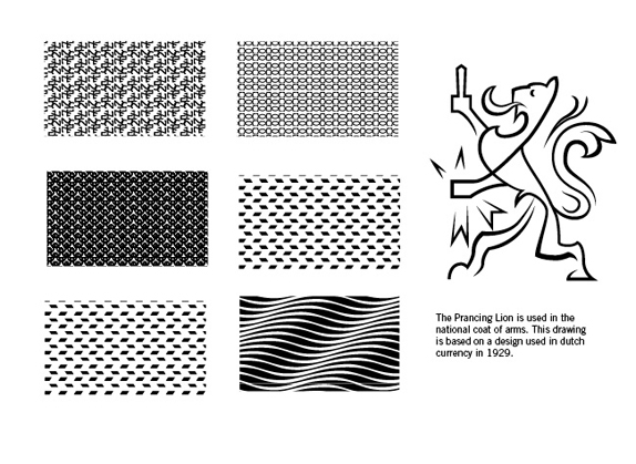
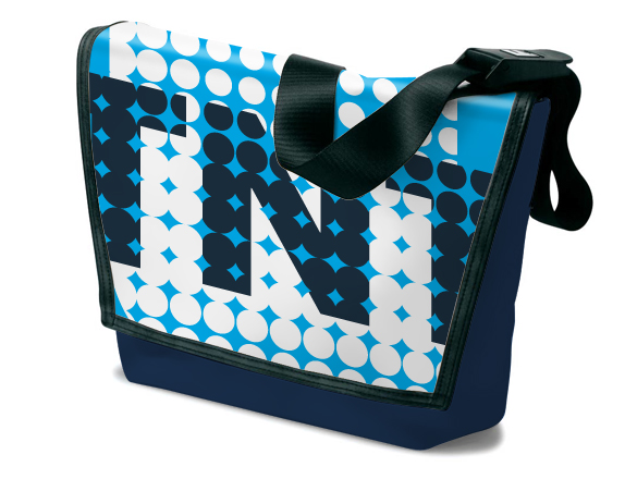
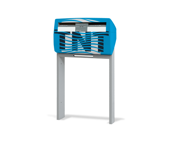
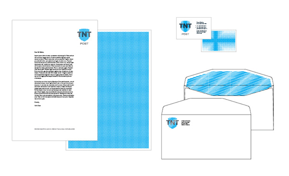
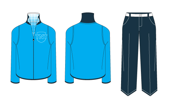
I researched the company’s history and surveyed other nations postal branding systems. Avoiding clich�s like the post horn, I focused on symbols of the postal system and the Netherlands. I combined security patterns found on the inside of envelopes with a shield symbol, derived from the Netherlands coat of arms, to create a flexible identity system.

Sketches and Process

Solution


Colin’s Website


DATE: May.19.2011 POSTED BY: Lauren Dickens
 CATEGORY: Service
 COMMENTS:


Comments › Jump to Most Recent


