
The School of Traditional Western Herbalism by Cameron Sandage
In the 321 branding class, the students of the class compete for the opportunity to work with a real client through PSU's academic partner, Micro Enterprise Services of Oregon (MESO). We were given the choice of four clients, Simply Perfect Cleaning, Spice of Africa, The School of Traditional Western Herbalism and Clear Reflections Counseling. Each client had specific wants / desires for the project, and a budget.

Portland State University
Portland, Oregon
Art 321 - Communication Design Studio IV
Chris North

Approach
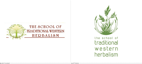
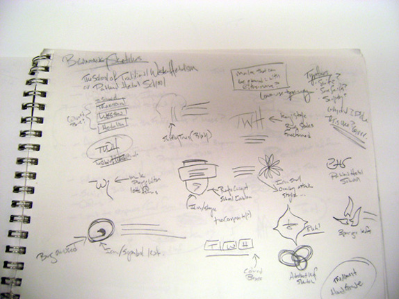
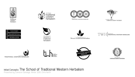
I chose to do The School of Traditional Western Herbalism because they expressed interest in a possible change of name during the initial client meeting due to their web url being portlandherbalschool.com. However after further discussion I decided to brand the school as is. They really wanted to keep the tree aspect of what their original logo however I felt it was necessary to step away from that design choice due to what I knew at the time trees were not a big part of the herbalism practice. I proposed 12 original sketches to the class of which we narrowed it down to three and then two before doing a presentation to first our professors of the design department and then the client.
At the presentation to the professors we had to present a brand book with possible deliverables, and a budget. Out of three classes they picked 7-8 people to present to the client, I was one of the people that presented to the client again presenting the same presentation and brand book. A week later the client came back with a decision of which student designer they liked for their brand, which turned out to be myself.
Once the brand was chosen I worked closely with the client for the rest of the term. She initially wanted to change the design to have a tree again in the mark but after working on multiple options for the mark she decided to go back to the original design that was presented. Due to time running out we did not get any further on the deliverables.
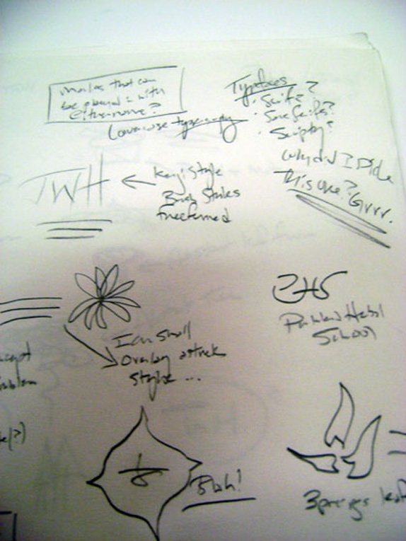
I approached this project as I do all my projects, first researching what the client is, who they are, what they want, talking to the client (if available) and looking at other marks that are in the same field. I then start to sketch generally in the margins of my notebook as I take notes for whatever class I am in or in my sketchbook then moved to doing digital sketches on the computer. Once I decide on what marks I like, I will pin my favorites up for critique and see what my fellow classmates and professors think. And then re-vamp, modify, add change etc based on the feedback.
For this mark I knew they wanted to have a tree in their brand, but after researching other herbalism school near theirs as well as else where I found that many schools used Papyrus or Trajan as typefaces with some kind of whimsical tree figure. To brand The School of Traditional Western Herbalism (STWH) away from the other schools and with the knowledge of how STWH was different then other schools, they are different in that they do most of their classroom learning in the field / in the forest etc to educate their students, with that in mind I decided to focus the mark on where the school is taking place.
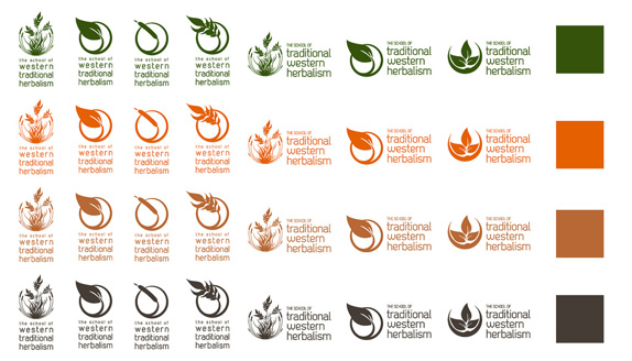
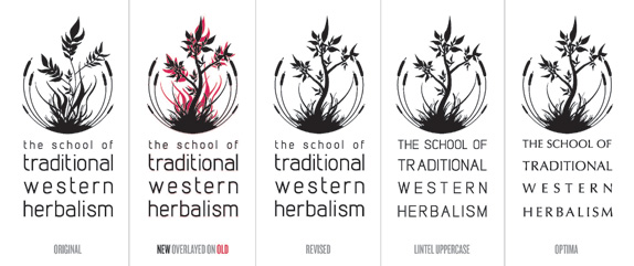
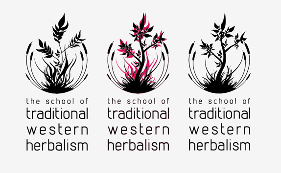
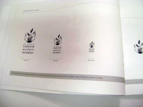
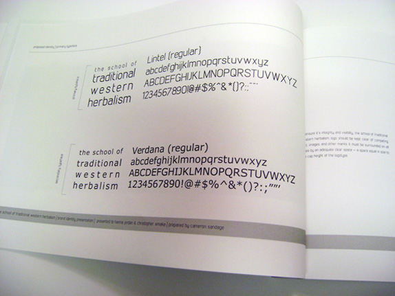
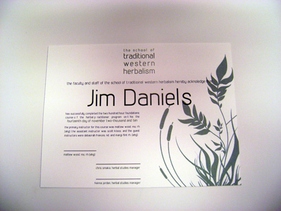
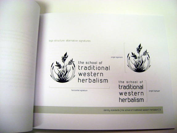
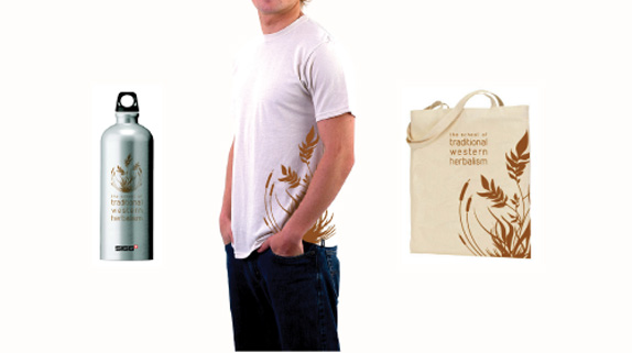
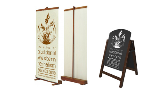
I created the mark to resemble more of a marsh / grassy area to represent that their school is out in the field. And kept with the original circular shape of their current logo to keep the feel. It also added a seal type mark that would be more official for a school. I also wanted to go with a more modern / thinner weight sans serif for the type choosing Lintel and then playing with the size of the words and tracking. I kept the color of the mark green with alternative version is a sage, cooper, and dark brown. The mark can be broken up in two separate marks and a third logo where the type is horizontal to the mark.
What I learned from this experience is that working directly with a real client who has multiple partners / instructors to please (design by committee) is not always easy and its a lot of give and take to get the client to a place where both parties are happy. In the end it was a very interesting process creating the identity for the school and one piece that I am proud to have in my portfolio based on how much stress it was to get to the final point for me.
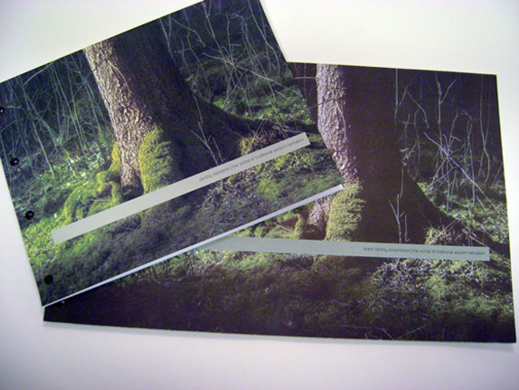
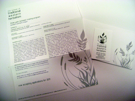
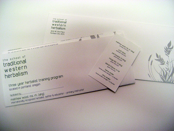
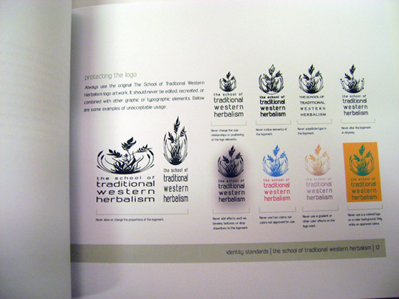
When the project was over the client got the original brand book used for the presentation as well as an identity standards book and a cd with all the various marks. The interactive team class at Portland State University is currently working on re-designing the website with my new mark.

Sketches and Process
Solution

Cameron’s Website


DATE: Apr.26.2011 POSTED BY: Lauren Dickens
 CATEGORY: Service
 COMMENTS:


