Realistic by Jason Permenter
This project involved reinventing and reviving a dying brand by extending the audience and type of products in new directions. Any brand could be chosen, as long as there was a clear need or possibility of reinterpretation and innovation.

Academy of Art University
San Francisco, CA
Nature of Identity
Hunter Wimmer

Approach
My concept was to take the original Realistic brand, which sold inexpensive electronics and stereo equipment, and bring it into the same innovative, modern folds as Apple, Google, etc. The approach was to have Realistic embody the seamless integration of personal communication and digital connectivity into everyday life. As part of the final course deliverables, I chose to fabricate a branding and style guide as if it had been made in the year 2045, decades after Realistic had become the world’s primary technology company. The guide not-so-subtly suggests that Realistic has gone a bit too far by then, and truly has been integrated into *every* aspect of life, including human cybernetics, Big Brother-like security and global surveillance.

Solution

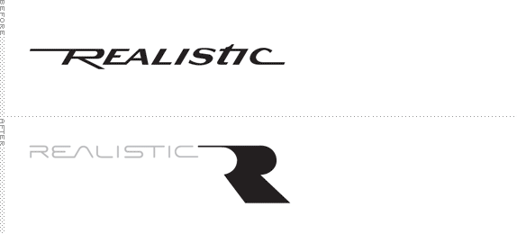
Proposed logo.
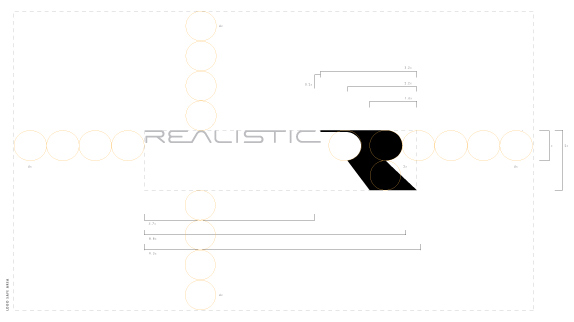
Shows the new logo with the lockup measurements intact. The ‘x’ unit relates to the outer curve of the ‘R-wave’. All lock-up measurements are in relation to that measurement (seen as orange circles for reference), regardless of the final logo size. Conceptually, the new logo is meant to not have any other logos in proximity, so as to make it stand out.
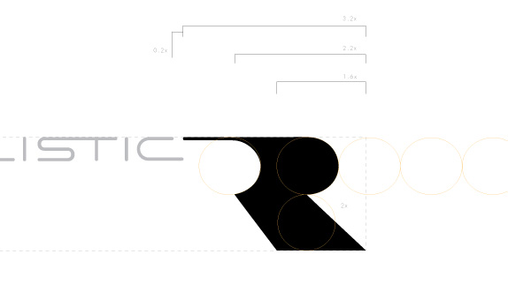
A close-up look at the lock-up.
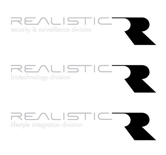
The simple and clear divisions I envisioned for this more nefarious Realistic brand.
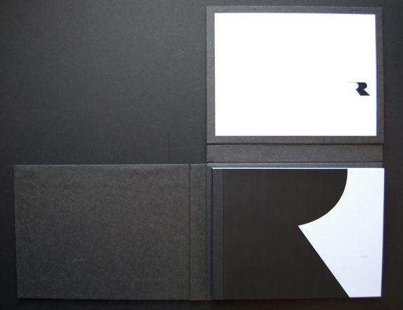
The final branding book for the new scope of the Realistic brand. The book’s cover is in two parts: one folds up, then another folds again out the left to expose the book itself.
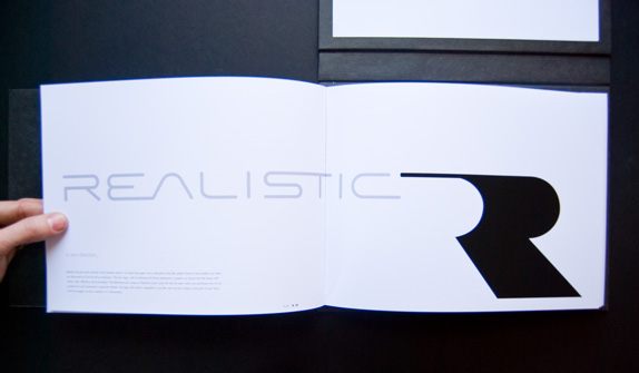
The unveiling of the logo in the branding book.
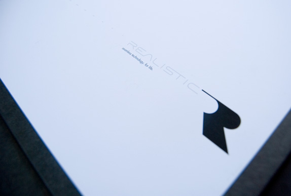
Showing the Realistic brand tag line, which borders on the uncomfortable: “Seamless integration. For life.”
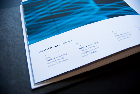
A portion of the Realistic history within the branding book. I extended the history to incorporate fake global saturation of the Realistic brand through 2050.
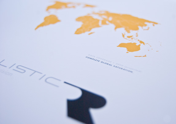
A diagram within the book showing all countries filled to suggest “global saturation” for integrated communication by Realistic.
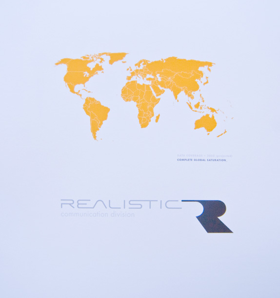
The same diagram within the book, from another angle, showing all countries filled to suggest “global saturation” for integrated communication by Realistic.
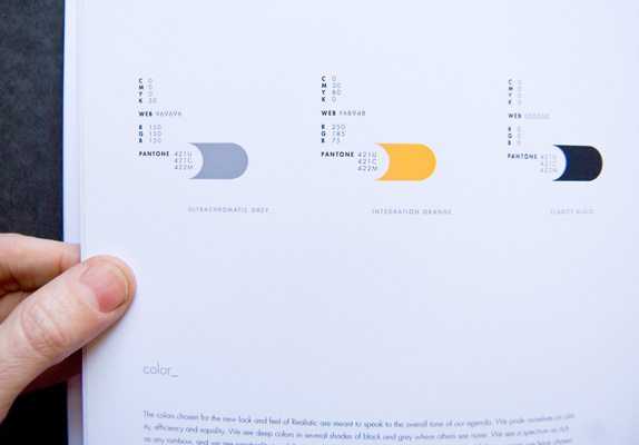
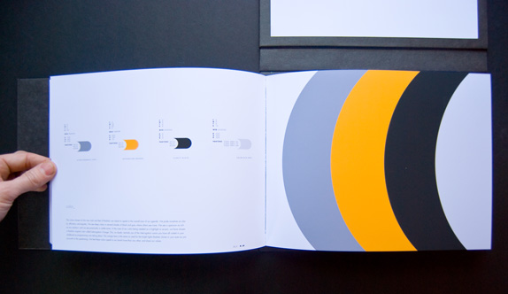
The simple color palette used for the new brand. To enhance the foreboding, Big-Brother-like feeling, I chose contradictory and confusing names for the colors used: “ULTRACHROMATIC GREY”, “INTEGRATION ORANGE”, “CLARITY BLACK” and “COLOR-RICH GREY”.
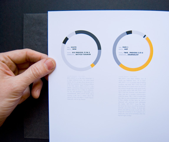
Audience profiles were included in the branding book, with specific examples of people who might need Realistic within their lives. Rather than using photos of people, I kept with the Big Brother concept by making the names be more like ID numbers.
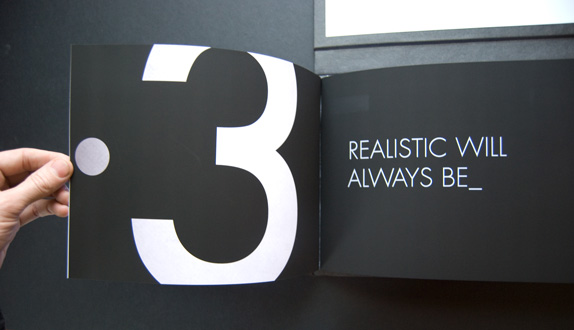
One of the section breaks within the branding book. I kept trying to give Realistic a ‘1984’ voice, as if they were taking such good care of you on one hand, but in the very worst of ways on the other.

Jason Permenter’s Website


DATE: May.26.2010 POSTED BY: Bryony
 CATEGORY: Consumer Product
 COMMENTS:

TAGS: applications, branding book, logo, logo detail, typography,


