
Polish Post by Zofia Szostkiewicz
ASSIGNMENT
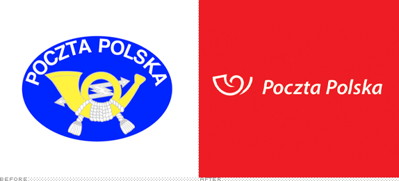
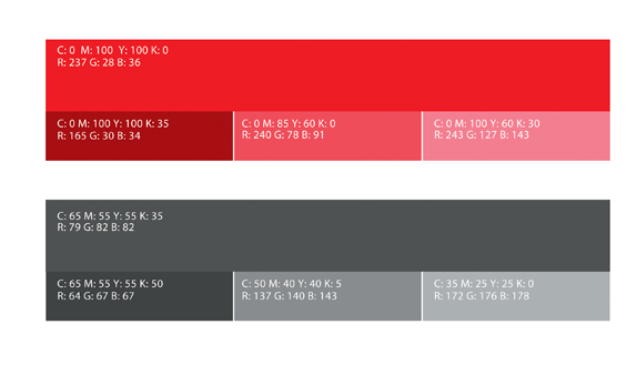
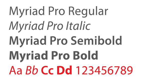
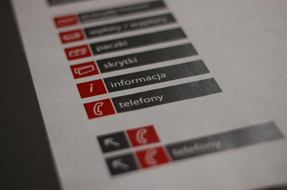
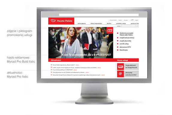
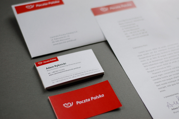
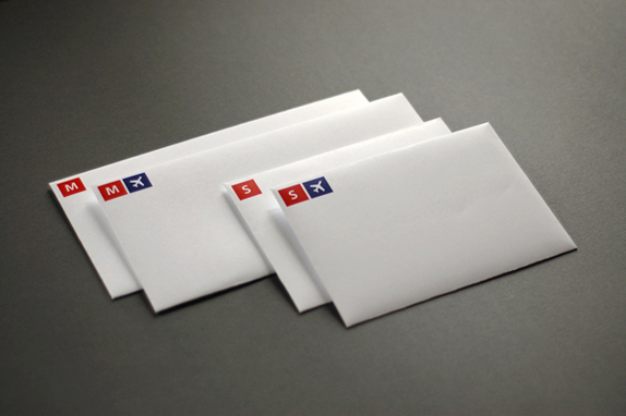
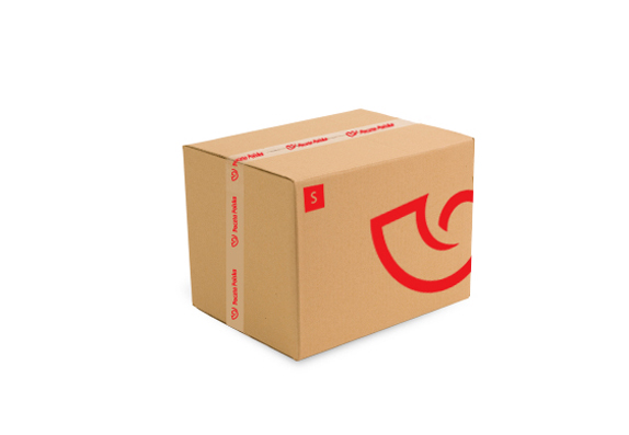
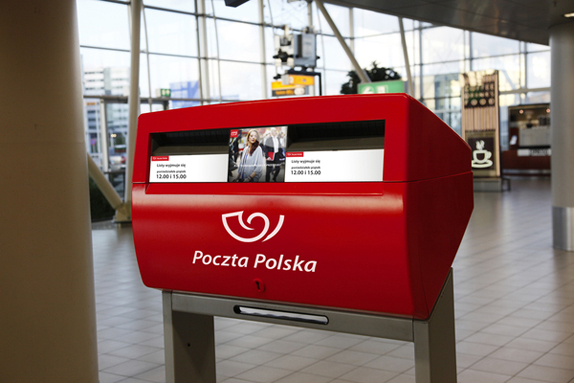
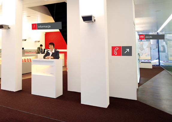
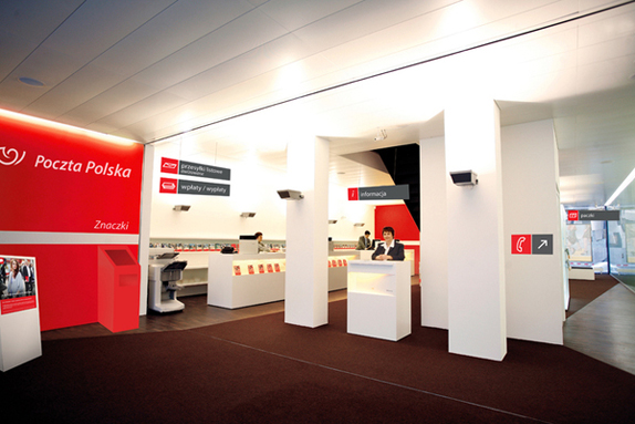
I have redesigned the visual identety of the Polish Post. I wanted to create a simple, modern and strong brand. I redesigned the logo, created an new color-scheme for the identety, I desined stationary, pictograms, uniforms, and website layout.


I have redesigned the visual identety of the Polish Post. I wanted to create a simple, modern and strong brand. I redesigned the logo, created an new color-scheme for the identety, I desined stationary, pictograms, uniforms, and website layout.

SCHOOL
Academy of Fine Arts
Kraków, Poland
Academy of Fine Arts
Kraków, Poland
COURSE
Visual Communication
Visual Communication
INSTRUCTOR
Dr. Barbara Widåk
Dr. Barbara Widåk

Approach
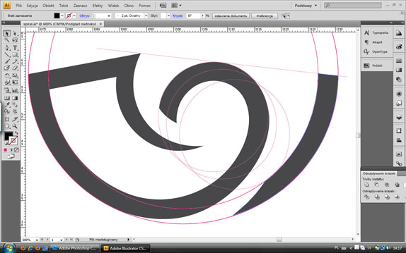
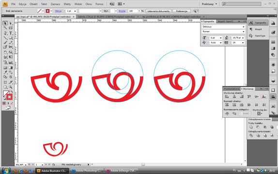
I used simple shapes and bold colors to create an strong impression. The choice of color comes from our national flag, white and red.
Once again i discoverd that… “reduce to the max” is the best way.

Sketches and Process

Solution



Zofia Szostkiewicz’s Website


DATE: Sep.23.2010 POSTED BY: Bryony
 CATEGORY: Service
 COMMENTS:

TAGS: envelopes, packaging, polish post, stationery, store interior, system manual, typography, uniform, van, website,

Comments › Jump to Most Recent


