
PBS by Dilek Turan

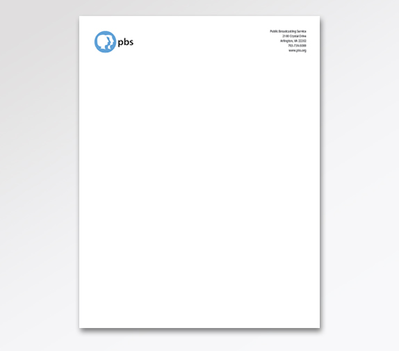
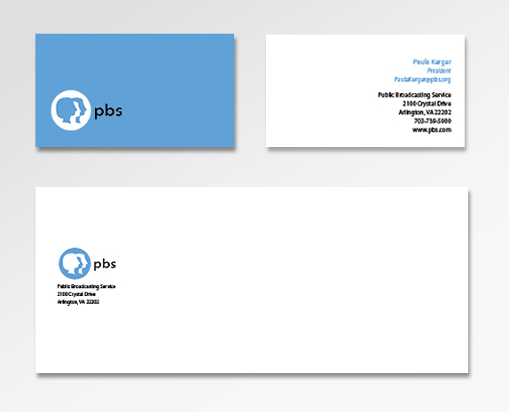
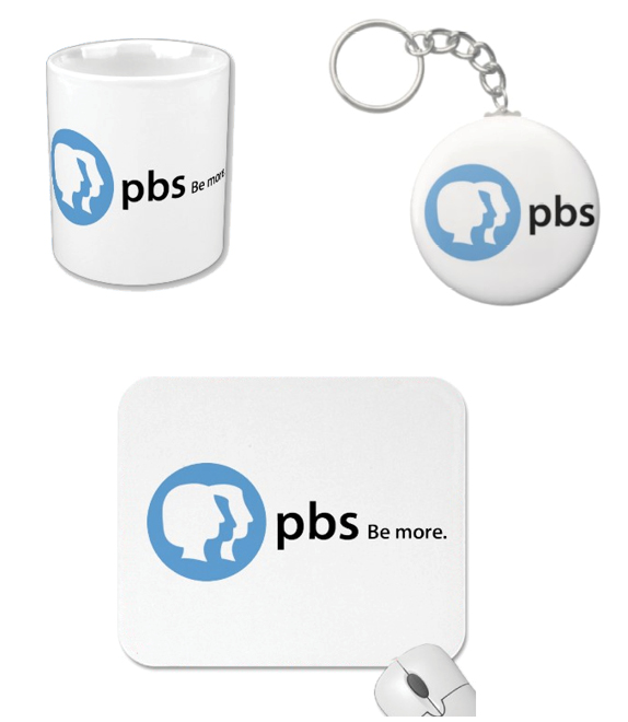
We were asked to redesign a corporate mark for a large corporation or non-profit organization. Along with our corporate marks, we had to design applications including a business card, letterhead, and envelope. We also had to present a graphic standards manual and our choice of a collateral selling device.

Baruch College
New York, NY
Art3055- Corporate Redesign
Terry Berkowitz

Approach
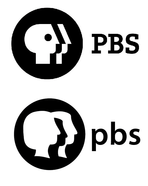
I knew I was taking a risk when I first approached this assignment. The current PBS logo is iconic. Ernie Smith and Heb Lubalin designed the first idea of the head within the logo in 1971. Chermayeff and Geismar designed the concept of putting the three heads within the circle in 1984. I knew wanting to redesign a logo that incorporates ideas from these iconic designers was going to be challenging. I decided to move forward with this project and took that risk anyway. I believe like many other corporations, PBS deserves an updated, modern identity.
My primary goal for the redesign of the new PBS logo was to make sure I did not alter the symbol of the logo too much. It is a great representation of what PBS is about however it looks outdated. I thought the heads needed to be redesigned so they can relate more to what the outline of our head and neck looks like. I also thought that the eye within the head was very big and awkward. Another change I wanted to make to the logo when I initially started the project was to change the logotype to a sans serif type so it would look more consistent with the symbol. Lastly, I thought that PBS needed more color with their branding. They’ve been around for so many years with programs aimed toward family and I thought it would be safe for them to look more “fun”.
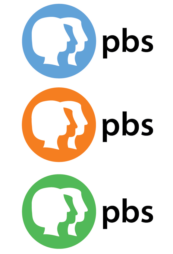
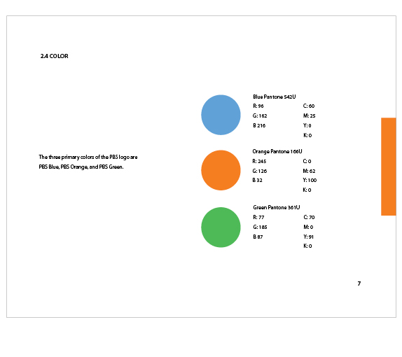
After doing hours of research on PBS, the first step I took was deciding what colors I wanted to incorporate into my logo. When I had done my research I found that the colors within their logo from 1971 worked the best. The blue, green, and orange within this logo were great and I thought they really represented PBS. I decided to bring those colors back for this redesign.
Before I got started on working on the heads of the logo, I thought about what PBS really wanted to portray. I read their mission statement, browsed their website, and watched their commercials and advertising to get a better sense of what they were about. The one reoccurring theme that I came across and believe they stress as well was family. I really thought I needed to represent family in this logotype. I did that by changing the first two heads into a female and child. While this new logo represents family, it also represents them individually because they have shows geared toward men, women, and children. This is why I think this concept works any way you look at it. It’s representing family the same time it’s representing each individual. Once the logo was put together, I thought it looked more modern and fresh than the current PBS logo. I think this update is more effective in representing what PBS means to their viewers.

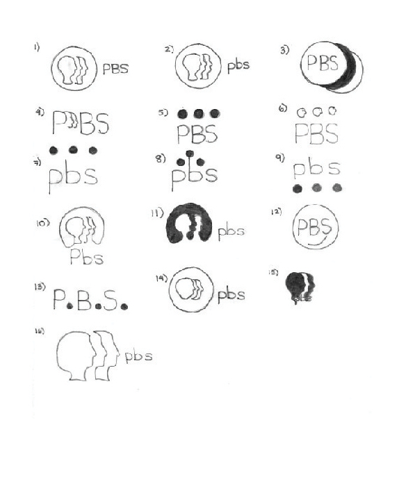
Sketches and Process
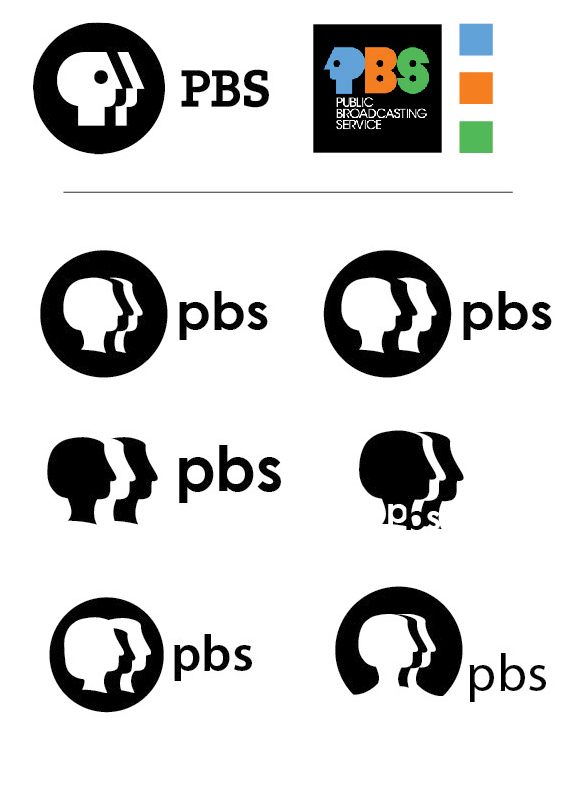

Solution


DATE: Jun.30.2011 POSTED BY: Lauren Dickens
 CATEGORY: Entertainment
 COMMENTS:


