Patagonia by Claire Milligan
The assignment was to choose a well-recognized brand and refresh its identity system. Final deliverables included the logo and a standards manual including 20+ applications of the identity in a variety of formats (environmental, consumer, multimedia etc.). Emphasis was placed on identifying the equity in the existing identity system and translating that into a refreshed identity system that could truly be the next generation of the brand.

Academy of Art University
San Francisco, CA
Identity 2
Todd Hedgpeth

Approach
Patagonia was on my radar screen as an option for this assignment because of two things: 1) I grew up in Ventura, CA where the company has held a very respected and prominent role in the local economy, and 2) I volunteer as a ski patroller and their winter products keep me safe and warm throughout the entire season as sponsors of the National Ski Patrol. What made me decide to pick Patagonia was the fact that while has the company been the ultimate innovator in outdoor apparel industry, throughout its entire history, the company has held firm in its belief in the importance of environmental responsibility. Not all industry leaders take the time to do right by the world!
I approaching a design for Patagonia, I recognized that the company’s ethos has always been a little against-the-grain. Founder Yvon Chouinard decided that climbers should be wearing bright colors, unlike the drab woolen outfits of the time, when he selected his initial designs. Initially, I saw the company as the consummate innovator, which created the ideas of cool without even focusing on trends (which is reflected in my moodboard). But ultimately I realized that the evolution of Patagonia and its products is more the story of a family of coworkers committed to a common goal. I wanted to pay homage to the original irreverence and uncommon business model by creating a brand that reflects the consumer’s personal experience with Patagonia products.
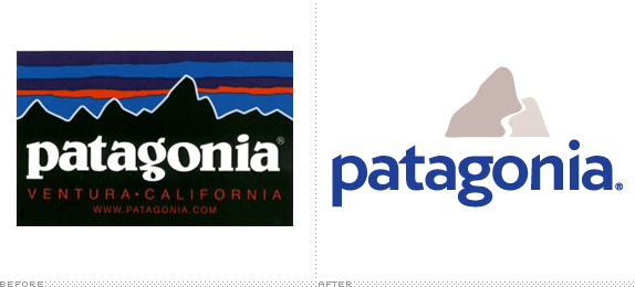
For the logo, I identified the wordmark as the primary source of equity in the existing design. (The wordmark itself is often used alone, but the sunrise-over-mountains logo continues to be in consistent use as well). It was very important to me to keep the two-storied a’s and g, as well as the upward angles created by the serifs in the existing wordmark. In order to achieve this I tried many variations, but ended up settling on the use of Verlag, distorted to create the consistent upwards angles, with a g borrowed (and tweaked to match scale and proportion) from Gill Sans.
In my sketches I toyed with the idea of updating the mountain range scene as well as throwing it out altogether. In the end, I settled on a zoom-in of the range to a specific peak that represents to me the idea of choose-your-own-adventure. Is it a skier’s path? A road? A river? A crack for a climber? How you ascend or descend the mountain is up to you, but Patagonia will take you there.
Translating this logo into a branding system was initially quite challenging to me, but ultimately I developed a system of iconography that would serve as signposts to consumers about the contents of each of the products (organic cotton, recycled polyester, organic hemp, repurposed wool) and its appropriate usage (clear weather, rain protection, cold temperatures).
Using this iconography set, I developed a notebook design style to chronicle the consumer’s personal outdoor adventures. Each of my applications were rendered from hand-drawings in a standards manual that is spiral bound at its top to mimic a field notebook. The photography I used had a snapshot quality to it, sometimes showcasing the less glamourous side of outdoor activities. My intention was to focus on the personal experiences and the stories that we share about our own adventures.
In terms of typography, I mixed the use of handwriting (my own) for notes and directions that would come from individuals with the use of ITC Souvenir for labels, signage and captions. I felt that the existing logo was a tad bit still in the 70s and choosing that typeface paid homage to the era. In addition, it has a very human touch to it that played well off the handwriting.
Ultimately I realized that the more I researched about Patagonia the more I fell in love with it as a company. I was consistently trying to create designs that lived up to the spirit of the organization. Here’s a quote I found from Yvon Chouinard that pretty much sums that up, “Can you imagine if a computer company said, ‘When you’re done with your computer, we’ll buy it back from you and make more computers out of it?’ We have a different way of accepting responsibility.”

Sketches and Process
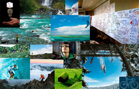
Initial moodboard with photography predominantly sourced from Patagonia.com.

Initial sketches covering a broad variety of concepts, mostly sticking to the use of a strong wordmark due to its equity.
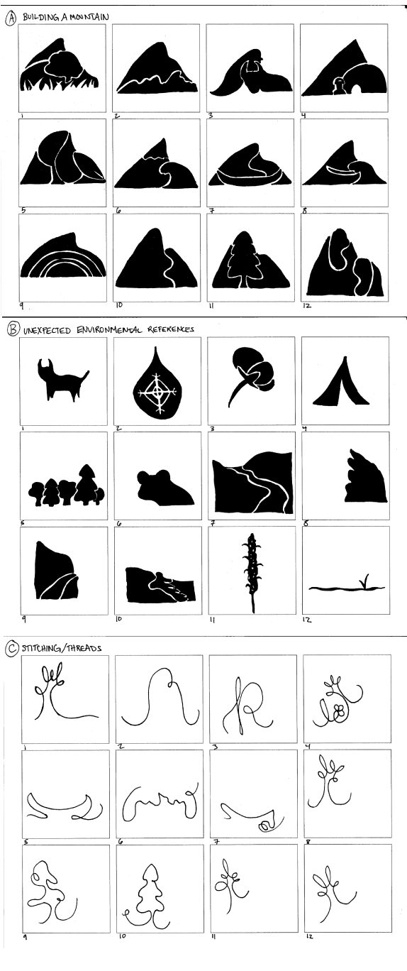
Refined sketches in 3 directions.
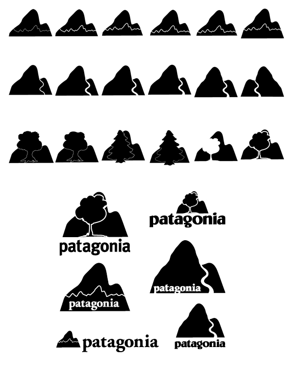
Initial exploration of Concept A of the refined sketches.
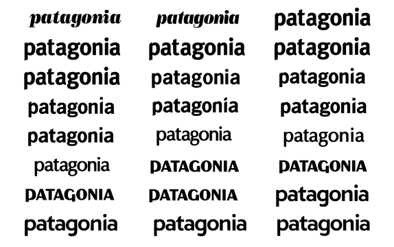
Studies on updating the wordmark.

Solution
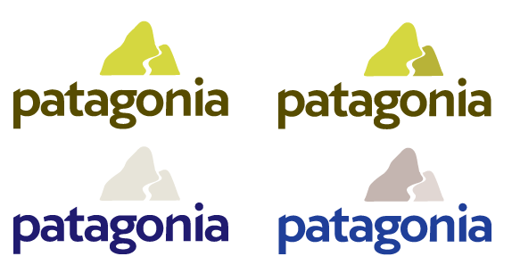
I was focusing here on have a ‘natural’ color palette. I decided that greens would be too ‘eco-friendly’ - perhaps even to the point of looking false or superficial.
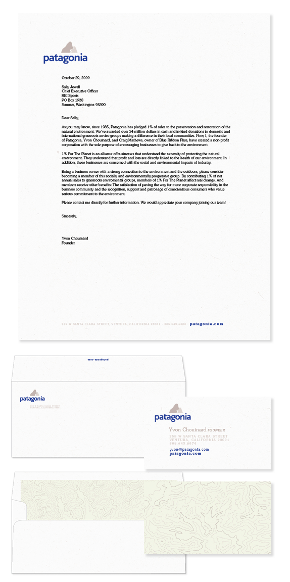
This was my most conservative interpretation of the brand.
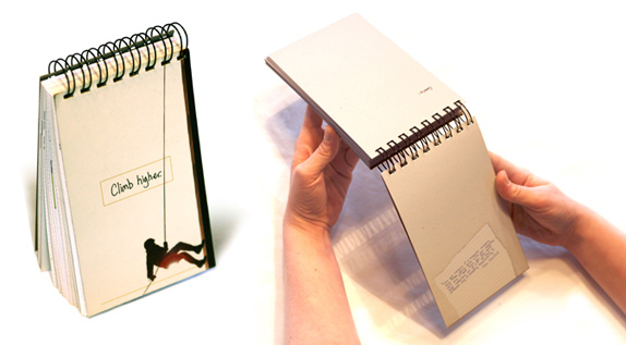
image8_standardsmanual.jpg: The standards manual measures 4.75” x 7.75” and is meant to be reminiscent of a field notebook.
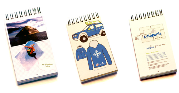
Standards manual interior reflects the personal notes, ideas and drawings that would be present in a field notebook.
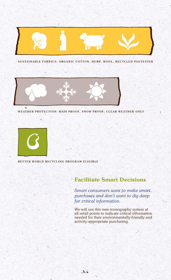
I developed a branded iconography system for ease in consumer purchasing decisions.
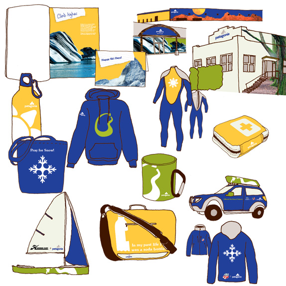
A broad array of applications from building fa�ades to print ads, co-sponsored vehicles to wetsuits!

The iconography system turned into fun clothing graphics as well.
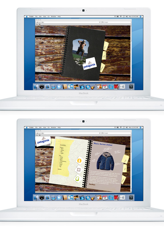
A new website design based on the same field notebook idea as the standards manual - this time as a sketchbook.

Claire Milligan’s Website


DATE: May.27.2010 POSTED BY: Bryony
 CATEGORY: Retail
 COMMENTS:

TAGS: applications, identity manual, logo, mood board, patagonia, stationery, t-shirt, web site,


