Outdoor Research by Seth Clark
ASSIGNMENT
The assignment called for us to take a major corporation and redesign their identity. We had to create a new logo and implement that in business cards, letterhead, envelopes, store signage, shipping labels, annual reports, and anything else we wanted.


The assignment called for us to take a major corporation and redesign their identity. We had to create a new logo and implement that in business cards, letterhead, envelopes, store signage, shipping labels, annual reports, and anything else we wanted.

SCHOOL
University of Oklahoma
Norman, OK
University of Oklahoma
Norman, OK
COURSE
Visual Communications V
Visual Communications V
INSTRUCTOR
David Hissey
David Hissey

Approach
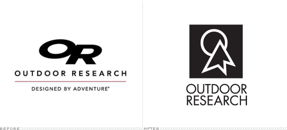
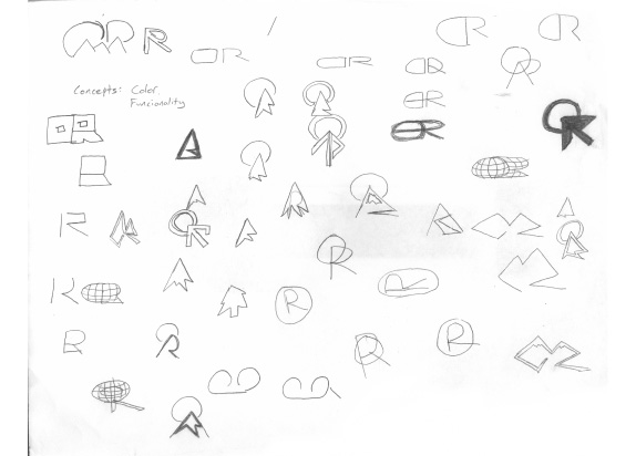
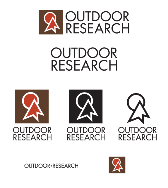
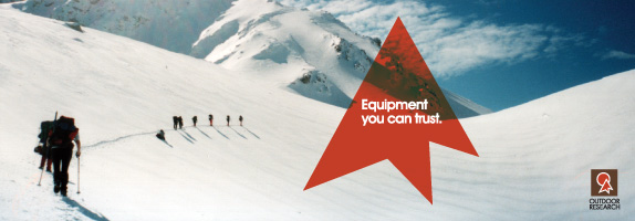
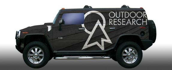
I first looked at all of Outdoor Research’s competitors. I thought brands such as Patagonia and The North Face had solid logos so I wanted to create a logo that could keep up with them. I eventually settled on a logo that was an abstraction of the “O” and the “R” of Outdoor Research. They also form a mountain peak and moon/sun. After the symbol was complete I moved on to the Typography. I chose Futura to represent the brand because I believe it puts a more humanistic look to the company. Once the logo was done, I implemented it into different applications.

Sketches and Process


Solution

Seth Clark’s Website


DATE: Jun.07.2010 POSTED BY: Bryony
 CATEGORY: Retail
 COMMENTS:

TAGS: advertising, icon, logo, outdoor research, vehicle,

Comments › Jump to Most Recent


