Occassions by Veronica Taillon
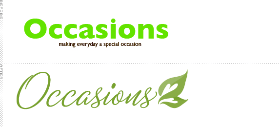
We were asked to redesign any logo of our choosing, as long as it was a company logo. We were also asked to heavily consider using as few colors as possible.

Oklahoma Christian University
Oklahoma City
Graphic Design 1
Tim Watson

Approach
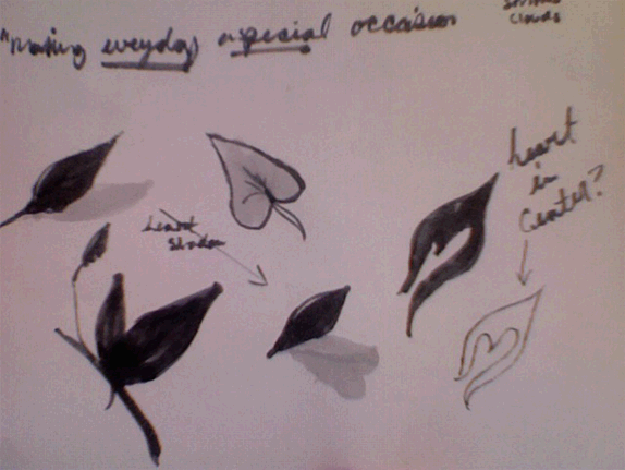
The first thing I decided for this assignment was that I wanted it to be a one color logo, I wanted to push my instructors constraints further by giving myself this stipulation. The second thing I decided is that I wanted to make this logo simple and sophisticated but still maintain the “fun” of the company. This is where I first found myself in a bit of a pickle. I had chosen Occasions Paper as my company, who sell stationery, wedding invitations and a whole slew of random odds and ends. I began struggling to pinpoint one aspect of the company; do I go with more of a style conducive to wedding invitations, or a style that shows the company’s unique array of fine gifts and gourmet foods? After copious amounts of ridiculous thumbnails and sketches I realized that I was trying to get too much information about what the company sells into a single logo rather then providing a visual solution for what the company stands for and is about, “making everyday a special occasion”. This is where I took a giant leap in the right direction.
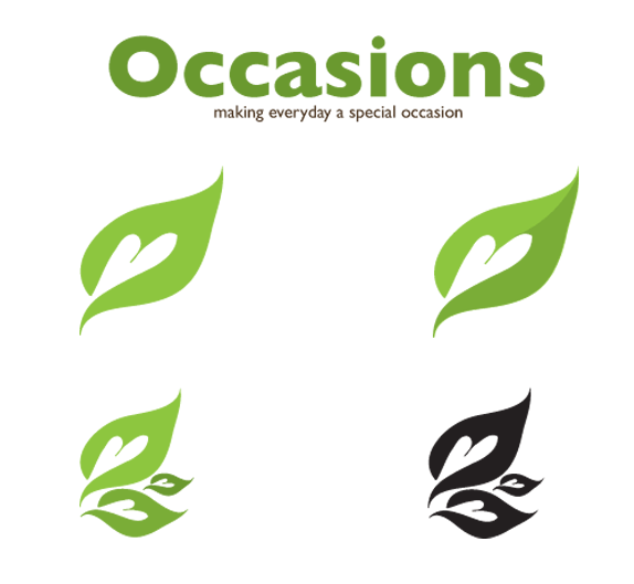
I began thinking about the things that were around me that were ordinary, everyday things, and leaves stuck out, not only because of how commonplace they are, but because of how they represent trees and paper. So I started playing around more with this idea of leaves being part of a logo for a paper company and then I realized it was missing something “special” that took it from everyday to a special occasion. I started incorporating hearts into my design, trying to obtain that special feeling without being stuck with a cheesy logo. After incorporating it in a variety of ways, I decided on what would be the base of my final logo, creating a double entendre of ordinary and special.

Sketches and Process

Solution




DATE: Jan.20.2011 POSTED BY: Bryony
 CATEGORY: Retail
 COMMENTS:

TAGS: icon, ocassions, typgoraphy,


