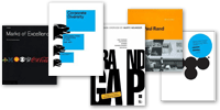
Nordstrom by Eric Doctor
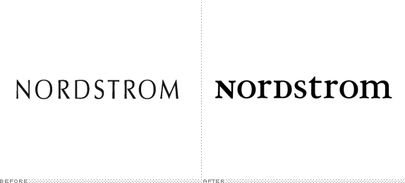
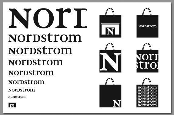
Final project for class: choose your own project, as long as it is more substantial than anything else you have previously done for a design class. I chose to redesign Nordstrom's visual identity and create a Paul Rand-esque case study booklet for presentation in class.

Rice University
Houston, TX
WILL 251: Advanced Topics in Graphic Design
Jen Cooper

Approach
I knew that I wanted to do something with corporate identity for the final project. I struggled with choosing a company. I had originally intended to do Kodak (inspired by the season one finale of Mad Men), but I realized that Kodak, having abandoned their film division — which has defined them for their entire existence — no longer has any real brand equity to build on. I eventually landed on Nordstrom, a company that has an incredibly strong brand equity — but their visual identity is far from the strongest part of their brand.
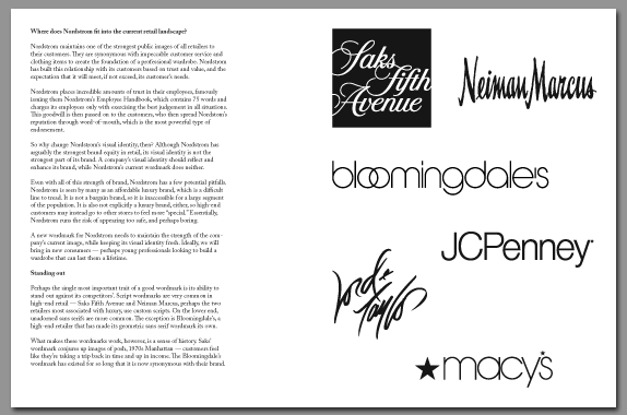
Nordstrom is uniquely positioned in the retail landscape in that they are perceived as an affordable luxury brand. This is a great place to be, but it is also a difficult line to tread. Being a luxury brand, Nordstrom is inaccessible to lower-end customers, and higher-end customers may chose to go to the explicitly “luxury” stores because they want to feel special when they shop. Nordstrom runs the risk of being perceived as the safe choice, and its current visual identity does not help that perception.
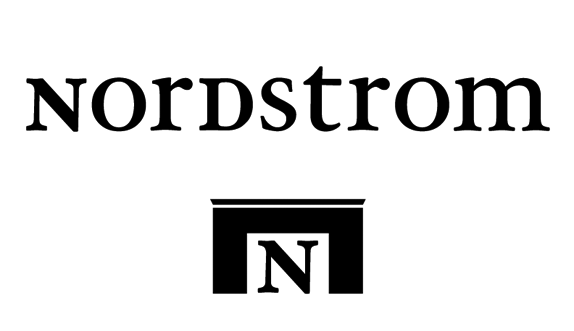
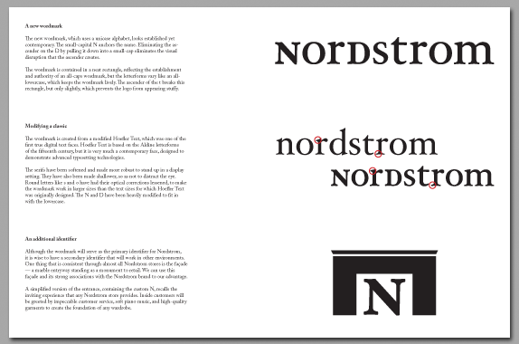
I wanted to maintain the establishment of Nordstrom’s current wordmark, while making it more vivacious and inviting. I decided to go with a unicase wordmark, because by fitting into a rectangle it maintains the establishment of an all-caps wordmark, while the varying letter shapes make it more lively.
My reasoning is more clearly explained in the presentation booklet I prepared [PDF]. I found that it was more difficult to write the copy than it was to create the new wordmark. I had to balance a clear idea of my own design aesthetic with the image I wanted to project to my hypothetical client. It was a great thought experiment that will help me as I begin my professional design career.

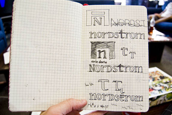
Sketches and Process

Solution
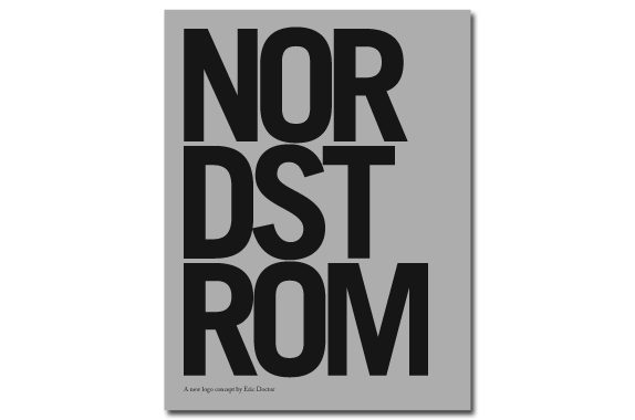
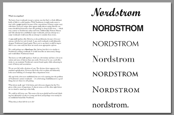
Cover, above, and sample spreads, below, of presentation booklet. See full PDF.

Eric Doctor’s Website


DATE: May.20.2010 POSTED BY: Bryony
 CATEGORY: Retail
 COMMENTS:

TAGS: applications, logo, nordstrom, typography,


