


Nashville MTA by Logan Hartline
Required of B.F.A. Graphic Design majors during their last semester. The purpose of this course is to develop the student's work and portfolio simultaneously. Entrance to the Capstone is contingent upon approval by an adjudicating committee composed of full/adjunct professors in the Department of Art. Prior to beginning the Capstone, the student is required to present his/her proposal project for the Capstone to the committee. This presentation should include work from previous courses, influences, and directions for future growth as well as a concise agenda for the Capstone. This class is dedicated to refining a student's: design abilities, theories, and stylistic approaches in graphic design. Special emphasis will be given in preparing each student's portfolio, working knowledge and creativity of desired job before entering an interview. This class is for stretching the student to develop a level of design competence that reaches beyond current cultural standards while aiding them in finding their respective niche. Prerequisite: All required and additional courses for the B.F.A. in Graphic Design.
Basically, this was the accumulation of all of my work in my major. Capstone was open to all students to pursue something they were passionate about and wanted to explore. I was allowed to choose any client/project/direction I wanted.

Lipscomb University
Nashville, Tennessee
Capstone
Professor Jonathan Gillette
Approach
I love mass-transit. Always have and always will. I wanted to tackle the beast that is a legitimate re-brand. I met with the director of communications at Nashville MTA (Nashville Metropolitan Transit Authority) to talk about if she and her team would be willing to have me re-brand them for a project. She was more than helpful and apt to the idea. She made clear on the front end that they might not take what I presented, but were more than helpful in giving me assets (digital and print), answering emails, etc.
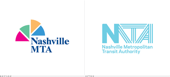
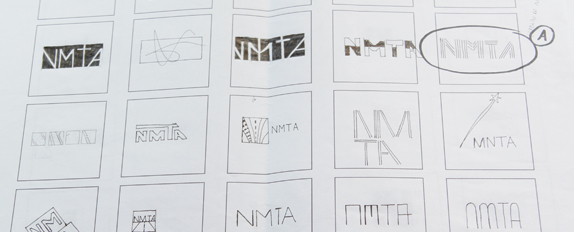
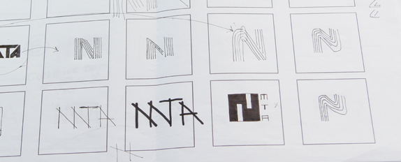
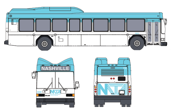
I started with a question: How do I express the spirit of mass transit through the letters N M T A?
I made the decision to simplify “Nashville MTA” to “NMTA.” In thinking about the future of where NMTA is headed, it made sense to condense what the public knows as “Nashville MTA” simply to, “NMTA.”
I then started working on over 130 thumbnails of how the letters N M T A connected and lived together. Once I landed on the mark, I began working on how to implement the logo into a system that would work and live legibly across many platforms. I learned that thumbnails are a necessary (evil) place to start on any project. If I had not taken the time to thumbnail out all of my ideas, I would have ended up with a typical, expected and likely boring logo. Thumbnailing made this logo soar.
I am looking to achieve this project being used!!! It would be great to see them take part (or all) aspects of what I have created.
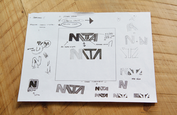
Sketches and Process
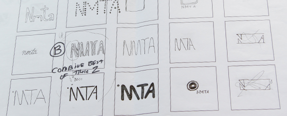
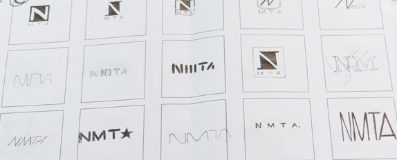
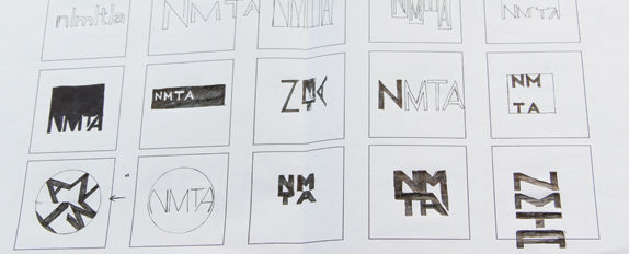
For the complete rundown of thumbnails please see here.
Solution
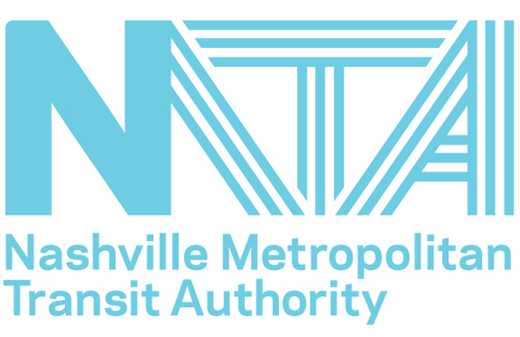
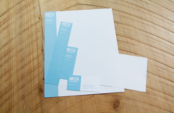
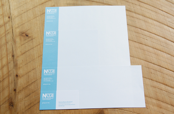
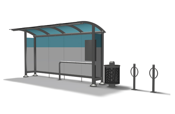
The blue line that is consistently used throughout the system hearkens back to the spirit of mass transit. The “zip” unifies the system as a simple element for a quick recognizable presence within its environment. The zip is dictated by whatever substrate or platform on which it lives (ex. vertical on stationary, horizontal on busses, etc.)
Logan Hartline’s Website


DATE: May.11.2010 POSTED BY: ArminCATEGORY: Transportation COMMENTS:

TAGS: acronym, logo, nashville mta, stripes, wordmark,


Celebrating the reality that print is not dead by showcasing the most compelling printed projects.

Corraling the most relevant and creative on- and off-line bits that pertain to the design community — and said community is openly invited and encouraged to add their hard-earned links.

Describing, tracking and explaining culture, commerce, politics, media, sports, brands — everything possible, really — through design.

Discussing, and looking for, what is relevant in, and the relevance of, graphic design. [Archives Only]

Encouraging creative diversity in the community through monthly, one-word challenges. [Archives Only]

Designing corporate and brand identities and full development of printed and digital matter for clients and us.