NASA by Neil Uhl
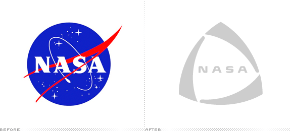
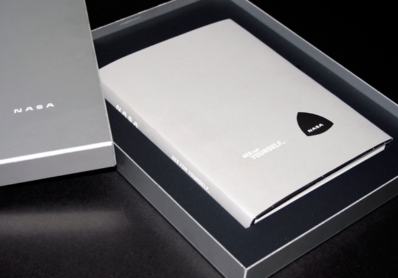
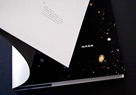
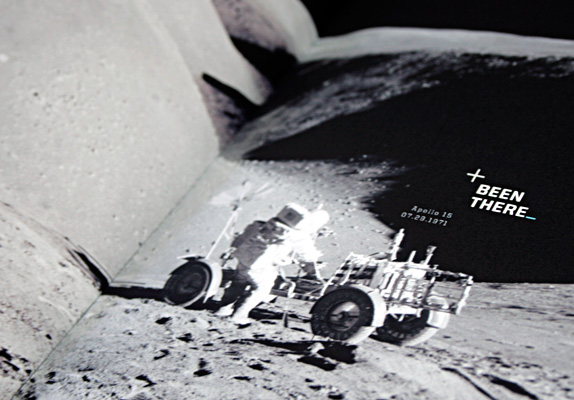
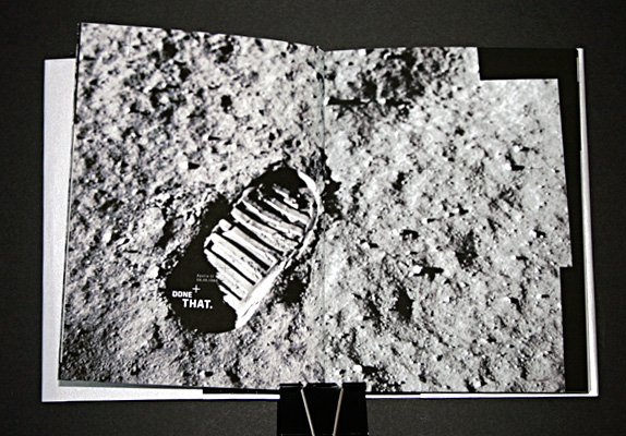
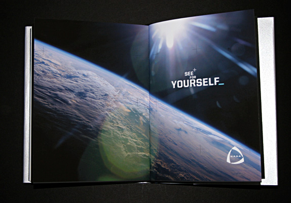
We were asked to choose any brand in decline and reinvent it: a new visual identity system as well as a reconsidered mission and scope as a company. The final deliverable was a book introducing the new brand, its audience, logo guidelines, and brand extensions.

Academy of Art University
San Francisco
Nature of Identity
Hunter Wimmer

Approach
I chose NASA, whose star is fading in the face of reduced funding and two space shuttle disasters. (Yes, it’s another NASA rebrand, but I’m intrigued by the periodic attempts by other designers, and wanted to join the conversation.) The most exciting part of the project was to imagine what NASA could theoretically become, given their brand’s potential.
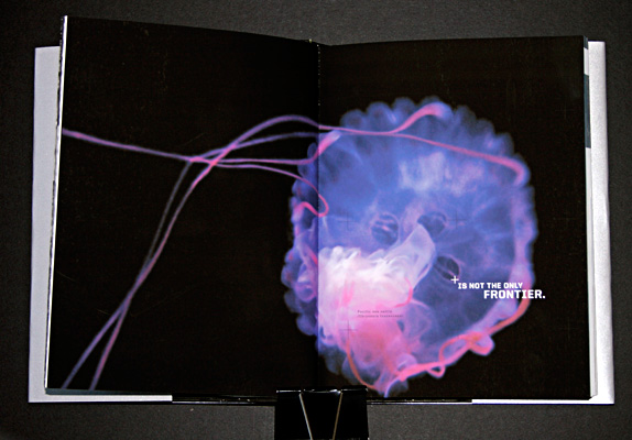
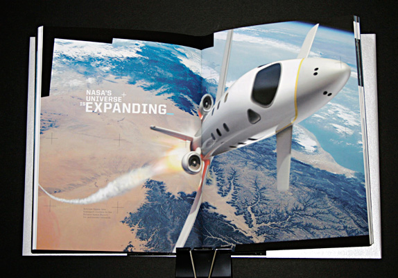
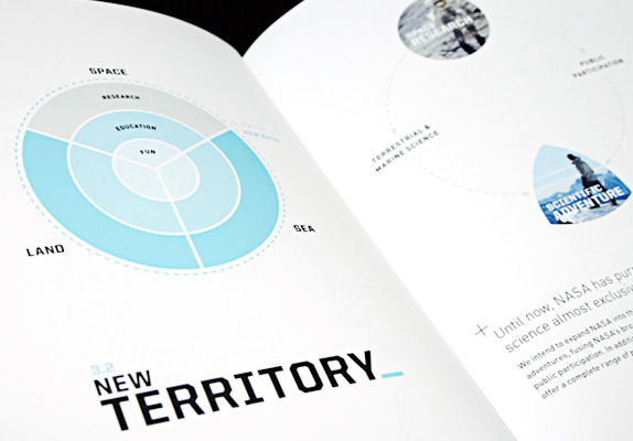
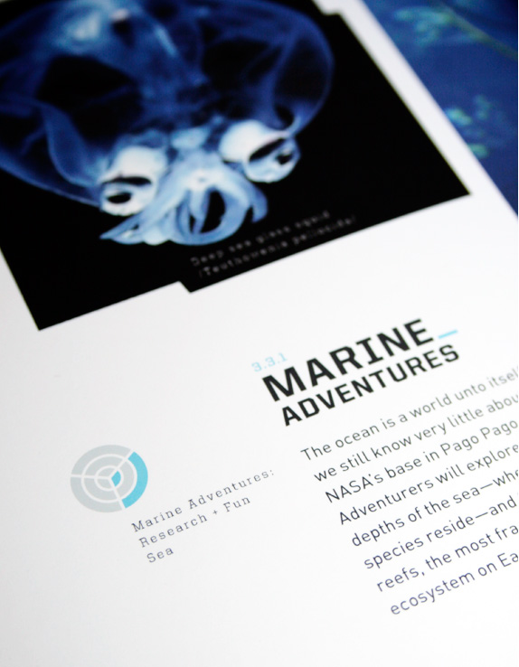
I began by getting down to the essence of NASA and then rebuilding its identity from that core concept. The most compelling part of NASA’s brand is the idea of an adventure into unknown places. I realized that space exploration is not the only way to do this: we already know more about the surface of Mars than we do about the bottom of the ocean. Why not explore that too? And why not engage the average person by letting them participate directly? This would restore NASA’s relevance without selling out their scientific credentials.
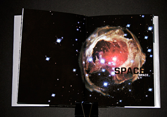
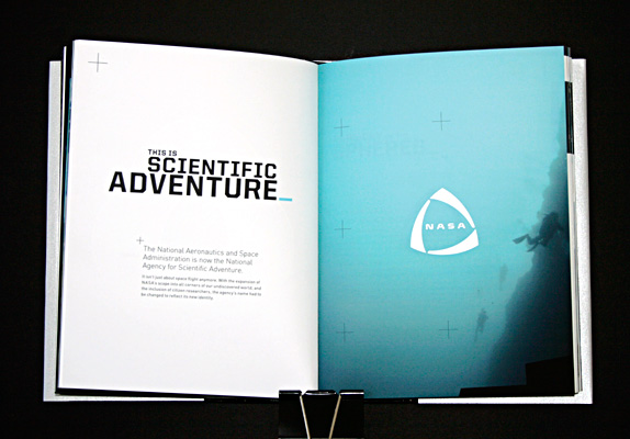
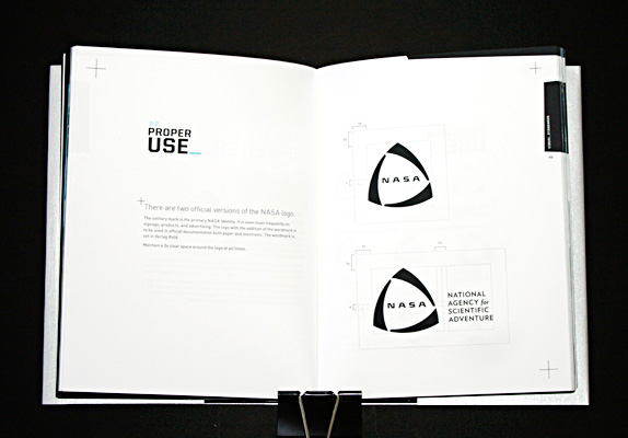
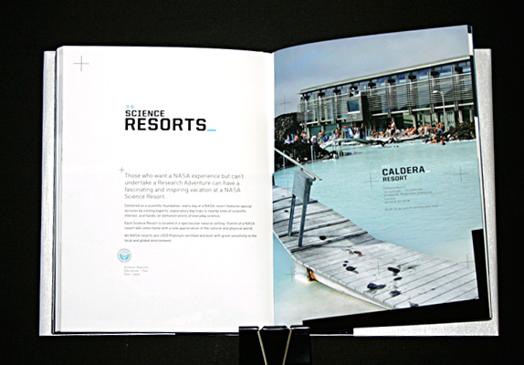
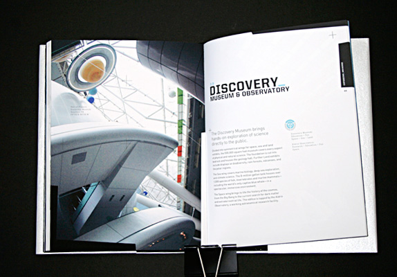
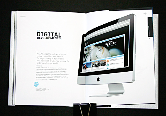
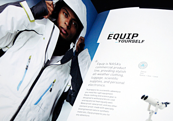
I ultimately turned NASA into the “National Agency for Scientific Adventure” with the tagline “See for Yourself.” I expanded the agency’s scope to include all parts of the natural world—space, earth, and sea—with an extensive range of products and services, from museums and public labs to science tourism and outdoor gear.
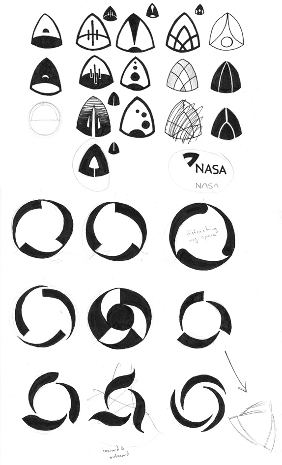
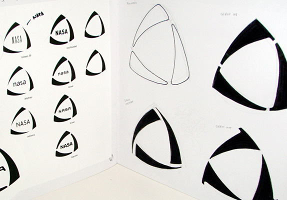
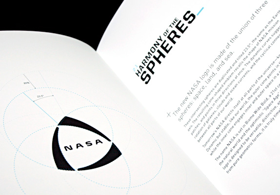
As to the logo, I thought it should be dynamic, technical, and timeless. Based on the pure geometry of three intersecting circles, the logo is an abstract icon that is both balanced and constantly in motion, like the dynamic stability of the physical world.

Sketches and Process

Solution


Neil’s Website


DATE: Apr.19.2011 POSTED BY: Lauren Dickens
 CATEGORY: Goverment
 COMMENTS:

TAGS: identity manual, NASA, student,


