
NASA by Corinne de Ocejo
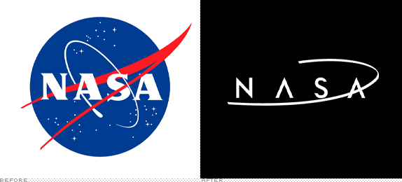
I'd been looking for a branding project to do this summer to keep in practice and I came upon the NASA redesign by BaseNow. While I do appreciate the premise I was not a fan, particularly when it gets smaller. So I set about doing my own rendition which you can view in the attached.

Pratt Institute
New York, NY
Student Project

Approach
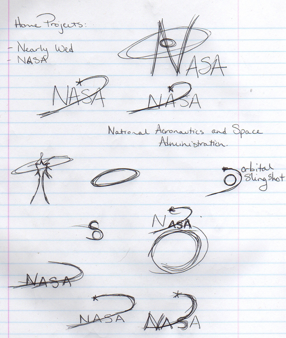
I started sketching in my notebook (attached). The first thing I knew I wanted to portray in the logo was an essence of what NASA does which in my mind is the exploration and mapping of the stars as well as taking us there and back. My mind immediately went to the notion of orbit and the scene in Apollo 13 where they talk about slingshot-ing the ship around the moon. I realized that this could easily be worked into the logo as the crossbar of one of the As. I played briefly on paper before moving to computer.
There, I quickly discovered that I needed to shift the orbit to the second A. I chose Neutraface Display and modified the As and the S (the N is beautiful and I wouldn’t change it). I also increased the kerning quite a bit not only to lay the orbit right but also to suggest the vastness of space.
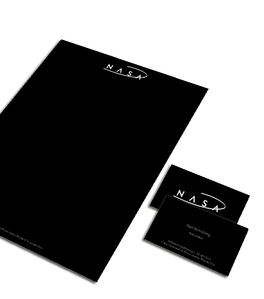
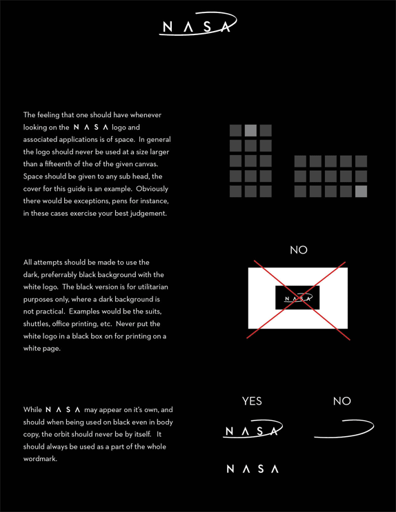
Ideally the logo would be primarily used in white on black. But could be used black on white for office purposes (or the ships, astronauts, etc. that need to be white). For more public facing items such as ads, invitations, yadda yadda it should be white.

Sketches and Process

Solution



Corinne de Ocejo’s Website


DATE: Jul.12.2010 POSTED BY: Bryony
 CATEGORY: Goverment
 COMMENTS:

TAGS: advertising, brand guidelines, logo, nasa, stationery,


