


Motorola by John J. Custer
To conceptually redesign a typographic treatment of a corporation of our choice.

University of North Texas
Experimental Type
Eric Ligon
Approach
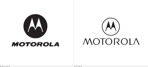
Motorola has repositioned themselves as a company that designs what I isolated as “fashionable technology.” The greatest example of this is the Motorola RAZR mobile phone. Sleek, slim, and sexy — all characteristics of modern day fashion models. The concept for this redesign was just that, “fashionable technology.”
Taking notes from Barney’s New York and Nordstroms while maintaining the 1950s flare of the iconic “M” logo the typographic redesign was born. Inspired by Gotham Light which with its contemporary style overpowered the hints of 50s just enough to create a respectable, charming, and sexy treatment that can bring Motorola into the 21st century. This typographic treat was designed to work with the “M” logo or is distinct enough to live on its own.
Sketches and Process
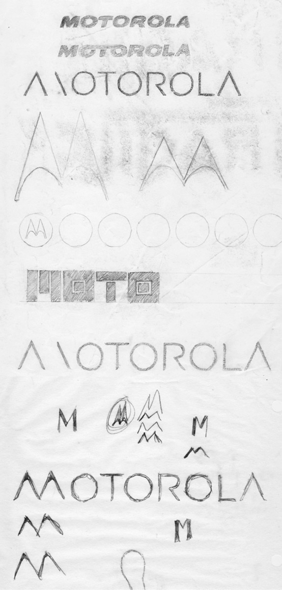
With assignment being for a Maymester class (2 1/2 weeks long) the pace for this assignment was on a whole other level than I had ever experienced in school (I know, I know, I have learned that the real world is just that way). The sketches were done quickly as this logo redesign assignment was meant to be executed in mere days.
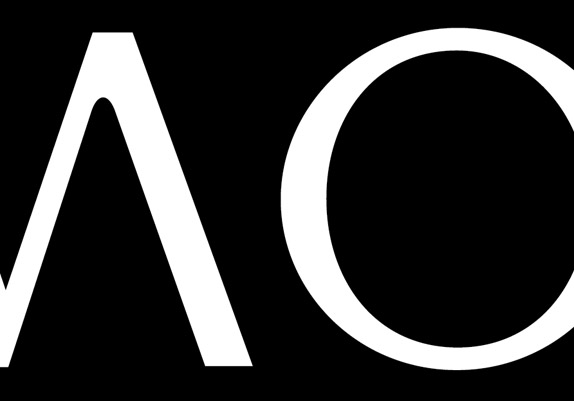
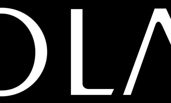
The logo type was derived from Gotham Light where I doubled the type and created a thick and thin on a modern day classic. This brought the type into a realm of sophistication that is shared by that of Barney’s New York and Nordstroms.
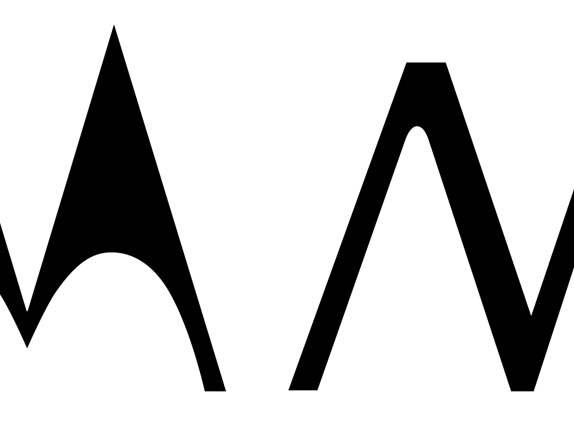
With such an iconic logo I refrained from altering it. This created a great challenge by having to create a logotype that was contemporary yet totally 50s at the same time. With that said the logotype took notes from the classic 50s mark. This is noticeable with the soft internal terminals of each letter.
Solution
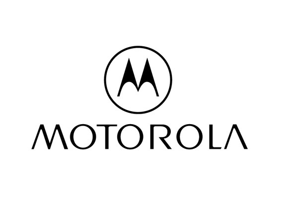
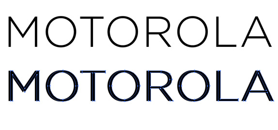
The new logotype shares the same thicks and thins as the “M” logo and is completely complementary due to this.
John J. Custer’s Website


DATE: May.13.2010 POSTED BY: BryonyCATEGORY: Consumer Product COMMENTS:

TAGS: logo, motorola, typography,


Celebrating the reality that print is not dead by showcasing the most compelling printed projects.

Corraling the most relevant and creative on- and off-line bits that pertain to the design community — and said community is openly invited and encouraged to add their hard-earned links.

Describing, tracking and explaining culture, commerce, politics, media, sports, brands — everything possible, really — through design.

Discussing, and looking for, what is relevant in, and the relevance of, graphic design. [Archives Only]

Encouraging creative diversity in the community through monthly, one-word challenges. [Archives Only]

Designing corporate and brand identities and full development of printed and digital matter for clients and us.