Mastercard by Lunar Thuhang Le

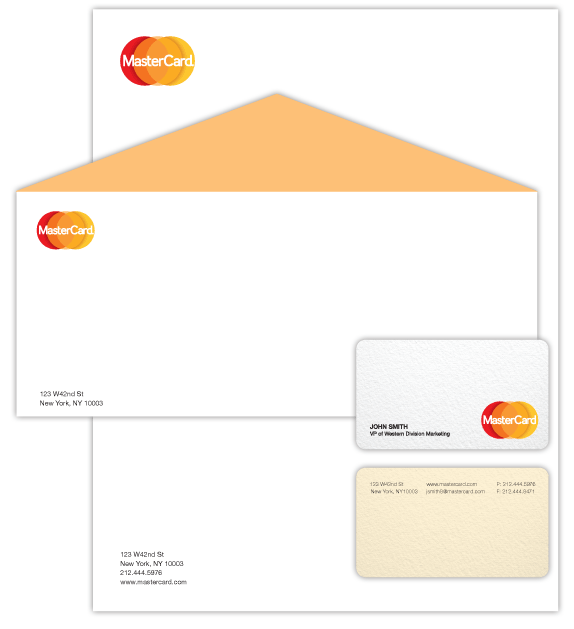
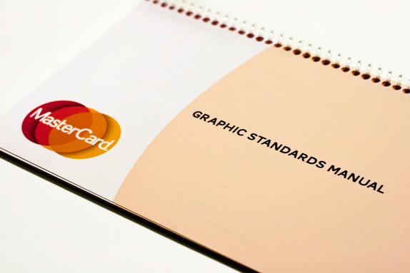
For this assignment I had to redesign a well-known logo. I was allowed to choose any company I wanted with the approval from my professor. Along with the redesigned logo I had to create a business card, envelope, letterhead and a business application. I also had to design a Graphic Standards Manual.

Baruch College
New York, New York
Branding Design
Terry Berkowitz

Approach
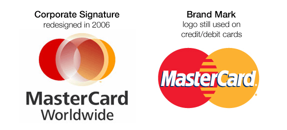
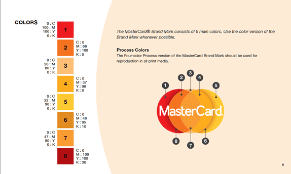
Currently MasterCard has a variety of different logos used for different situations. The most famously known is its “Brand Mark” which is seen on credit cards, debit cards and commercials. The logo that caught my attention however is its “Corporate Mark” which was redesigned in 2006.
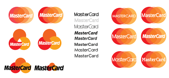
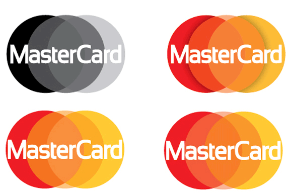
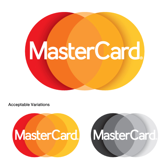
MasterCard’s different logos all resemble each other, with the exception of the Corporate Signature. Whether it is a rumor that the company plans on implementing this new logo as the new Brand Mark or not, I still felt that it should at least be similar. The logo I’ve created is meant to act as the Brand Mark and the Corporate Signature. For this reason I combined both aspects of MasterCard’s existing logos, and following its explanation of the new Corporate Mark, I decided to stick with three intercepting circles.
I originally wanted to take this on because it’s completely different from anything I’ve ever done. MasterCard is such a big corporation that I knew I couldn’t be too dramatic. I also knew that taking on this project would cause a lot of controversy because not many people know about the newly redesigned Corporate Mark and would criticize me for dramatically changing such a widely known logo.
I learned tremendously from this project. Perhaps changing the MasterCard mark is akin to altering the Nike Swoosh, but MasterCard needs a core identity to unify its different branches. The current Corporate Mark does not converse with the other logos and it should. My redesigned logo incorporates that core concept while remaining on the same level as the other logos. For this reason I would strongly suggest slowly rolling this logo out. First, using it in communications; and then switching it to being the Brand Mark.

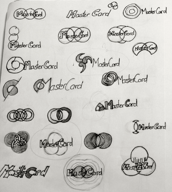
Sketches and Process

Solution


Lunar’s Website


DATE: Jun.16.2011 POSTED BY: Lauren Dickens
 CATEGORY: Financial
 COMMENTS:

TAGS: mastercard, redesign, student,


