Manischewitz by Ariel Braverman
ASSIGNMENT
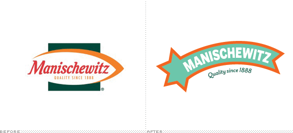
The assignment was to select a common, household product that you actually use and enhance the visual design to make a product that is more appealing to college-age users. The process involved redesigning the logotype as well as the overall identity design.


The assignment was to select a common, household product that you actually use and enhance the visual design to make a product that is more appealing to college-age users. The process involved redesigning the logotype as well as the overall identity design.

SCHOOL
Maryland Institute College of Art
Baltimore, MD
Maryland Institute College of Art
Baltimore, MD
COURSE
Graphic Design I
Graphic Design I
INSTRUCTOR
Ellen Lupton
Ellen Lupton

Approach
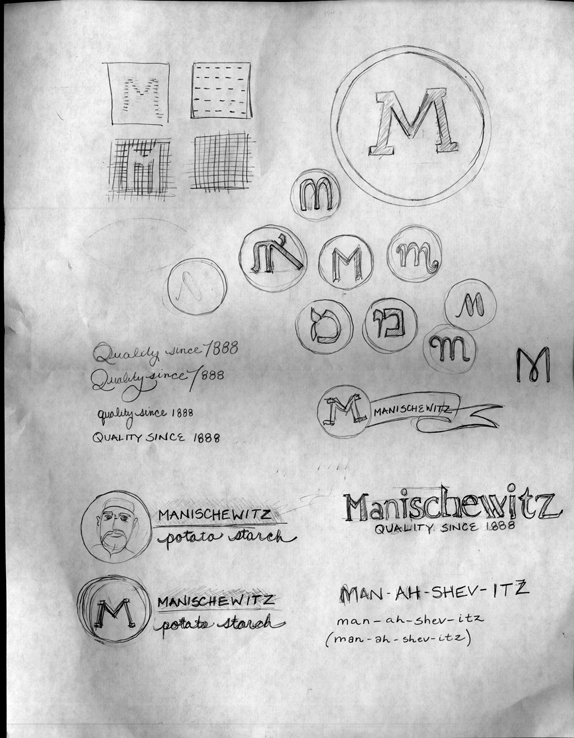
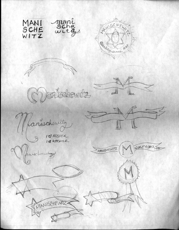
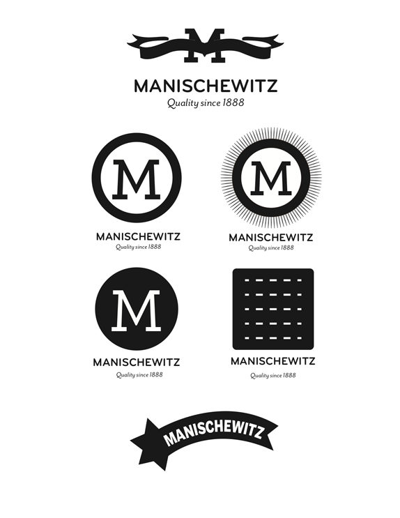
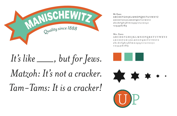
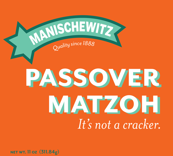
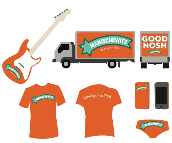
I approached the assignment by looking for ways to honor the 120+ year old Manischewitz company’s design history, while bringing it into a contemporary context. My goal was to bring a sense of humor and a brightness, and play up the kitsch factor of the well-known company.

Sketches and Process

Solution
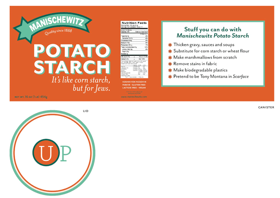
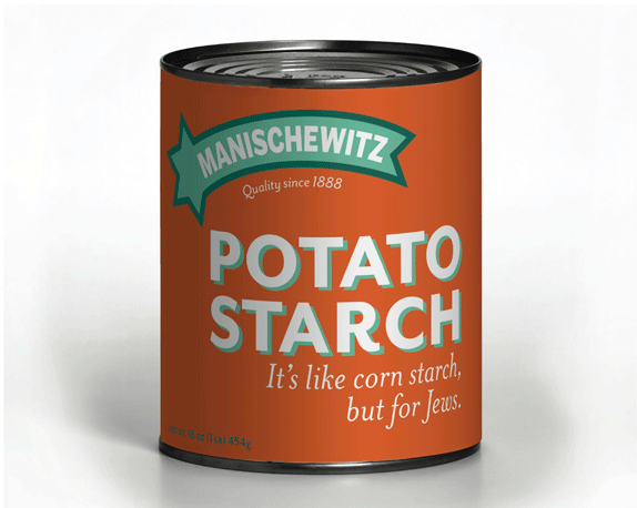
Like the nutrition information, the adherence to Kosher standards is a significant, mandatory component of Manischewitz product packaging. I did a minor update of Kosher for Passover symbol and gave it a prominent location on the lid of the canister.


DATE: Feb.01.2011 POSTED BY: Lauren Dickens
 CATEGORY: Consumer Product
 COMMENTS:

TAGS: identity, logotype, manischewitz, packaging,

Comments › Jump to Most Recent


