


Land Rover by Alisha Kurtz
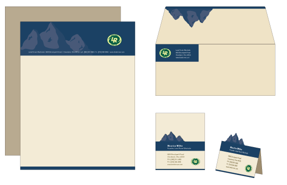
This was a semester long project where we were to select an existing brand and completely redesign everything. The end product was a corporate standards manual that would include all our new brand guidelines. Before doing thumbnail sketches we heavily researched the company and learned anything and everything about the company and their competitors. Then came the logo design, stationery, website, collateral, and standards manual.

Bowling Green State University
Bowling Green, OH
Brand/Identity Design
Matt Davis
Approach
I wanted to draw upon Land Rover’s rich history and tradition as my inspiration for the new design. I did not think a brand with such integrity would completely change their identity in one shot, so I decided to create more of an evolution of the logo instead of a complete redesign. This was one of the most intense projects I’ve ever completed, and one thing I learned was that the language of a company is just as important as the new design. It wasn’t until I developed the language for the new Land Rover, that I could see the standards manual really coming together in its design.
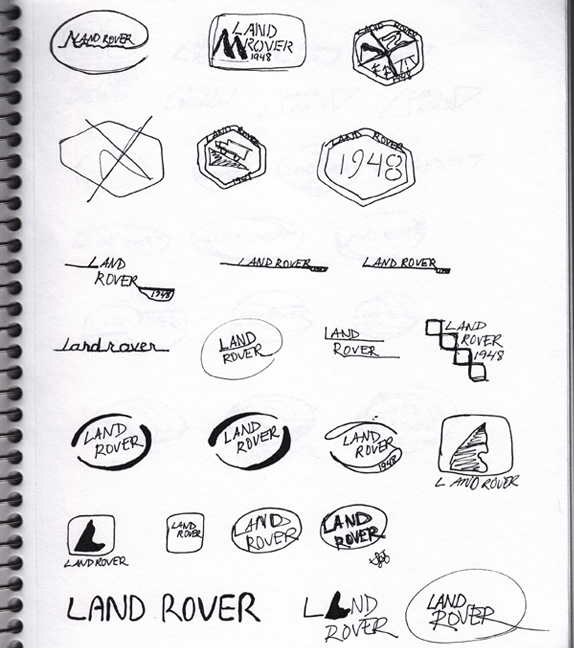
Sketches and Process
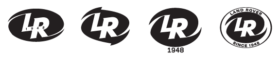
Solution
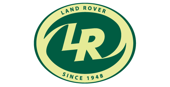
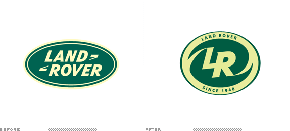
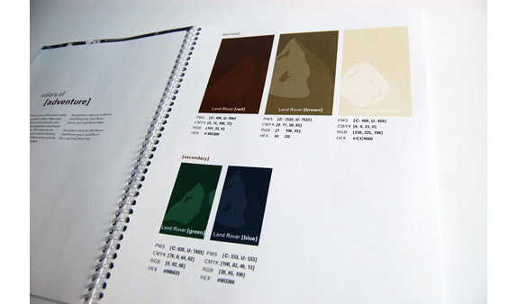
Final two-color logo.
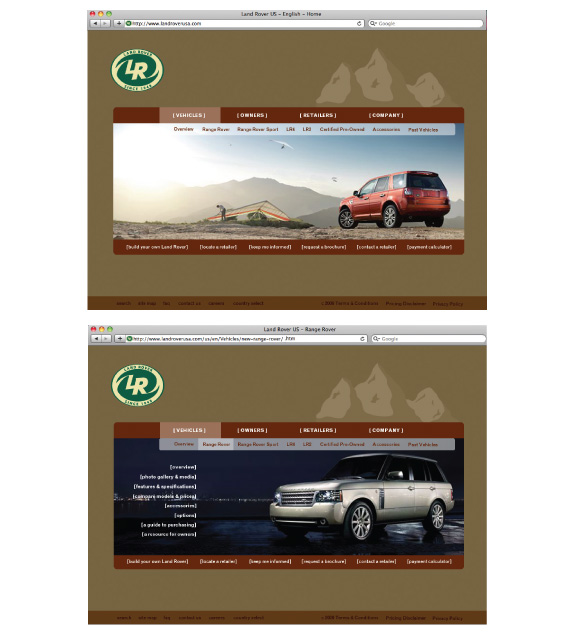
Homepage and Interior page.
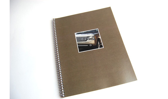
This is the cover of the Graphic Standards Manual. I wanted to tease the viewer a little bit by not revealing the new logo right away on the cover.
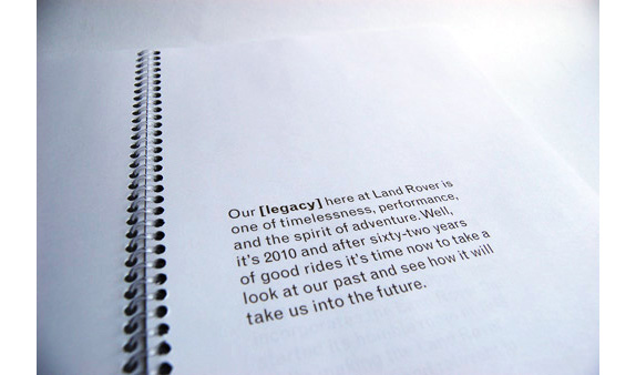
In the introduction I developed the language that would continue to be used throughout the piece. I wanted to build up anticipation for the new identity system, as well as inspire any employees to understand the meaning of the brand so that they would take care in following the guidelines.
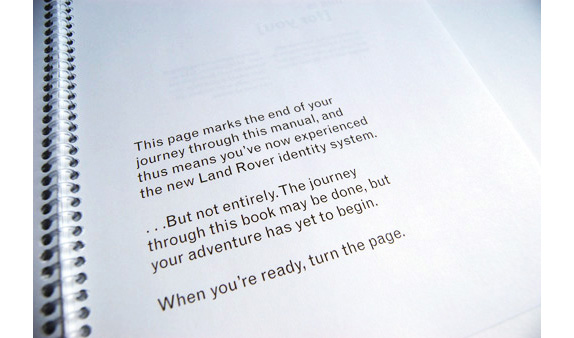
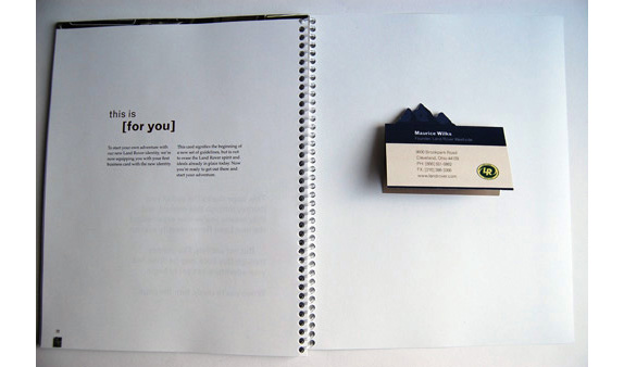
The last page of the manual ends with the employee finding their very own business card, signifying that the change is now official and the new identity system is now in effect.
Alisha Kurtz’s Website


DATE: Jun.25.2010 POSTED BY: ArminCATEGORY: Automotive COMMENTS:

TAGS: guidelines, land rover, monogram,


Celebrating the reality that print is not dead by showcasing the most compelling printed projects.

Corraling the most relevant and creative on- and off-line bits that pertain to the design community — and said community is openly invited and encouraged to add their hard-earned links.

Describing, tracking and explaining culture, commerce, politics, media, sports, brands — everything possible, really — through design.

Discussing, and looking for, what is relevant in, and the relevance of, graphic design. [Archives Only]

Encouraging creative diversity in the community through monthly, one-word challenges. [Archives Only]

Designing corporate and brand identities and full development of printed and digital matter for clients and us.