International Student Identity Card by Jordan Jacobson

We were asked to identify an organization, business, audience/niche group that had a problem that could be solved though design.

University of Kansas
Lawrence, Kansas
Designing for Change
Jeremy Shellhorn

Approach
The reason I chose to redesign the International Student Identity Card (ISIC) grew from my own experiences with ISIC during my semester studying abroad in Germany. I got the ISIC fully intending on using it to get discounts on food, travel, retail, etc, only to later find that I kept forgetting to use it. There was a lack of communication between ISIC and the cardholder and they could clearly benefit from a strong visual communication revamp.
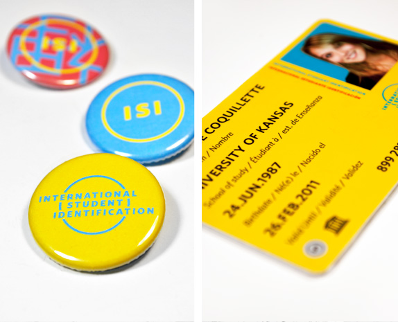
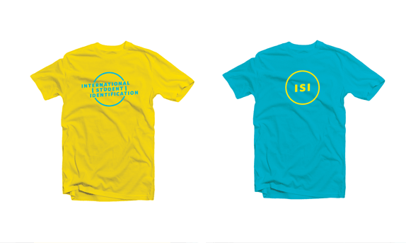
I wanted to keep the look and feel simple, bold, and youthful. Since ISIC is a global entity, it needed to have international appeal as well. I changed the name to International Student Identification (ISI) to get rid of the risk of awkward redundancy with the word card. I kept the circular aspect of the old logo, and ended up with a typographic lockup that subtly suggests the act of crossing/traveling/intersecting the globe.
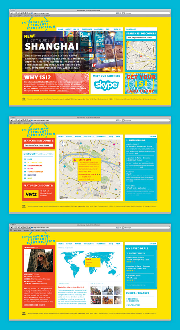
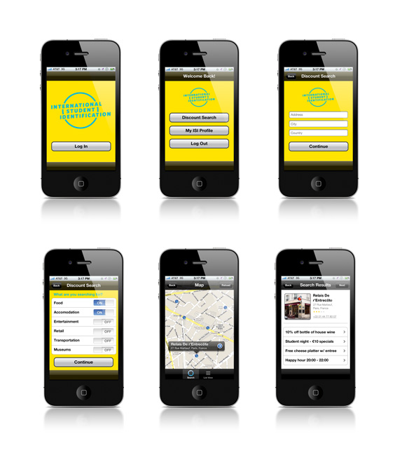
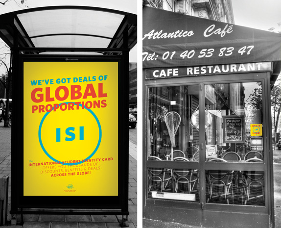
The full brand relies on advertisements, a reworked website and environmental aspects to establish a more direct, bold and clear communication model so that both ISI and the cardholder benefit in their relationship. The mark is referenced elsewhere as the brand voice begins to become apparent with speech bubbles and an abbreviated ISI mark to use on the actual card and in environmental pieces.

Sketches and Process


Solution




Jordan’s Website


DATE: Jun.14.2011 POSTED BY: Lauren Dickens
 CATEGORY: Service
 COMMENTS:


