Ikea by Greg Lindholm
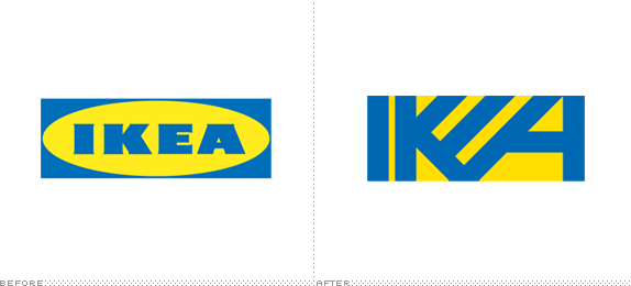
We were asked to rework a logo. Our choices were restricted to The Arbor Day Foundation, 2012 Olympics, IKEA, or Myspace.

Minneapolis College of Art and Design
Minneapolis, Minnesota
Graphic Design I
Neal Peterson

Approach
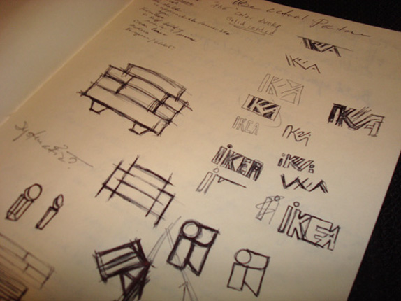
I approached the assignment by first doing a brand/company evaluation of each option. By filtering through my notes I determined that I wanted to redesign the IKEA logo based on the fact that I felt their current logo was missing its company’s point of view (I’ll admit that my Swedish ancestry was pulling me in that direction as well). My research notes found more of a modern, sleek and refined sense of design and business styles than their current logo portrays. Their current logo is pretty flat, in a what-you-see-is-what-you-get manner. In a lot of ways that did not fit with the image of IKEA that I had found. IKEA strives to give the consumer a great piece of stylish furniture at a great price, which is followed by an immediate interaction with the furniture by putting it together. So my thought process started by thinking about how I could achieve a logo that a customer could interact with a bit more, while being more modern. I wanted to design a logo that better fit this image of IKEA, without taking away some of their instant recognition, by shifting the logo into more of a symbol than the standard typeset lettering.

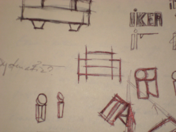
Sketches and Process
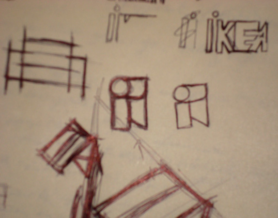
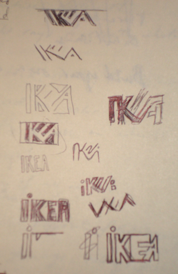
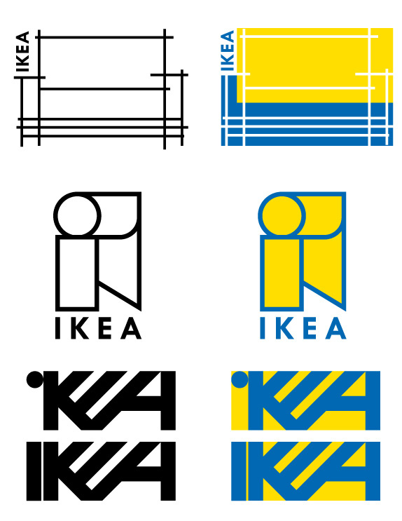

Solution

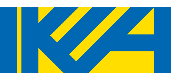
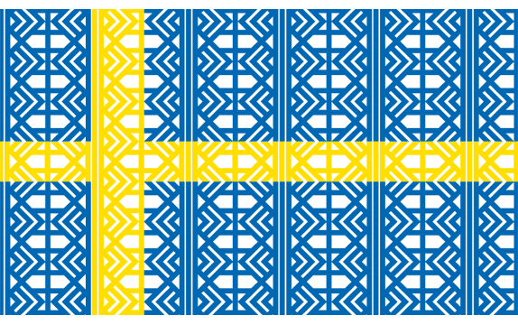
The logo can work as a pattern to create different things.


DATE: Apr.29.2010 POSTED BY: Armin
 CATEGORY: Retail
 COMMENTS:

TAGS: ikea, logo, pattern, typography,


