Hoopes Vision by Skyler Bradsby
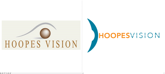
This was in our Visual Communications program where we could choose to work on a variety of projects or one big project. I recently attended a student portfolio review hosted by AIGA SLC Chapter they mentioned I lacked showing an identity system so I took that critique and decide to develop a rebrand of an existing company.

ITT-Technical Institute
Murray, Utah
Design Project
Kevin Davenport and Ray Rackiewicz

Approach
I approached this assignment asking myself a simple question such as, Why did they need a rebrand?
The previous logo didn’t signify the professional doctors that worked in the facility, the safe environment speaking with you one-on-one to discuss your options and the latest advances in technology to provide a safe surgery with your vision.
I decided I wanted to create an entire new identity creating stationery, website comps, applying logo in there facility and even creating possible campaigns.

Sketches and Process
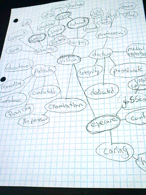
Mind mapping certain key words describing the company, finding out which key elements would best possibly represent them within the new logo. I am really inspired by David Airey, I used his “Logo Design Love” book to help with the process.
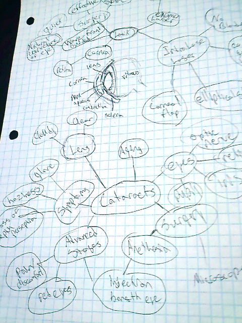
I narrowed it down with 2 procedures they focus majorly on Lasik Surgery and Cataract Surgery. Which helped me figure out a way to represent the eye using different views instead of the tradition eye shape logos. Hoopes Vision having performed over 42,000 LASIK/refractive and over 70,000 vision correction surgical procedures became one of the leading industries in the vision care.
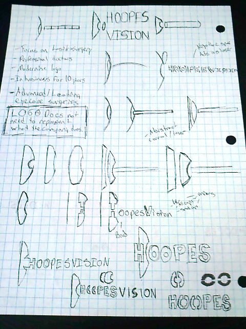
Initial sketching phases I had a few variety of concepts. Focusing it down to a laser, portraying an abstract eye or a word mark with Hoopes Vision.
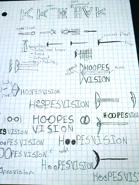
Further concepts for sketching a symbol as an abstract eye.
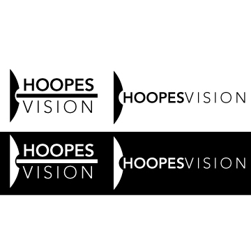
Initial concept executing it onto the computer if you can imagine a side view of your eye with the cornea flap removed which then the laser can focus on you pupil.
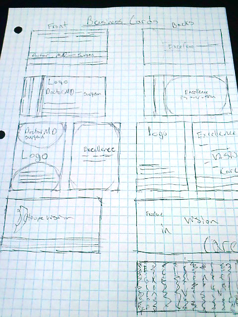
Initial sketches of business cards.
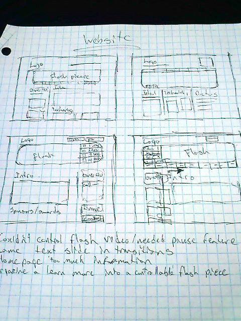
Initial sketches evaluating the website and the organization of all the information.
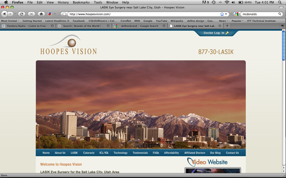
Before website had some issues including the huge flash banner which serves just as a distraction to all the valuable information that is available on the site.

Solution
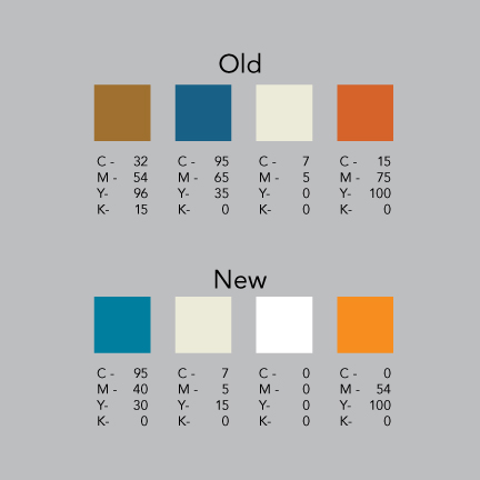
Their old color scheme felt dull needed to add more vibrants to show it’s a refreshed up to date technology, a sense of warmth and comfortable environment but yet still an professional experience.
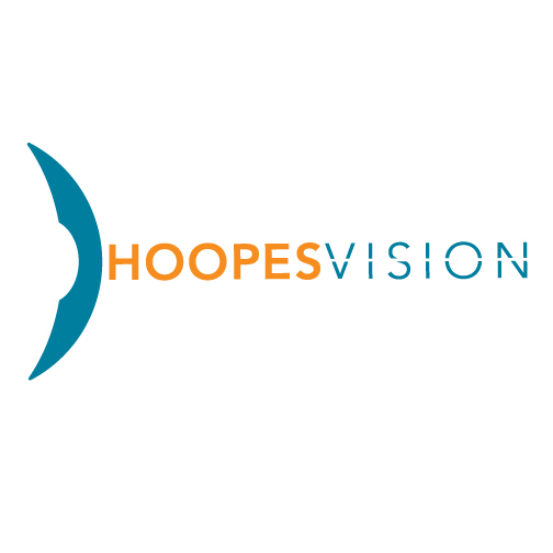
Final concept. Smoothed out the edges to better represent the curvature of the eye, the outside edge of the symbol is the cornea part of your eye and in the negative space is the retina. Subtle line to show the direct focus on vision also representing a laser.
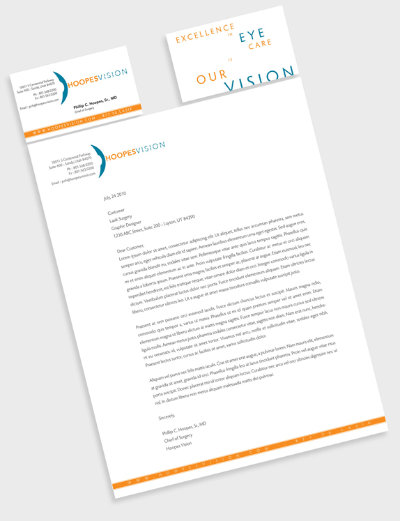
Had some fun on the back of the business cards playing with typography to add more visual interest to the company’ motto. Business cards front and back including the letterhead.
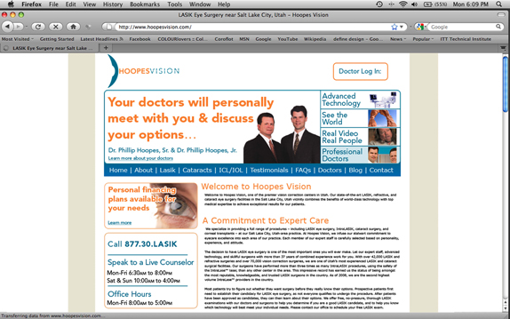
New website simplified the color scheme to match the rebrand. Reduced the flash banner to not so be so distracting rather with links to further information to help you gather information about this company.
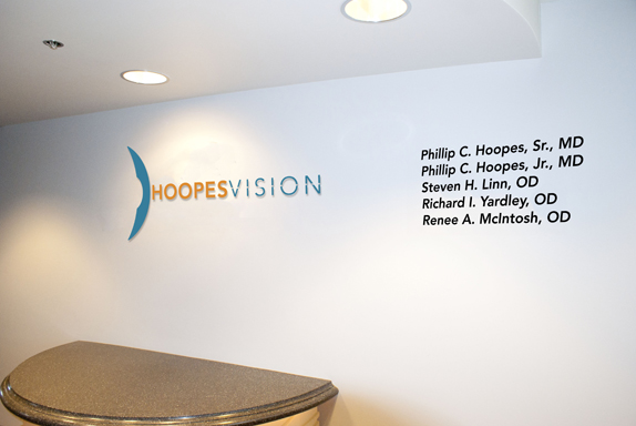
As you take the elevator up to the facility you exit the elevator this will appear on the wall, showing the new company’s logo within the facility.
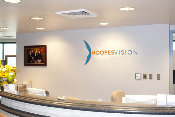
Behind the receptionists.
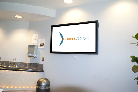
Inside in the facility at the waiting room as a static image on the TV shows, when it is not being used to help build the new identity.
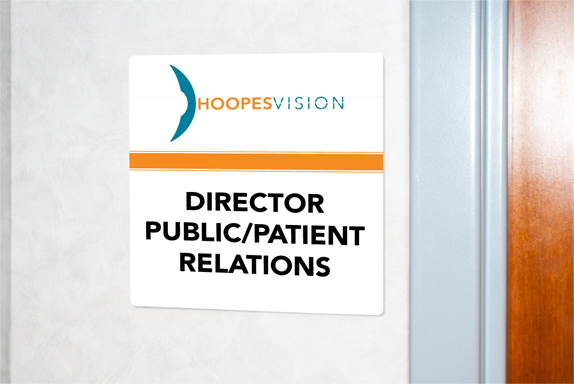
Next to each employee’s office. These will be plastered on the wall for each employee and specific positions in the company.
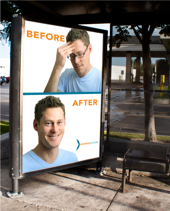
Campaign concept I developed to help expand there rebrand to the audience. People will be able read and understand the message quickly while driving also the people who are awaiting for the bus.
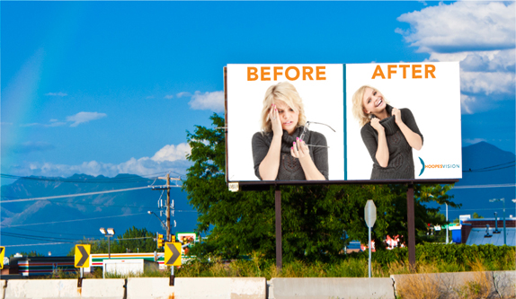
The campaign concept could also be applied to billboards.
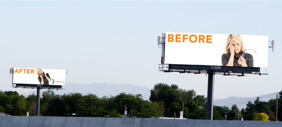
This concept could also be applied across multiple billboards to convey the message.

Skyler Bradsby’s Website


DATE: Sep.29.2010 POSTED BY: Bryony
 CATEGORY: Service
 COMMENTS:

TAGS: advertising, billboard, hoopes vision, icon, signage, stationery, typography, website,


