Goya by Jessica Suhr
ASSIGNMENT
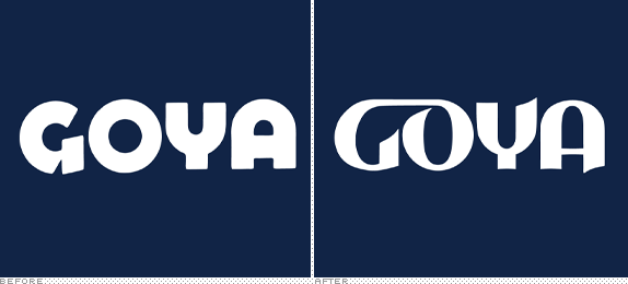
The assignment was to redesign an existing logo of a well known food company.


The assignment was to redesign an existing logo of a well known food company.

SCHOOL
University of Louisville
University of Louisville
COURSE
Letterforms II
Letterforms II
INSTRUCTOR
Steve Skaggs
Steve Skaggs

Approach
I approached the assignment from the notion that Goya is in the market to sell products, and that they’d probably like to sell more. To me it seemed that Goya was just the go to product when someone needed something Spanish but I felt they could be more than that. I wanted to update their logo so that they were something people sought out in the market and not just something they bought when they had to. In the end I realized that the original wood block type was charming, but I feel that they would sell a lot more product with a rebranding.

Sketches and Process




Solution

First solution.

Second solution.

Jessica Suhr’s Website


DATE: May.14.2010 POSTED BY: Bryony
 CATEGORY: Consumer Product
 COMMENTS:

TAGS: alternatives, goya, ligatures, logo, typography,

Comments › Jump to Most Recent


