


Google by Tom van de Velde
We were instructed to rebrand one of three organisations: Google, NASA or the ICA. The Graphic Design course at Brighton University has little to no emphasis on brand/identity design, it's far more directed at "image making" in my opinion. As such, this is a small and quick project — quite quick, actually, just in 24 hours. No further restrictions.

University of Brighton
Brighton, England
Graphic Design
Martin Andersen, Siobhan Keaney and Chris Bigg
Approach
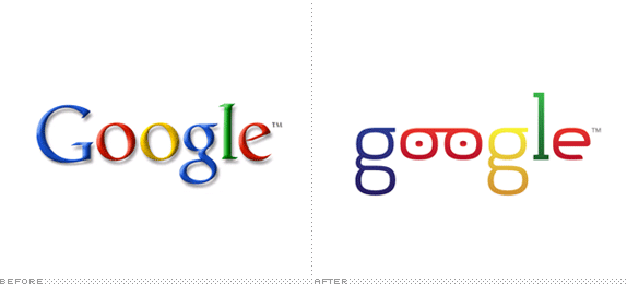
Google is one of those untouchable brands, if such a thing indeed exists. It’s truly awful but at the same time it’s appealing, though I can’t explain why. The letterforms bother me much more than the clownish colour-scheme. It’s particularly the “G” and “e” that I dislike. I chose to evolve the current mark rather than starting from scratch. This seemed more realistic (mathematicians don’t like change) and harder to pull off (to avoid this becoming a bit of fun instead of a serious effort). Using the “g” from Soho Std Light, the rest of the letters were drawn in Illustrator using the same proportions throughout. A bit of gloss and gradient on the letters to give the mark a sense of depth and plasticity. The mark would be supplemented (or even replaced, dependent on context) by bold illustrations.
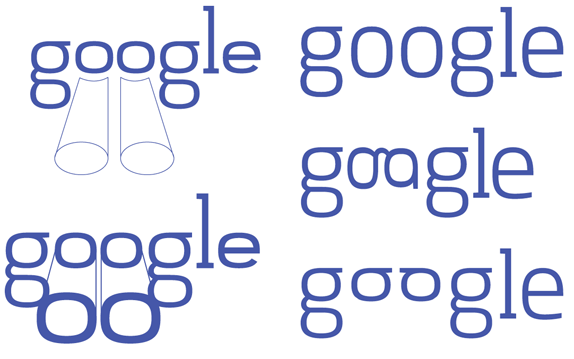
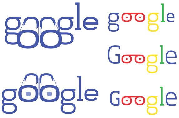
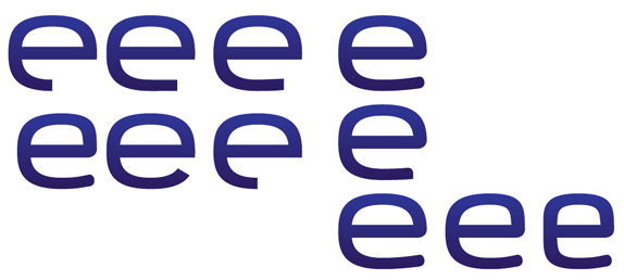
Sketches and Process
Solution
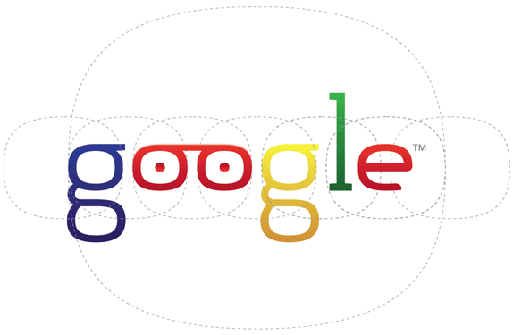
Final logo, with the “Hamburger” Spacing Method.
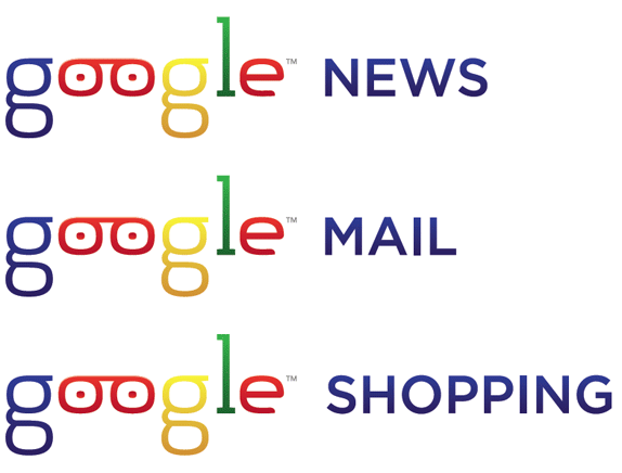
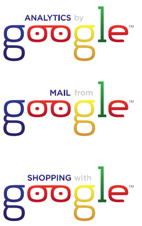
Google services unified.

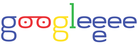
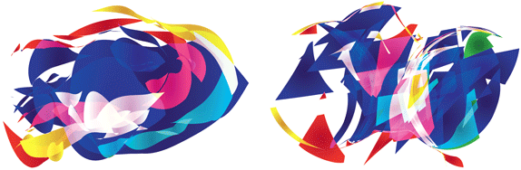
Above and below: Bold, abstract illustrations that could replace the logo.
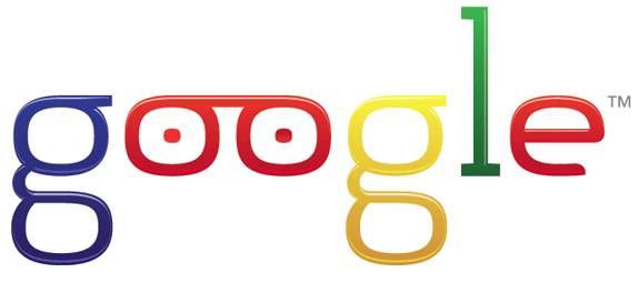
Final rendering with additional gloss and gradients.
Tom van de Velde’s Website


DATE: Apr.19.2010 POSTED BY: ArminCATEGORY: Technology COMMENTS:

TAGS: google, illustration, logo, wordmark,


Celebrating the reality that print is not dead by showcasing the most compelling printed projects.

Corraling the most relevant and creative on- and off-line bits that pertain to the design community — and said community is openly invited and encouraged to add their hard-earned links.

Describing, tracking and explaining culture, commerce, politics, media, sports, brands — everything possible, really — through design.

Discussing, and looking for, what is relevant in, and the relevance of, graphic design. [Archives Only]

Encouraging creative diversity in the community through monthly, one-word challenges. [Archives Only]

Designing corporate and brand identities and full development of printed and digital matter for clients and us.