


Fujiya Japanese Cuisine by Chloe Scheffe
Redesign the logo of a local restaurant of your choice. Also create a stationery system, standards guide, menu and three collateral pieces of your choice.

Seattle Central Community College
Seattle, WA
Graphic Design VI
Tom Lenon
Approach
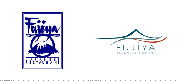
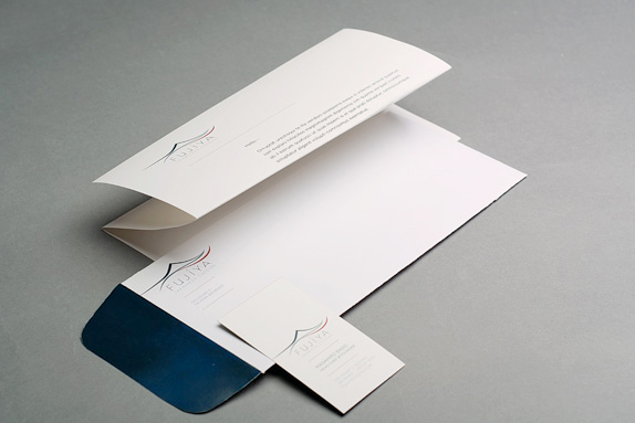
Fujiya Japanese Cuisine has long been a Pacific Northwest staple for delicious sushi and Japanese cuisine. The identity, however, is generic, inconsistent and painfully dated. In this hypothetical redesign, I brought Fujiya into the present with a sleek logo featuring a stylized image of Mt. Fuji, also reminiscent of the visual lines of sushi when presented to customers on plates. I went through a lot of iterations of the image before I landed back on the mountain and ocean scene, deciding it would be best to A) not stray too far from the original mark, and B) leave the meaning of the name Fujiya intact. The wordmark is custom Kabel with a fun dot over the “i” to remind viewers of the friendliness of the establishment and staff.
All in all, this redesign is about staying true to the original intentions of Fuijiya and giving a nod to classic Asian design, while creating a presence that visually matches the level of renown and respect the restaurant has earned over the years.
Sketches and Process
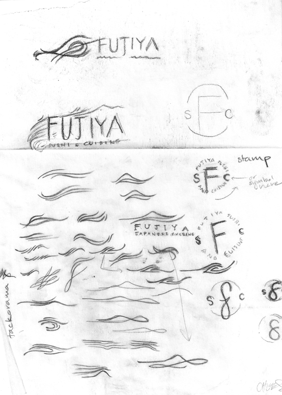
An early round of pencil sketches.
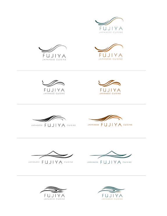
Computer sketches. Originally my choice for the final mark was the third down, but after feedback from classmates and some time refining it I realized it was more representative of an airline or beauty product, and returned the mountain scene concept.
Solution

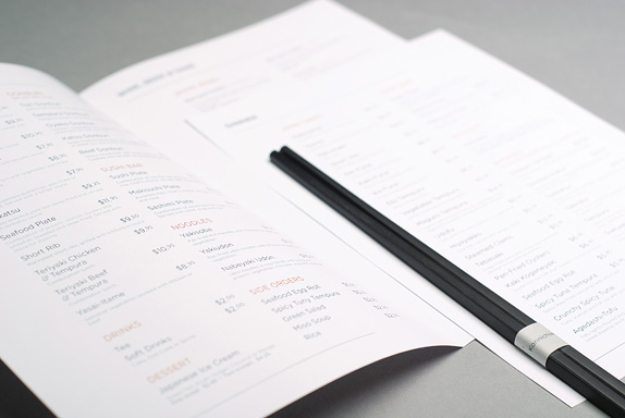
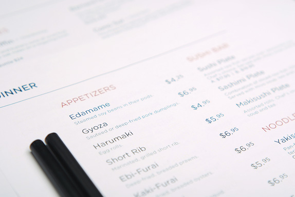
The menu is clean and spacious, and items are organized by color to improve ease of reading.
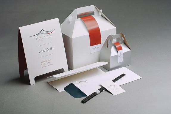
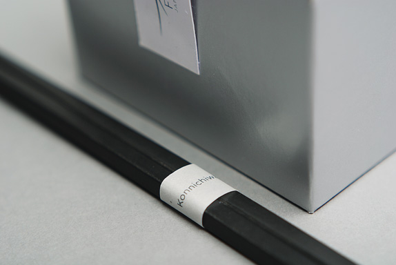
To round out this identity I designed a sandwich board to direct customers to the restaurant’s slightly out-of-the-way location, and two take-out boxes, which very purposefully avoid the Asian cliche. The small, silver one is intended exclusively for sushi, Fujiya’s speciality.
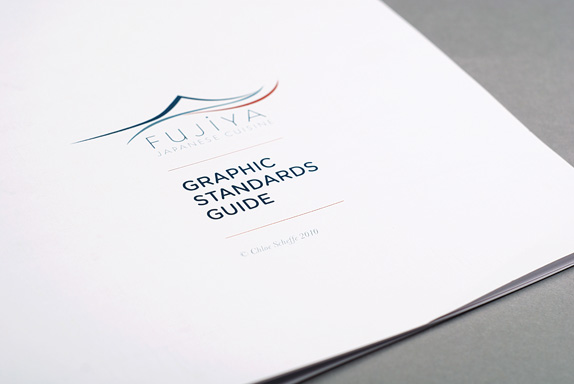
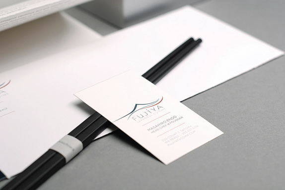
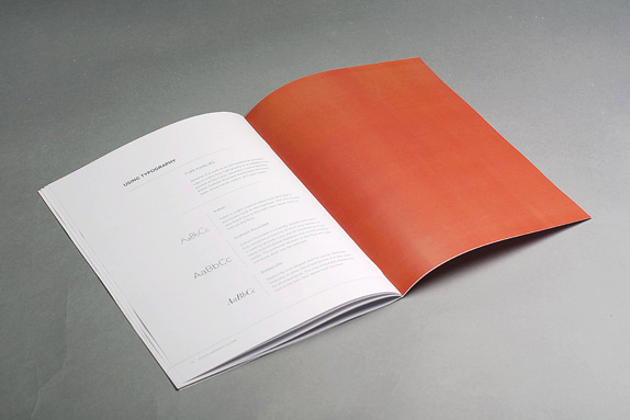
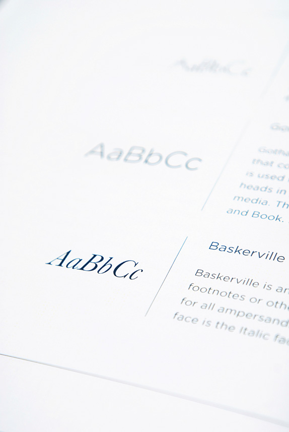
I also created a standards guide, which lives on the same asymmetric right-aligned grid as the menu and letterhead.
Chloe Scheffe’s Website


DATE: Jun.09.2010 POSTED BY: BryonyCATEGORY: Food COMMENTS:

TAGS: brand book, collateral, fujiya, icon, logo, menu, packaging, stationery,


Celebrating the reality that print is not dead by showcasing the most compelling printed projects.

Corraling the most relevant and creative on- and off-line bits that pertain to the design community — and said community is openly invited and encouraged to add their hard-earned links.

Describing, tracking and explaining culture, commerce, politics, media, sports, brands — everything possible, really — through design.

Discussing, and looking for, what is relevant in, and the relevance of, graphic design. [Archives Only]

Encouraging creative diversity in the community through monthly, one-word challenges. [Archives Only]

Designing corporate and brand identities and full development of printed and digital matter for clients and us.