FAO Schwartz by Alana Zawojski
The assignment was to select and research a well-known but dying brand and revive it by giving it a new purpose and identity system.

Academy of Art University
San Francisco, CA
Nature of Identity
Hunter Wimmer

Approach
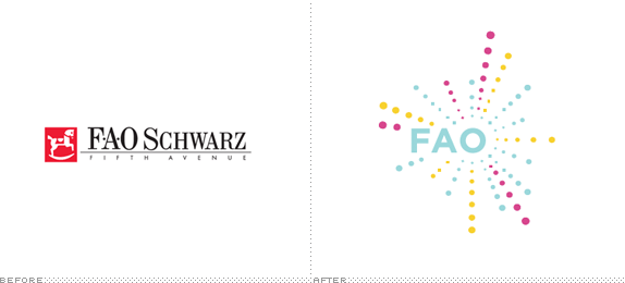
I selected FAO Schwarz and decided to build on their history of imagination and fun by developing a new direction for the brand that takes play out of the toy store and into the everyday life of the adults who grew up with FAO Schwarz. They still associate the brand with fun and entertainment, but don’t play with toys in the traditional sense. Instead, they play by interacting with gadgets, socializing, partying, and sports. The new “FAO” shifts their focus from retail to event planning and adventures while preserving the distinctiveness and integrity of the original brand.
The project required that we create a mission statement and rebranding objective. We were to identify our refreshed brand identity through several research methods, some of which included a before and after brand grid exercise, mood boards, and an audience profile. This resulted in a refreshed logo and identity guidelines book.
I wanted adults to turn to FAO for their current version of “play time.” The new identity would convey a sophisticated lifestyle infused with the playful experiences that people expect from the brand.

Sketches and Process
Brand Grid for the existing FAO Schwarz.

Brand Grid for the refreshed FAO.

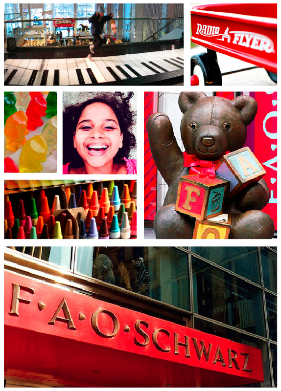
Mood board.
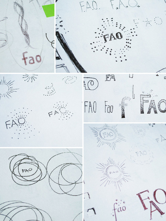
Initial sketches.

Three directions were selected for refinement.
Energy: This direction evoked the energy of play through its spontaneous ellipses. It hints at the carefree attitude toward fun and conveys the feeling you get from spinning in circles.
Burst: Burst is about radiating light. Its delicate lines are appropriate for the elegant celebrations it will represent.
Sparkle: Sparkle is the most playful direction and was inspired by the movement of bubbles in a champagne glass. Sparkle was selected for further refinement and evolved into the final logo.
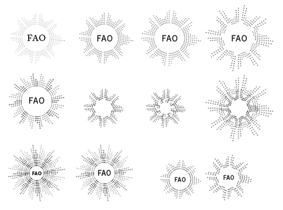
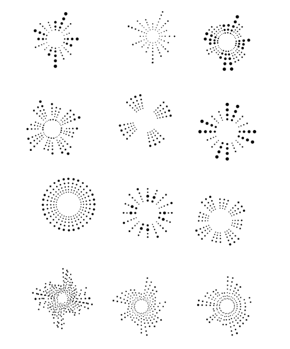
Sample of digital sketches.

Solution
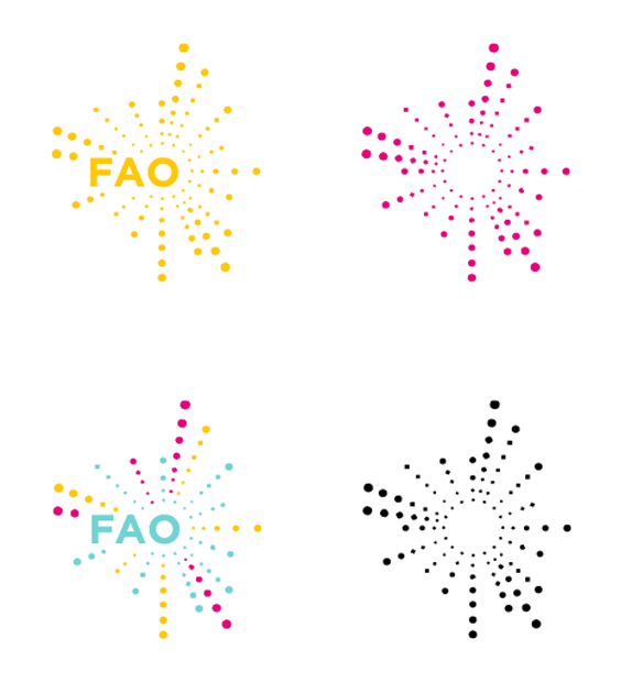
The refreshed logo conveys the excitement and energy of FAO to their new audience. The dots look like bubbles bursting forward in every direction and are intended to make the new mark bold, playful, and classic.
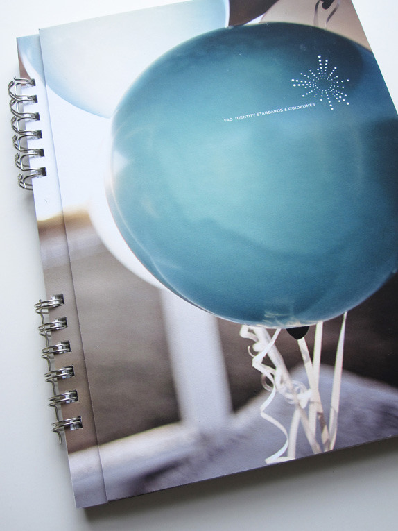
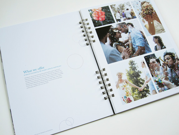
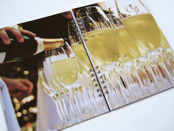
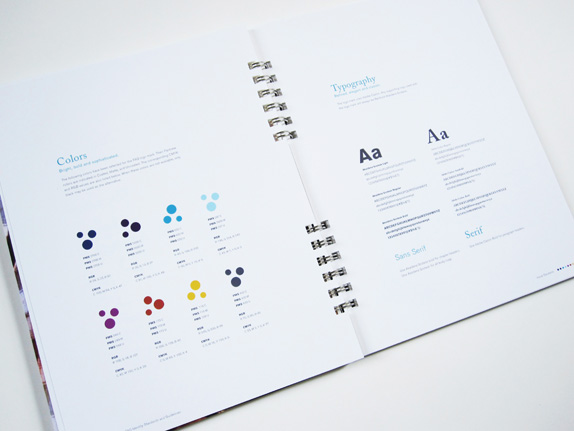
Sample spreads from identity guidelines manual.

Alana Zawojski’s Website


DATE: Apr.30.2010 POSTED BY: Armin
 CATEGORY: Retail
 COMMENTS:

TAGS: fao schwartz, guidelines, logo, mood board,


