Experience Music Project + Science Fiction Museum by Marissa Winkler
We were asked to choose an existing company, organization, or product with either global or local impact to redesign. The final deliverables were logo (with variations if needed), applications including stationery, and a brief brand book detailing the specifications of the identity.

Parsons the New School for Design
New York, NY
Graphic Design 2
Juliette Cezzar

Approach
Approaching the assignment, I immediately thought of the Experience Music Project and Science Fiction Museum in Seattle. The EMP has been in the Seattle Center since 2000 housed in an awesome Frank Gehry building, with the SFM opening in one wing in 2004. When both the divisions officially merged in 2007, the individual identities disappeared and they were left with nothing. I picked this to redesign because I felt that it would be a huge challenge to connect the two museums, one dealing with the experience of Rock ‘n’ Roll and the other the legacy of Sci-Fi. The new and re-branded Experience Music Project + Science Fiction Museum will exploit the uniqueness of the space, both in venue and architecture and in singularity of experience. There is a need to connect both the EMP and SFM instead of having each live as separate identities that sometimes come together. The museum still struggles financially, so the re-brand would aim to position the institution as an appealing and exciting venue with an emphasis on experience and participation in the hopes of attracting new audiences.

Sketches and Process
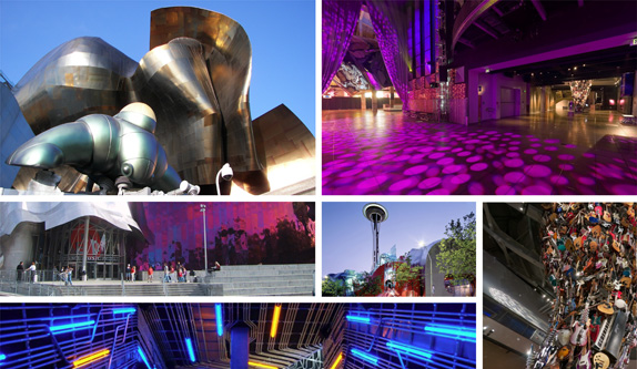
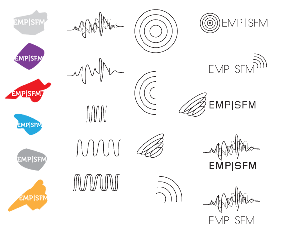
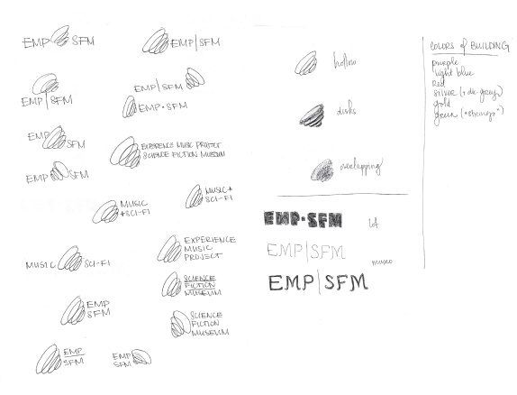
In sketching for the EMP+SFM identity, I took two different directions (that ended up combining in the end) — working from the shape and color of segmentation of the building, and the concept of sound or amplification, which connects both music and sci-fi.

Solution
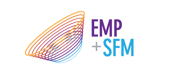
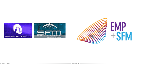
The resulting logo-type and mark used a symbol that is reminiscent of both a satellite and a sound wave, which works to express the institution’s promise. The colors used are drawn from experimentation with the buildings, with anything related to the Experience Music Project division belonging in purple, and the Science Fiction Museum owning the blue, which echoes the location of each main hall. The bar that appeared in some iterations of the current identity was replaced with a plus sign, which gives the place more of a sense of unity and activity rather than division.
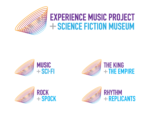
Variations on the logo can be used and changed depending upon the exhibitions on view at the time, or to advertise certain events. These are just a few ideas as to how the music + sci-fi concept in the original identity can be expanded.
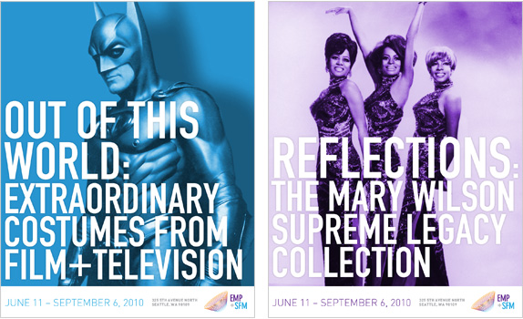
In the design for marketing material, such as posters for exhibitions, the main color from the logo would be applied depending upon which division of the museum was featured. Photography would be simple, bold, and engaging, with type large and similarly bold.
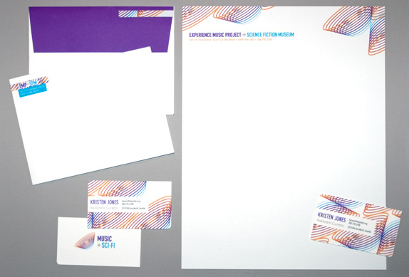
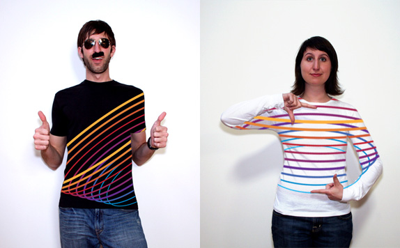
The stationery (and, in a way, the t-shirts) utilizes the amplification symbol in a pattern state. Business cards and address labels would be printed from a patterned sheet so that each card or label would have a slightly different variation with no two alike.
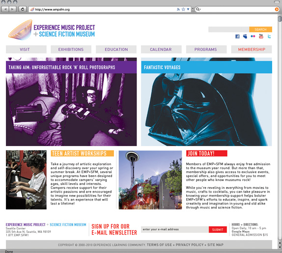
Marissa Winkler’s Website


DATE: Jun.10.2010 POSTED BY: Armin
 CATEGORY: Culture
 COMMENTS:

TAGS: experience music project, logo, photography, science fiction museum, stationery, t-shirt, website,


