Eveready by Ngoc Ngo
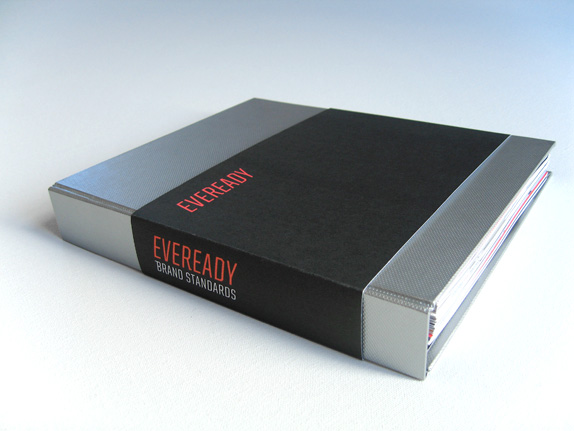
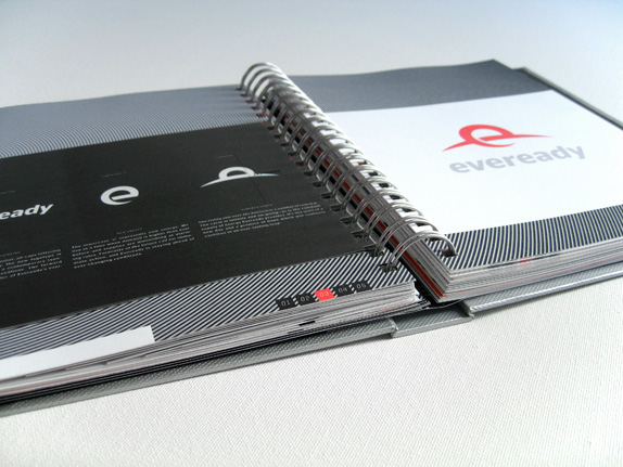
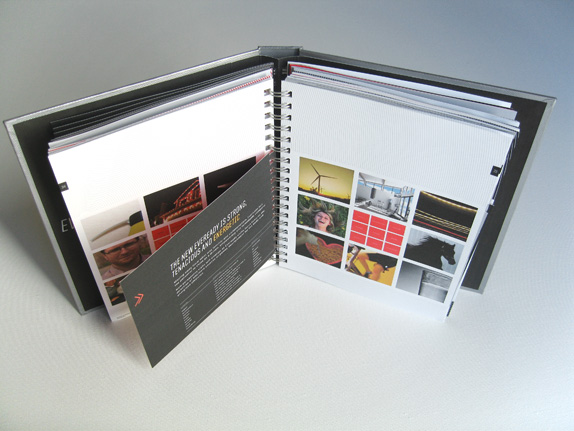
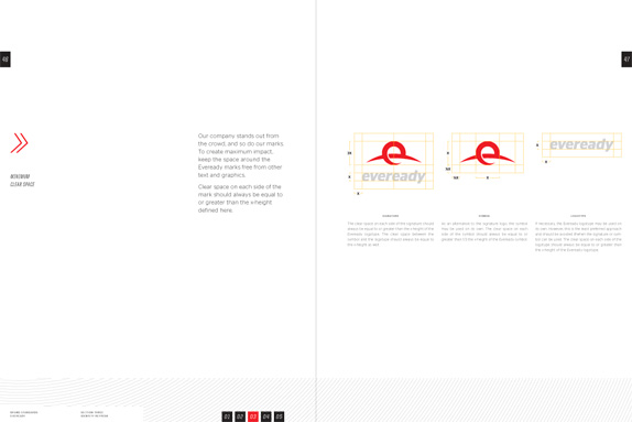
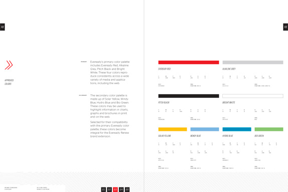
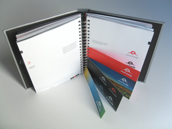
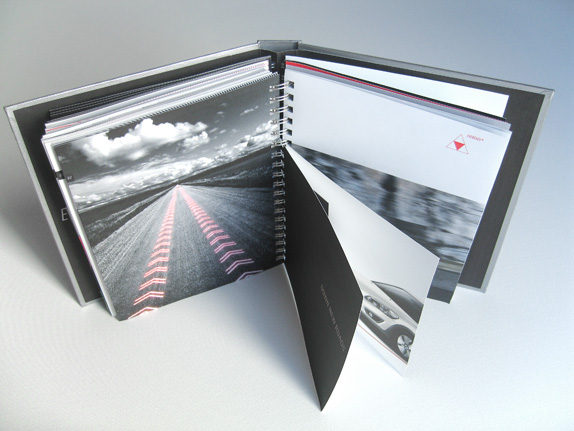
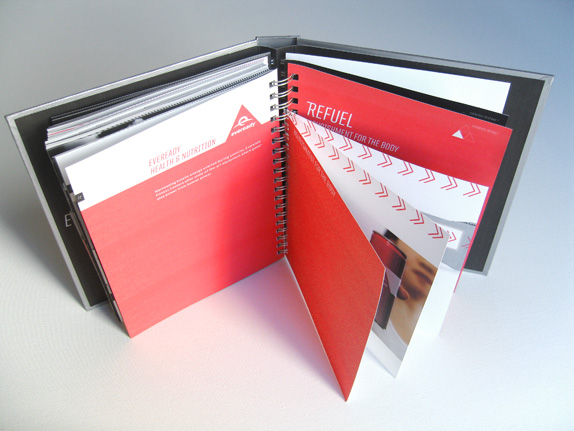
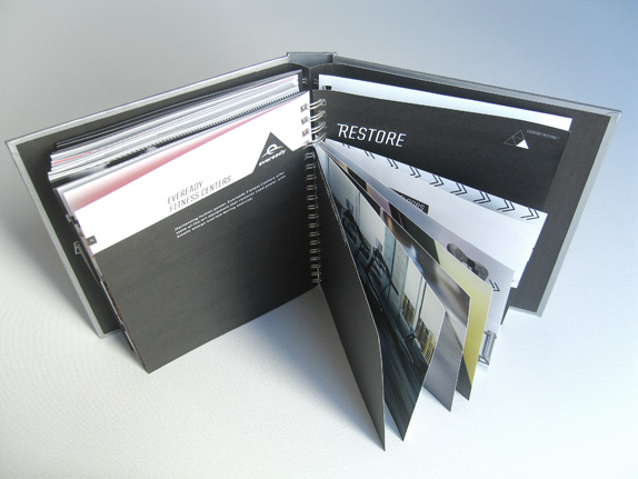
The assignment was to create a new identity for a forgotten, defunct or dying brand. We were asked to explore various methods of research to discover the audience, mood and soul of the brand & bring it to life through a collection of integrated collateral. Upon completion of the course, I delivered a brand book containing research/analysis, brand standards and possible brand extensions.

Academy of Art University
San Francisco, CA
Nature of Identity
Hunter Wimmer

Approach
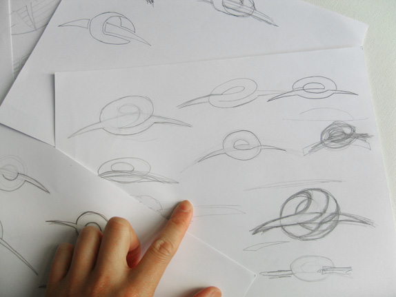
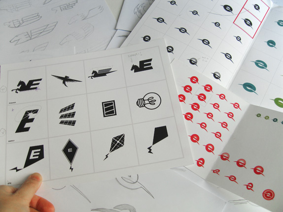
It wasn’t until week six of the course when I started to sketch out new logos for Eveready. The instructor made it clear on the first day of class that a brand is not simply a logo, but instead a highly considered and orchestrated set of elements meant to reach an audience on an emotional level & not just a visual one. So I used those first few weeks to investigate and discover Eveready’s soul; its reason for being.
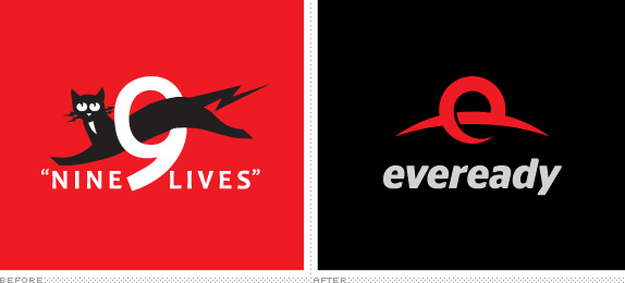
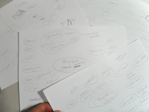
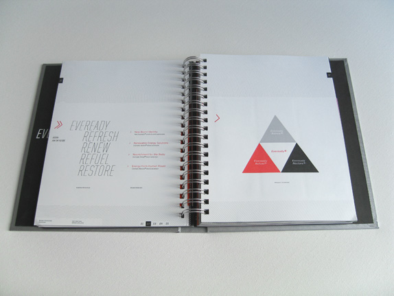
A study of Eveready’s history (a century-old company known for its batteries and flashlights) and a series of visual explorations based on the words “portable” and “power” (what I believe to be the soul of the company) led me to create a revised Mission and Strategy. With the old Eveready, portable power meant taking energy with you. But in Eveready’s rebranded objective, focusing on “limitless power” means taking energy further. Still encompassing portability, limitless power widens the gamut to include new ways of harnessing natural power (renewable energy), new power sources to help replenish what was used (human energy), and also providing for other energy needs (nourishment for the body).
Through a Brand Grid exercise, I developed a way to visually express the brand’s personality and its place in the world. This required looking at the current brand as though it were familiar things in our lives. What would Eveready be if it was an object? A person? A color? An animal? An activity? A font? Architecture? Food? Repeating this exercise for the rebranded Eveready helped to establish the right personality to connect with its new audience.
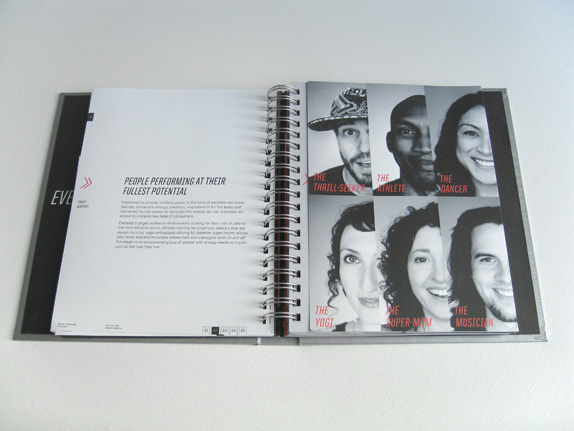
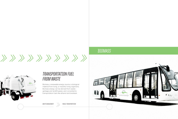
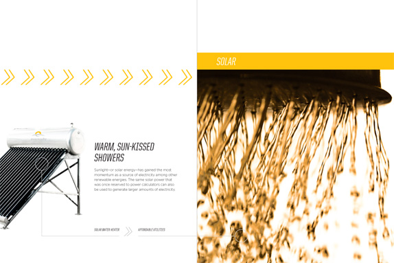
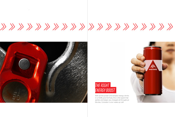
Naturally, this led to the development of audience profiles & an empowered group of people with energy needs as significant as the lives they live. This was the final element I had to define before beginning the “logo design” part of the project (and ultimately the brand expressions and extensions shown in the images below).

Sketches & Process

Solution

Ngoc Ngo’s Website


DATE: Mar.10.2011 POSTED BY: Lauren Dickens
 CATEGORY: Consumer Product
 COMMENTS:


