Dynex by Mark Johnson
We were asked to select an existing brand in an industry of our choosing and create packaging, and a new brand for it if we found it necessary.

Savannah College of Art and Design
Savannah, GA
Package Design
Jason Frazier

Approach
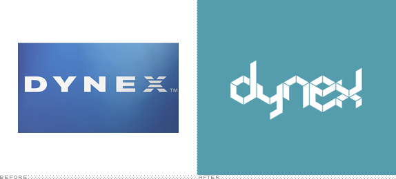
At the time I was working at Best Buy so I was surrounded by a ton of brands and packaging on a daily basis. Of all the brands in the store I always loathed pointing, handing over, or dealing with anything related to Dynex, one of Best Buy’s in-house brands. I was looking to take this brand from what looked like the 1980s into this decade while creating a branding system that was expansive enough to be recognizable across the wide range of products offered under the Dynex name.
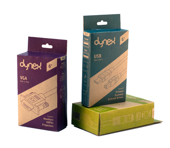
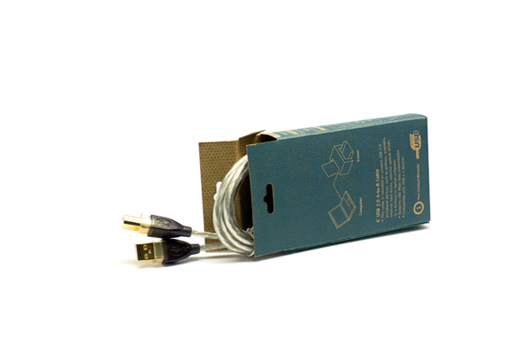
Along with rebranding Dynex I was focused on repackaging the Dynex product Best Buy probably sold the most of, which is cables. In doing this I wanted to remove the unnecessary plastic clamshells and replace them with a smaller and recyclable chipboard.
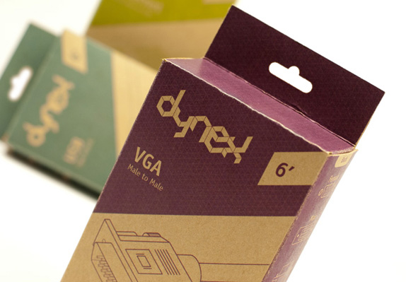
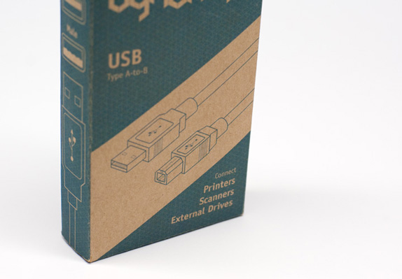
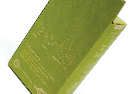
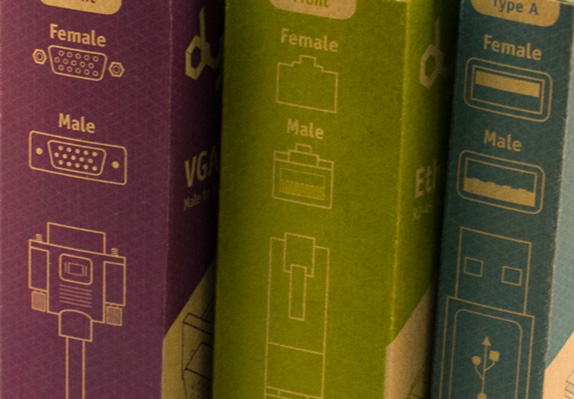
Because of the range of Dynex products, and the fact that they connect not only the brand throughout the store, but literally connect many of your gadgets I decided to build the brand on an iso-grid and expand from there. The grid gave me a base for the logo, as well the illustrations. The packages contained isometric illustrations on the front of the box, as well as a top and side view of the cables on the sides of the box. On the back of the box was all of the necessary copy as well as isometric illustrations showing the way the cable was used to connect devices.
I also decided to color coordinate the packaging and logo so that each type of cable would have its own color (USB Cables would be blue boxes, Ethernet would be green boxes, VGA would be purple, and so on). Having had to direct customers to these cables all the time, when I’d walk them there all you would see is a wall of blue and grey boxed cables, meaning if I wasn’t there they’d have to look at almost every single cable box unless they were savvy and knew what they were looking for. The color coordination would allow for anyone to just point, and inform customers that they were looking for the “x” colored box that does whatever it is they need done, reducing the confusion, and improving the ease of finding these cables.

Sketches and Process
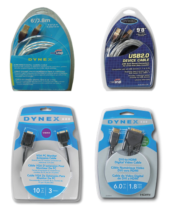
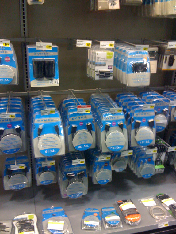
Existing products and context.
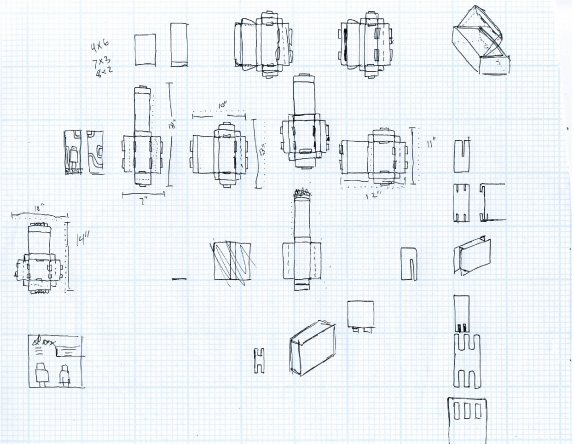
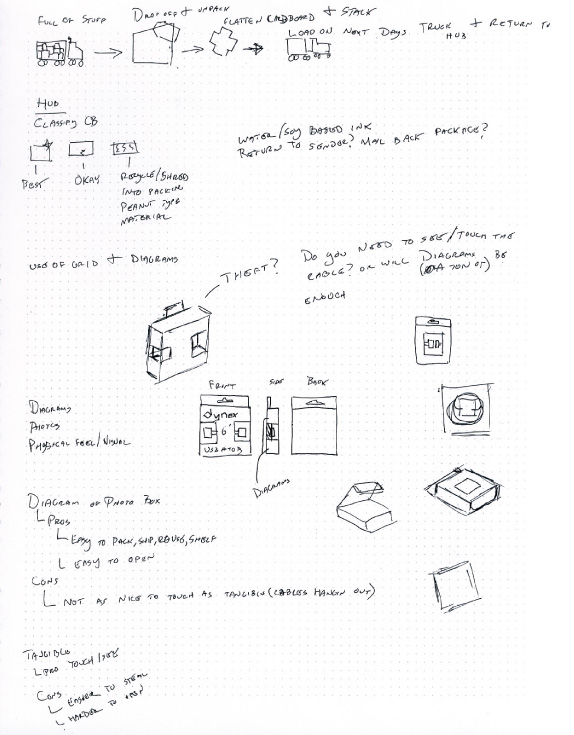
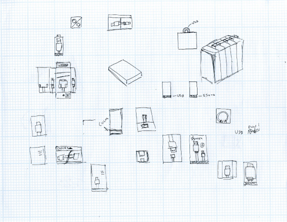
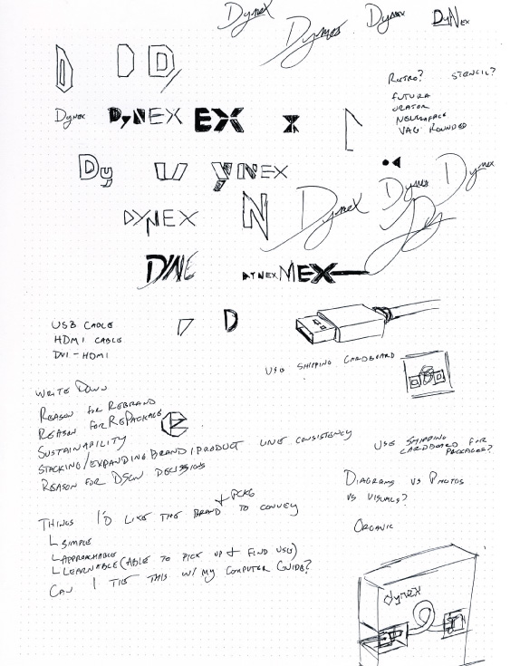
Sketches.
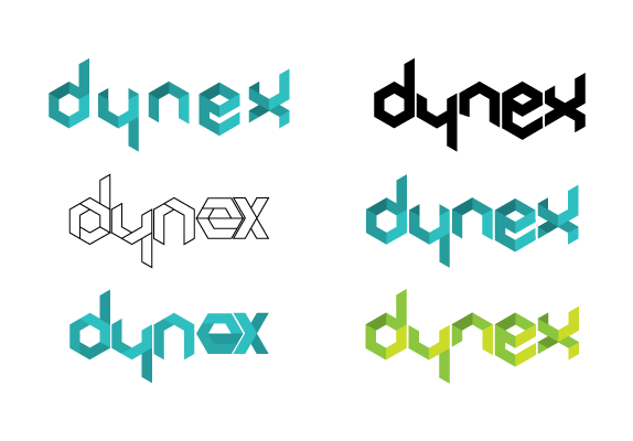
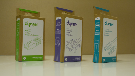
First iteration of logos and packaging.

Solution
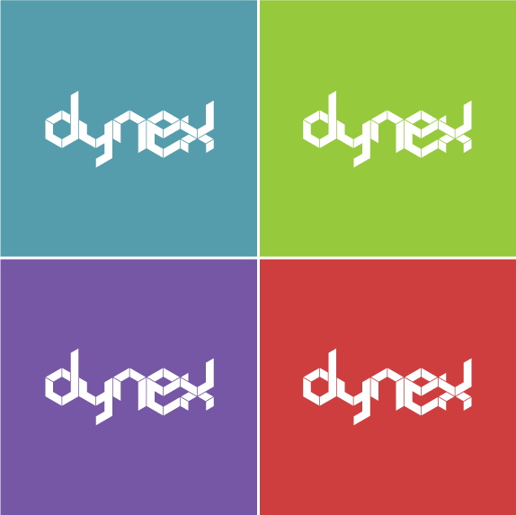
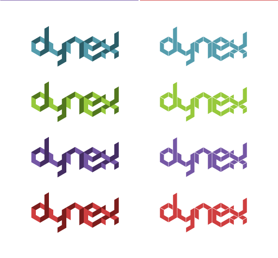
Final Logo, dimensional logo, and reversed color variations.

Mark Johnson’s Website


DATE: Jan.12.2011 POSTED BY: Bryony
 CATEGORY: Retail
 COMMENTS:

TAGS: dynex, illustration, packaging, typography,


