


Dairy Queen by Edrea Lita
Pick a company (any company) with an existing brand and redesign it. The assignment was broken out into 3 sub-assignments which took the entire semester to complete:
Assignment 1: Make a research document and presentation on the company's current brand positioning, and the positioning of its competitors.
Assignment 2: Create 3 logotypes and stationery sets
Assignment 3: Pick 1 of the 3 branding concepts and create a styleguide with brand applications.

York University/Sheridan College
Toronto, Ontario Canada
Corporate Identity Design
Annette Blum
Approach
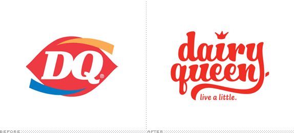
Dairy Queen has been serving tasty treats since the 1940s. So I began the project by doing a lot of research. I really fell in love with the idea of bringing the company back to its roots — leveraging its long history while creating something that seemed fresh, contemporary, and reliable. Currently, Dairy Queen’s marketing materials are aimed at teenagers and kids. But this strategy hasn’t worked very well for them since many of the franchises which were once very popular are seldom busy, and it has continued to have ongoing financial problems. In the rebranding, I wanted to address this problem by positioning the brand to market towards the baby boomers, and kids. The rebrand would bring back Dairy Queen’s original audience, while creating a friendly and fun identity that would appeal to their grandkids.
Sketches and Process
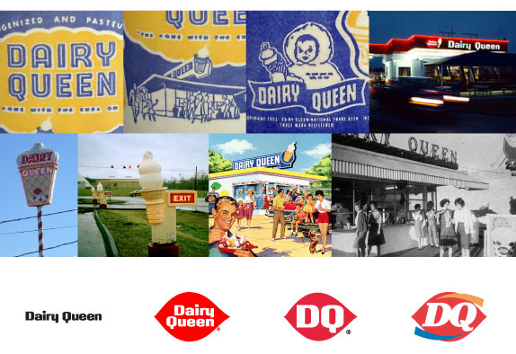
Initial visual research.
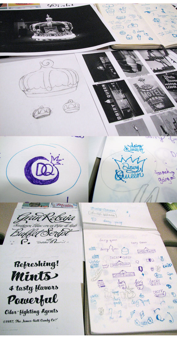
Initial concepts and sketches.
Illustrator sketches.
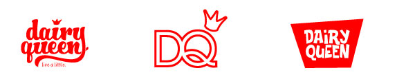
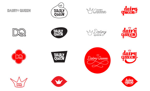
Final 3 logotypes.
Solution
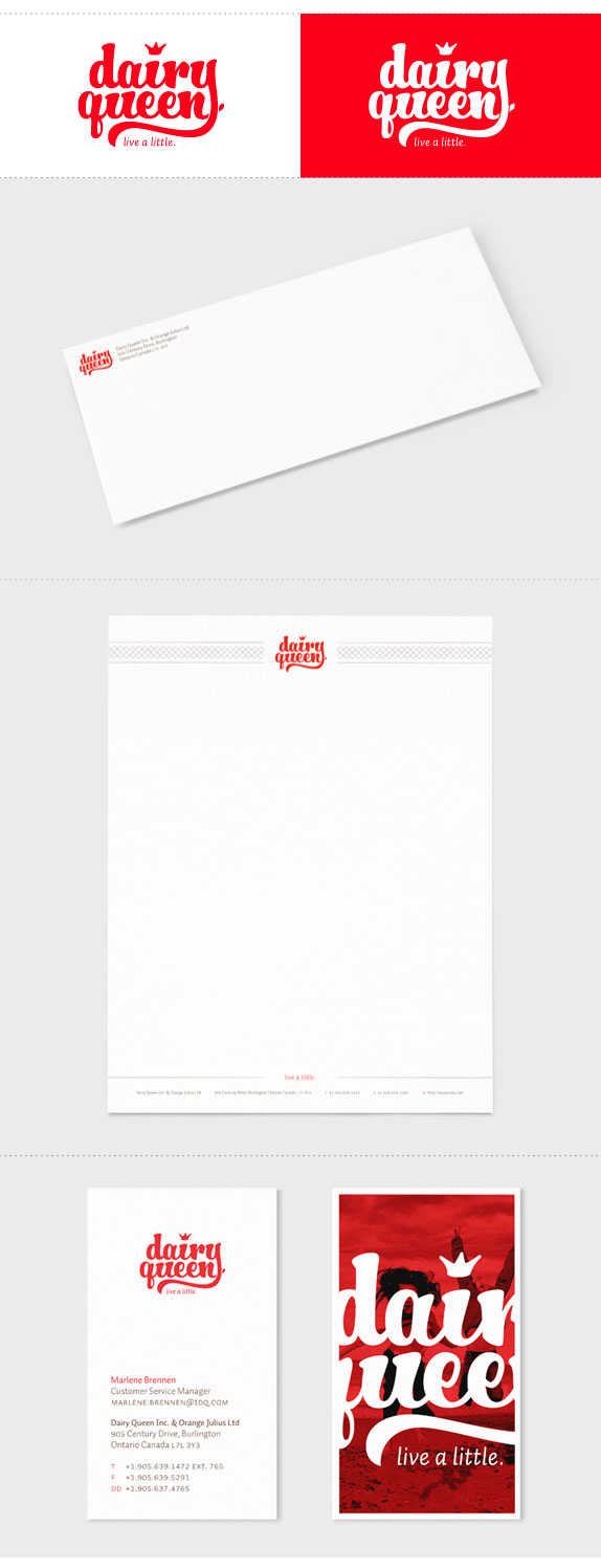
Applications.
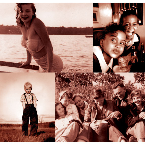
Photo style and treatments.
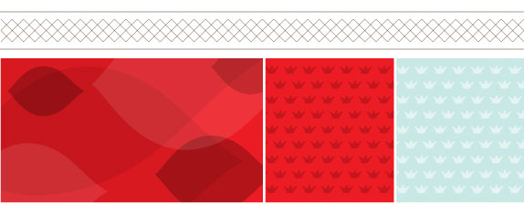
Patterns.
Edrea Lita’s Website


DATE: Apr.20.2010 POSTED BY: ArminCATEGORY: Fast Food COMMENTS:

TAGS: brand positioning, guidelines, logo, research, stationery,


Celebrating the reality that print is not dead by showcasing the most compelling printed projects.

Corraling the most relevant and creative on- and off-line bits that pertain to the design community — and said community is openly invited and encouraged to add their hard-earned links.

Describing, tracking and explaining culture, commerce, politics, media, sports, brands — everything possible, really — through design.

Discussing, and looking for, what is relevant in, and the relevance of, graphic design. [Archives Only]

Encouraging creative diversity in the community through monthly, one-word challenges. [Archives Only]

Designing corporate and brand identities and full development of printed and digital matter for clients and us.