


Coit’s Root Beer Stand by Taylor Goad
The assignment was to redesign a logo for an existing company. There were no other restrictions on the assignment and the students were allowed to choose the company.

Oklahoma Christian University
Oklahoma City, OK
Graphic Design 1
Tim Watson
Approach
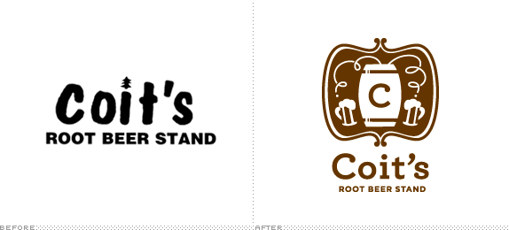
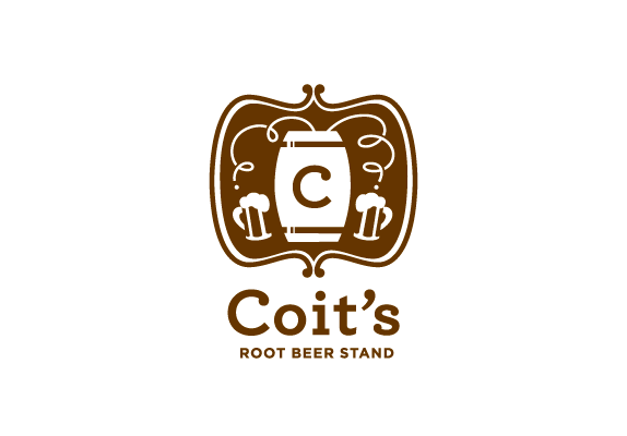
Coit’s Root Beer Stand has been doing business in Oklahoma City since 1953. They have a fanastic product: homemade rootbeer. Unfortunately they do not have the graphics to match the quality of their product.
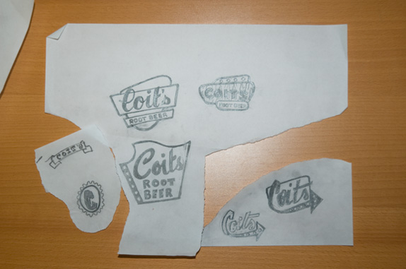
I started doing period-style logos from the 1950s; trying to give them an equity that they had not taken advantage of. The logos were interesting, but they didn’t separate them from other drive-ins in Oklahoma City. What makes Coit’s unique is that they make their own root beer and have been doing so in Oklahoma for over 50 years.
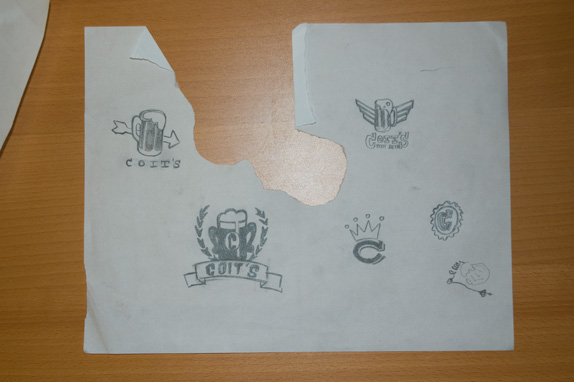
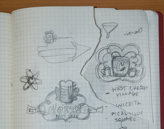
For a brief period I experimented with science and chemistry imagery, but realized this didn’t fit with Coit’s image; they need something to communicate their Oklahoma roots. I then switched gears from “retro” and pursued a country feel. I ended up with using moon shine still imagery to convey that they make their own root beer. I do not know about the rest of the country, but in Oklahoma there is a rich history with this iconography going back to the Prohibition era.
I chose to keep the logo in only one color for practical reasons; Coit’s is a family owned store and does have a lot of excess money to spend on printing. A key element in the logo are the drops coming from the still. It’s shape is echoed in the typeface chosen for the logotype as well as in the filigree of the enclosure shape.
Sketches and Process
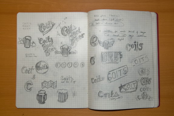
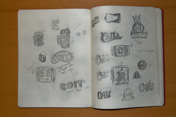
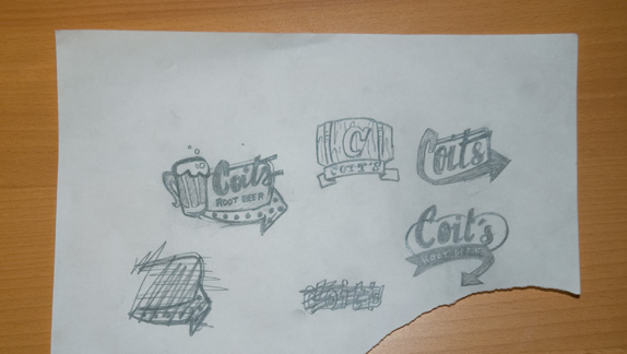
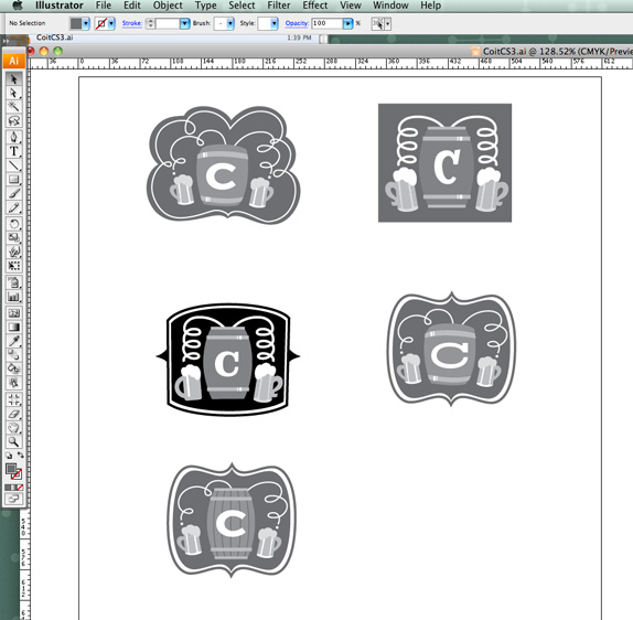
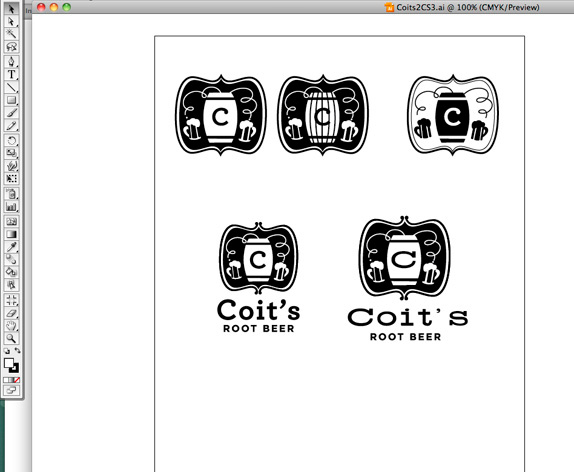
Here you can see the process once I began fleshing out the logo on the computer. The initial enclosure shape from my sketch seemed too feminine once it was fully realized in Illustrator. I also began to notice that the logo was beginning to feel too “cartoony”. So I made the proportions of the barrel and mug more realistic and also opted for an enclosure shape that felt more masculine. I also forced myself to only work in one color.
Solution
Taylor Goad’s Website


DATE: Oct.13.2010 POSTED BY: BryonyCATEGORY: Consumer Product COMMENTS:

TAGS: Coit's Root Beer Stand, emblem, illustration,


Celebrating the reality that print is not dead by showcasing the most compelling printed projects.

Corraling the most relevant and creative on- and off-line bits that pertain to the design community — and said community is openly invited and encouraged to add their hard-earned links.

Describing, tracking and explaining culture, commerce, politics, media, sports, brands — everything possible, really — through design.

Discussing, and looking for, what is relevant in, and the relevance of, graphic design. [Archives Only]

Encouraging creative diversity in the community through monthly, one-word challenges. [Archives Only]

Designing corporate and brand identities and full development of printed and digital matter for clients and us.