
Childress Vineyards by Emily Cuthbertson

ASSIGNMENT
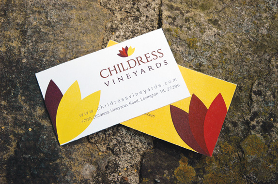
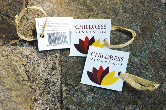
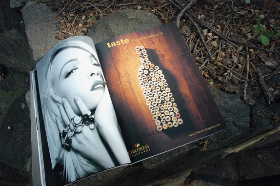
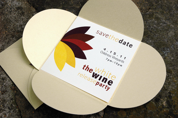
In my independent study, I was given free reign to create my own curriculum or project for the semester. I decided to develop a brand refresh campaign for Childress Vineyards of Lexington, North Carolina. Upon choosing the type of project I would complete, and the company I would focus on, it was up to me to decide what components of the campaign to include and what the timeline was going to be. I began in January, 2011 and completed the project in May, 2011.


In my independent study, I was given free reign to create my own curriculum or project for the semester. I decided to develop a brand refresh campaign for Childress Vineyards of Lexington, North Carolina. Upon choosing the type of project I would complete, and the company I would focus on, it was up to me to decide what components of the campaign to include and what the timeline was going to be. I began in January, 2011 and completed the project in May, 2011.

SCHOOL
University of North Carolina
Charlotte, North Carolina
University of North Carolina
Charlotte, North Carolina
COURSE
ARTA 3800 Independent Study in Art
ARTA 3800 Independent Study in Art
INSTRUCTOR
Kimberly Hoover
Kimberly Hoover

Approach
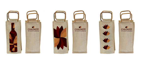
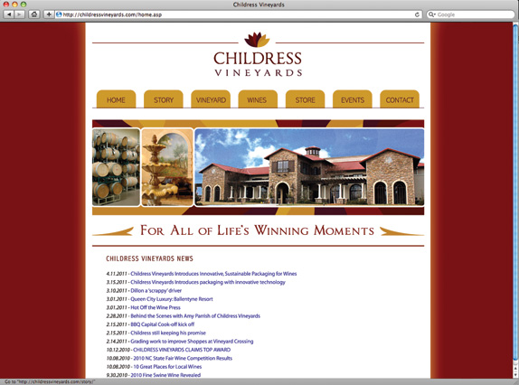
I approached the project knowing that I wanted to create a full campaign of work to show how an existing logo or brand can be changed and refreshed while still retaining a target audience, perhaps expanding that audience. From the current identity system that Childress Vineyards is working with, I wanted to make the brand feel more modern while still being represented as traditional and established; making one visual mark out of two opposite characteristics. In my process and research, I discovered how to learn about the competition in a given market, how to make a logo represent as much information as possible, and how to incorporate existing ideals and standards into a new idea.

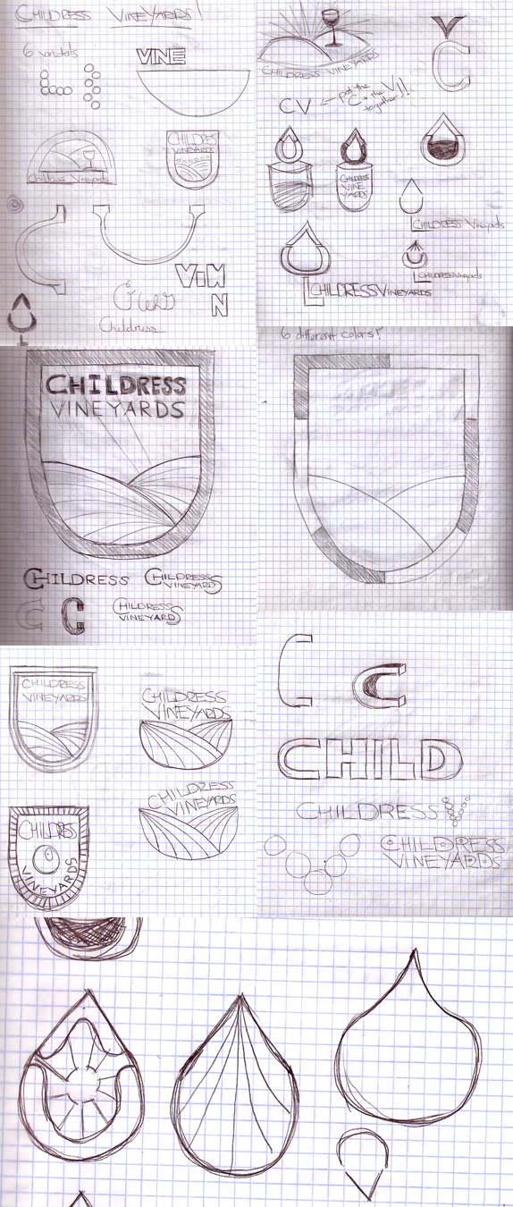
Sketches and Process
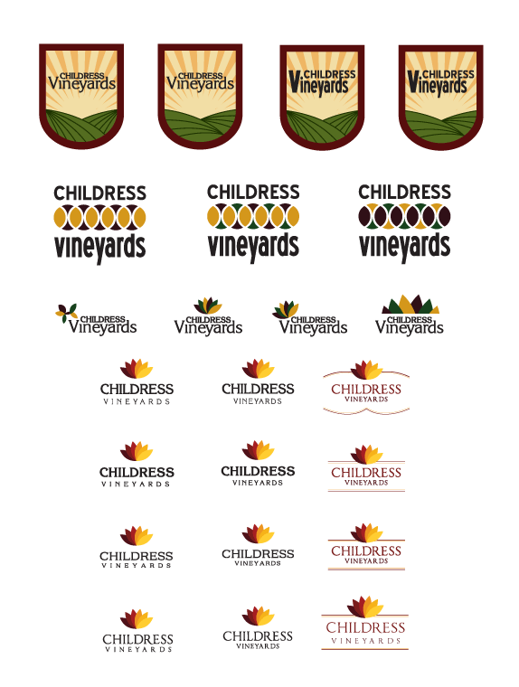

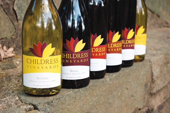
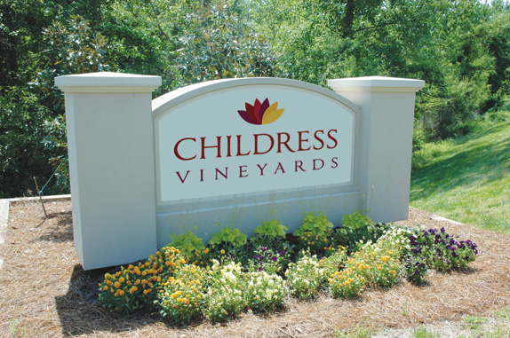
Solution


Emily’s Website


DATE: Jun.21.2011 POSTED BY: Lauren Dickens
 CATEGORY: Destination
 COMMENTS:


Comments › Jump to Most Recent


