Chicago Lighthouse by Brittney Givens
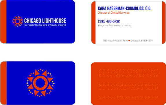
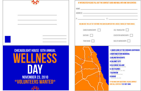
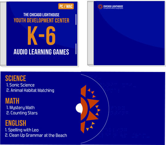
With an understanding of methodologies and strategies used for building and maintaining brands and their identity within a contemporary corporate environment. Visual systems are explored to develop culturally relevant messages and images, thus building sustainable brand recognition. Project focus on how organizations use visual communications to express their core values and impact consumer perceptions of their brand. So once choosing an organization for rebrand the first thing to do is to redesign the logo and from there adding the stationary, packaging, etc.

Columbia College Chicago
Chicago,IL
Branding Identity
Vithika Mehrotra

Approach
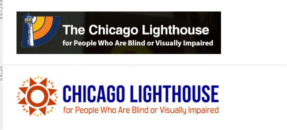
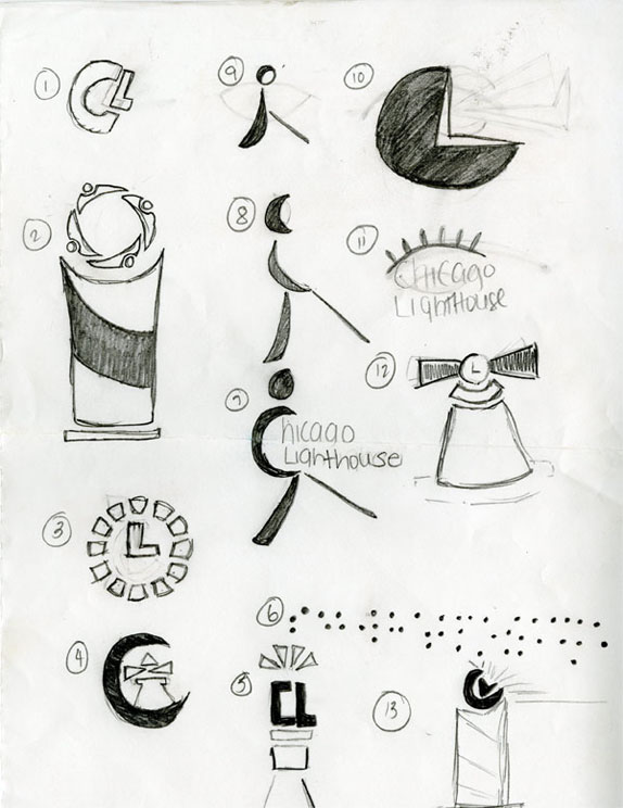
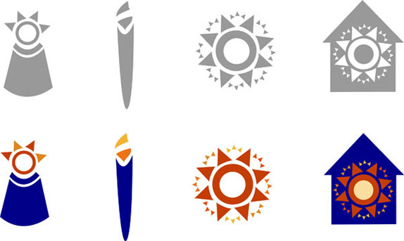
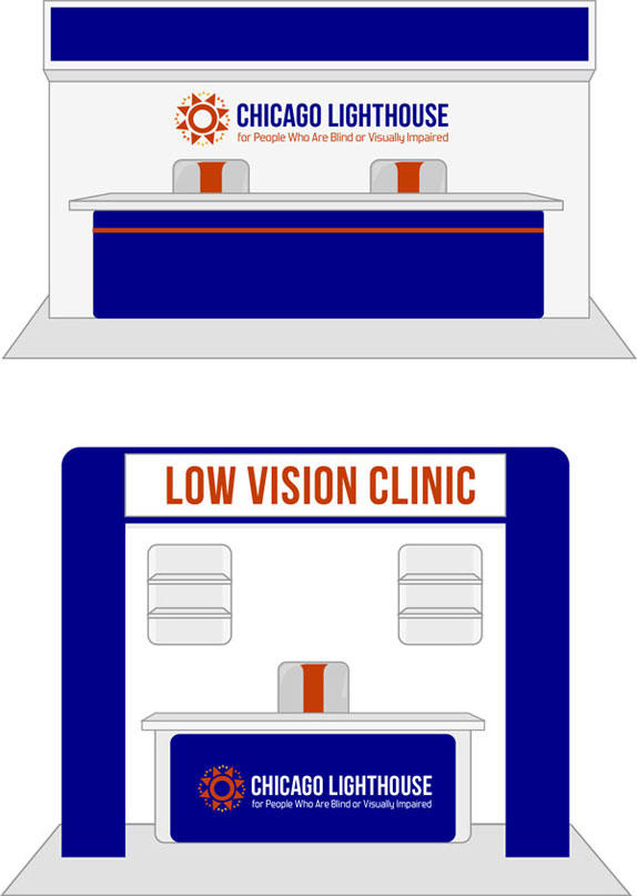
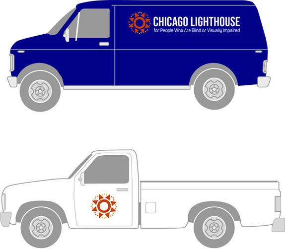
For this rebrand for the Chicago Lighthouse for the Blind and Visually Impaired, a non-for-profit organization I knew that I wanted to approach it giving them a look and feel that met their mission and vision of their company as well as their clients. I knew I wanted to keep using their corporate colors, blue and shades of orange. But wanted to have the logo mark of the lighthouse to be different. I started working with symbols of the sun, candle, eye, house, and even combine the symbols together.
I wanted the logo mark to be simple, bold, and something you would recognize without the company name. And wanted the same goal for the typeface, the original logo used a sans serif typeface. I wanted to keep it that way, but something that was bolder. After several revisions I was able to come up with a mark that represented the company well. Chicago Lighthouse sun mark, corporate colors, and corporate typeface were bold, with powerful lettering and the icon of the Chicago Lighthouse logo reflects the strength of their services. The blue color symbolizes reliability and history. And the shades of orange demonstrated social ability, assurance, and warmth. Together those elements demonstrate that the Chicago Lighthouse has over 100+ years expertise in social service for the blind and visual impaired community.

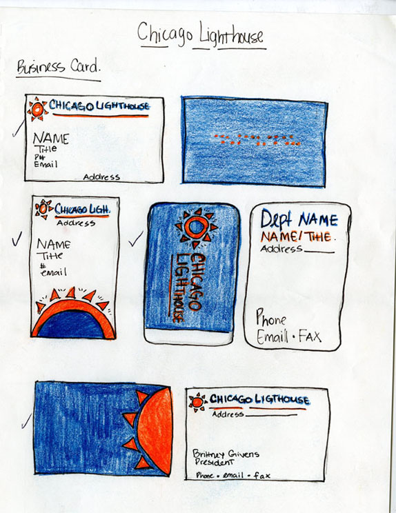
Sketches and Process

Solution




DATE: Feb.08.2011 POSTED BY: Lauren Dickens
 CATEGORY: Non-Profit
 COMMENTS:

TAGS: blue, chicago, chicago lighthouse, orange, visually impaired,


