Castle Palooza by Jamie O’Leary
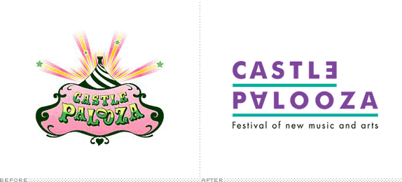
This was our final year project so each student was given the task of finding an organisation to complete a project for. I choose a visual identity redesign for Castle Palooza Music & Arts festival which takes place in Tullamore, Co. Offaly in Ireland. The reason I chose this festival is because it is largely unknown within Ireland and has a poor existing identity unsuited to its target audience.

Dublin Institute of Technology
Dublin, Ireland
MA Design Practice
John Greene

Approach
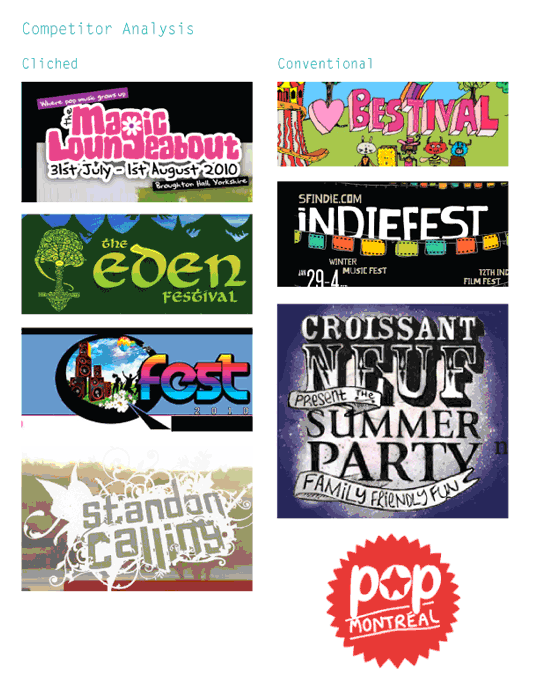
I used various research tools such as a literature review, competitor analysis and communications audit to establish a strong foundation for the project.
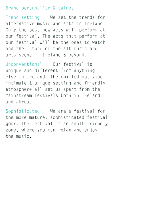
The identity was developed around the three core values of “unconventional, trend-setting and sophisticated”.
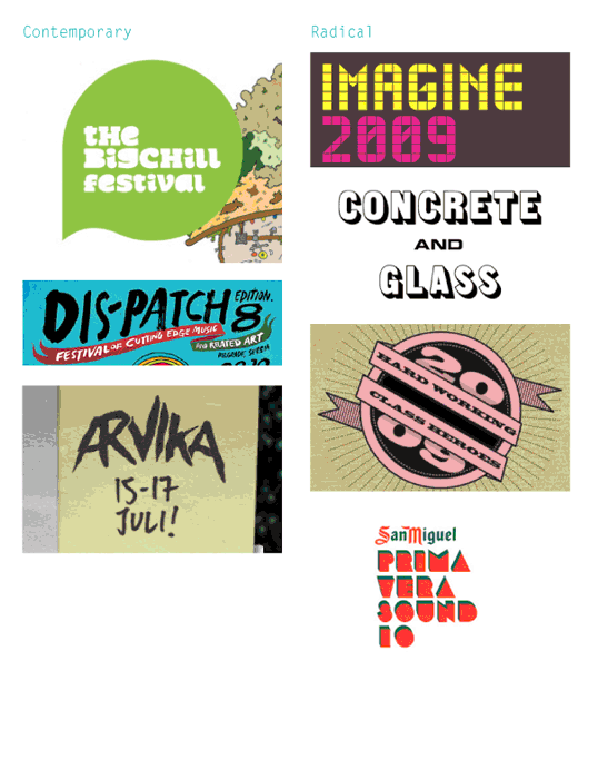
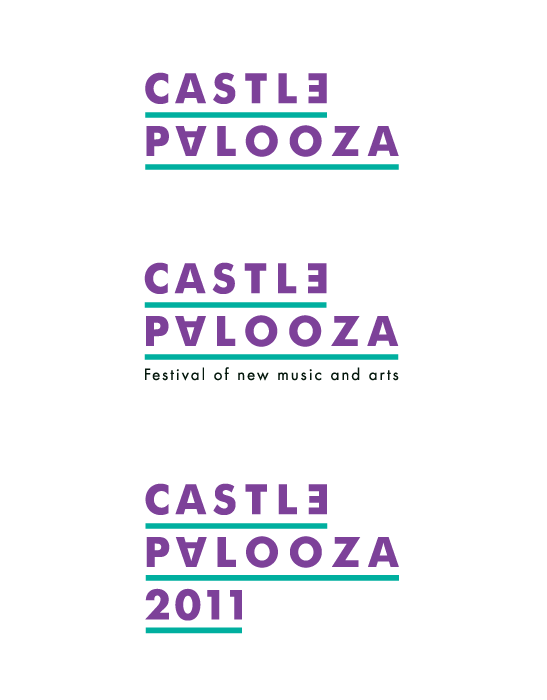
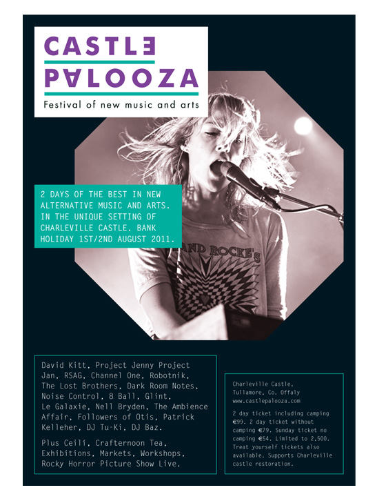
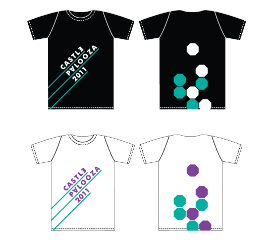
It was decided to completely revamp the existing Castle Palooza mark. The finished solution was a simple typographic mark, which was radical compared to its competitors and so conveying one of brand values, trend-setting.
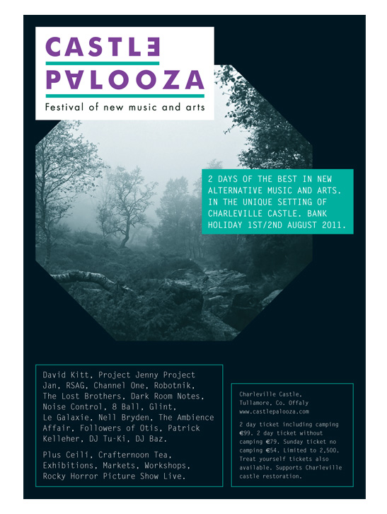
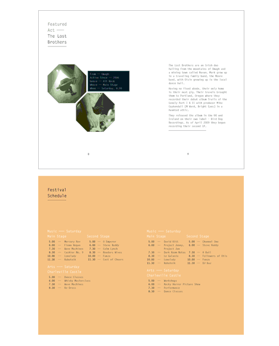
The holding device for the imagery (the octagon) was developed in order to reflect a turret, and so the setting of the festival (a castle).
Overall the identity sought to play to the festivals strengths, i.e. the fact that there are a lot of up and coming new acts at the festival, that it is not your average mainstream festival in terms of the music and arts showcased and that the festival has a more mature, sophisticated vibe to it.

Sketches and Process

Solution

Jamie O’Leary’s Website


DATE: Sep.07.2010 POSTED BY: Bryony
 CATEGORY: Entertainment
 COMMENTS:

TAGS: advertising, castle palooza, t-shirt, typography,


